Without changes and improvement, your product is surely to become less and less profitable with time. Even if you think that you have a stable and profitable situation with your subscriptions, there’s always something that could and even should be improved. Your paywall should be evolving and adapting to the trends and demands of the users. So let’s have a look at the main aspects of the paywall that you should take into consideration when launching A/B tests.
This is the second article in our tutorial series on paywall A/B testing. In this series, we show how to properly approach A/B testing and avoid common mistakes. Check out the rest of the articles to get more insights:
- Paywall A/B testing guide, part 1: how to approach split-testing and avoid mistakes
- Paywall A/B testing guide, part 2: what to test on the paywall
- Paywall A/B testing guide, part 3: how to run A/B tests on paywalls and why it can be difficult
- Paywall A/B testing guide, part 4: how to run experiments in Adapty
Popular ways to price your product
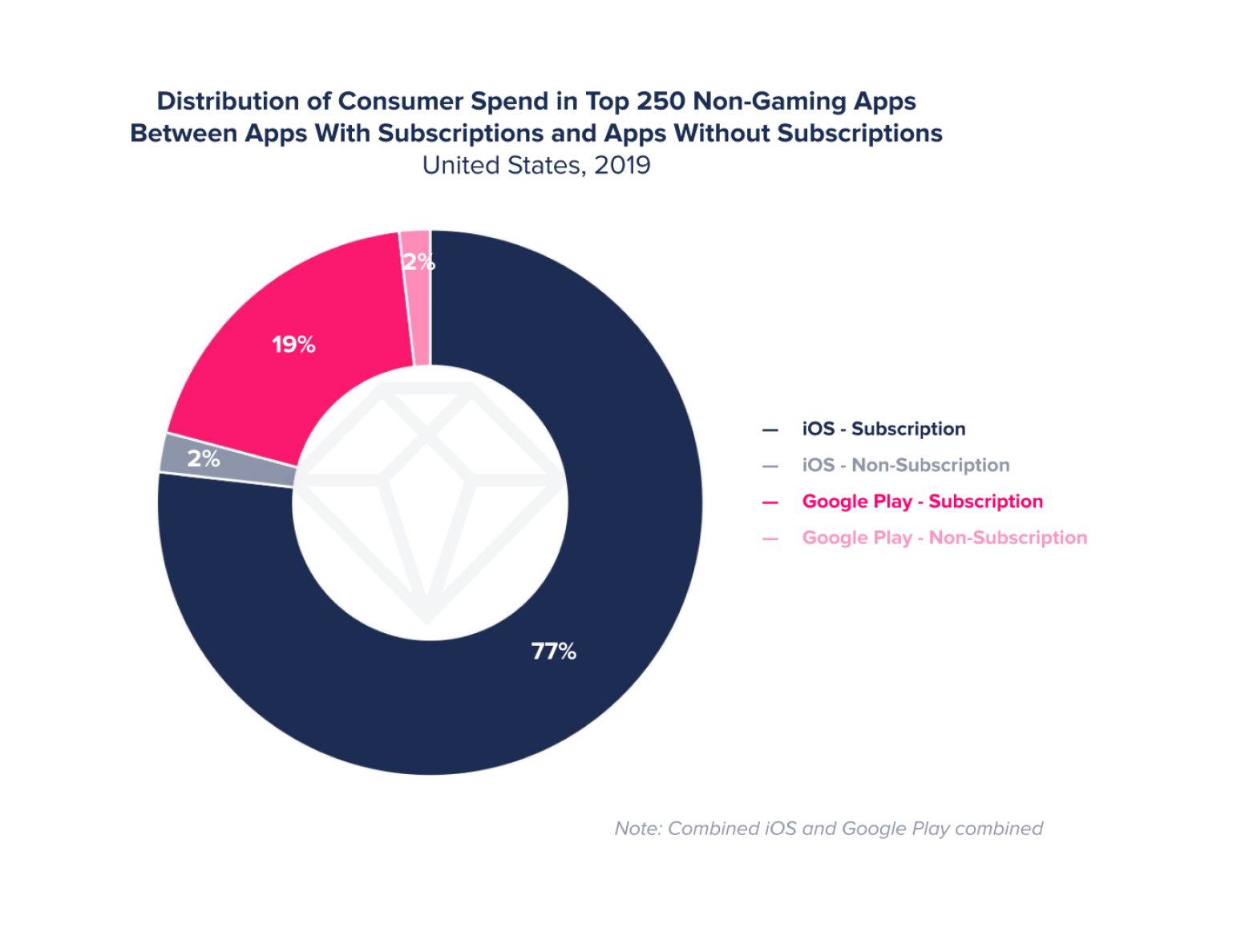
You sure know that there are two main pricing options to place on a paywall – subscription and lifetime. There’s no doubt that the subscription model has by now become commonplace and even sort of a benchmark of pricing mobile apps and desktop software. Many apps still offer a lifetime option on their paywalls, but it’s rarely in the focus. This option gives more money right away, but won’t be bringing any consecutive income, that’s why subscriptions are now taking over.
Let’s refresh on the current subscription variants offered by the App Store and how they can be used.
- Weekly – an option that is getting more and more popular with the users these days, especially if you price it right. In some countries people are willing to pay less money for a weekly subscription than a bit more for the whole month, so you may take advantage of that. Price it no higher than $5.
- Monthly – the most popular and balanced variant of subscription. Most of the subscription-based apps use this type of pricing as the gold standard, presenting it in the most favorable light.The reasons are simple: the user is willing to pay the average of $5-10 every month as it wouldn’t affect their wallet that much right away, and the developer gets the user who will potentially be renewing the subscription for a couple of months at least.
- 2-months/3-months – these options are good to experiment with. Depending on the niche and the nature of your app, people may find them attractive and beneficial. If you have a 3-product paywall, you can play this out as a middle offer (1/3/12 months) or even make it a starting point (3/6/12 months), thus boosting your minimal price.
- 6-months – probably the happy medium between the monthly and annual subscriptions. It’s also a good option to experiment with: if your paywall featured the annual subscription before, you can try to substitute it with the 6-months variant leaving the price unchanged, to see if the users would still find this offer reasonable. If this works out, you’ll just double your figures with no effort.
- Annual – If you manage to turn your users to purchase this option, you’ll know the exact amount of money you’ll have within one year, which also means having more assets to work with and invest in the further support of the app.
Figuring out intro offers
Introductory offers help hook the user or make the purchasing process more gradual and friendly. There aren’t many to choose from, but they all may be worth testing in order to find what performs best with your app.
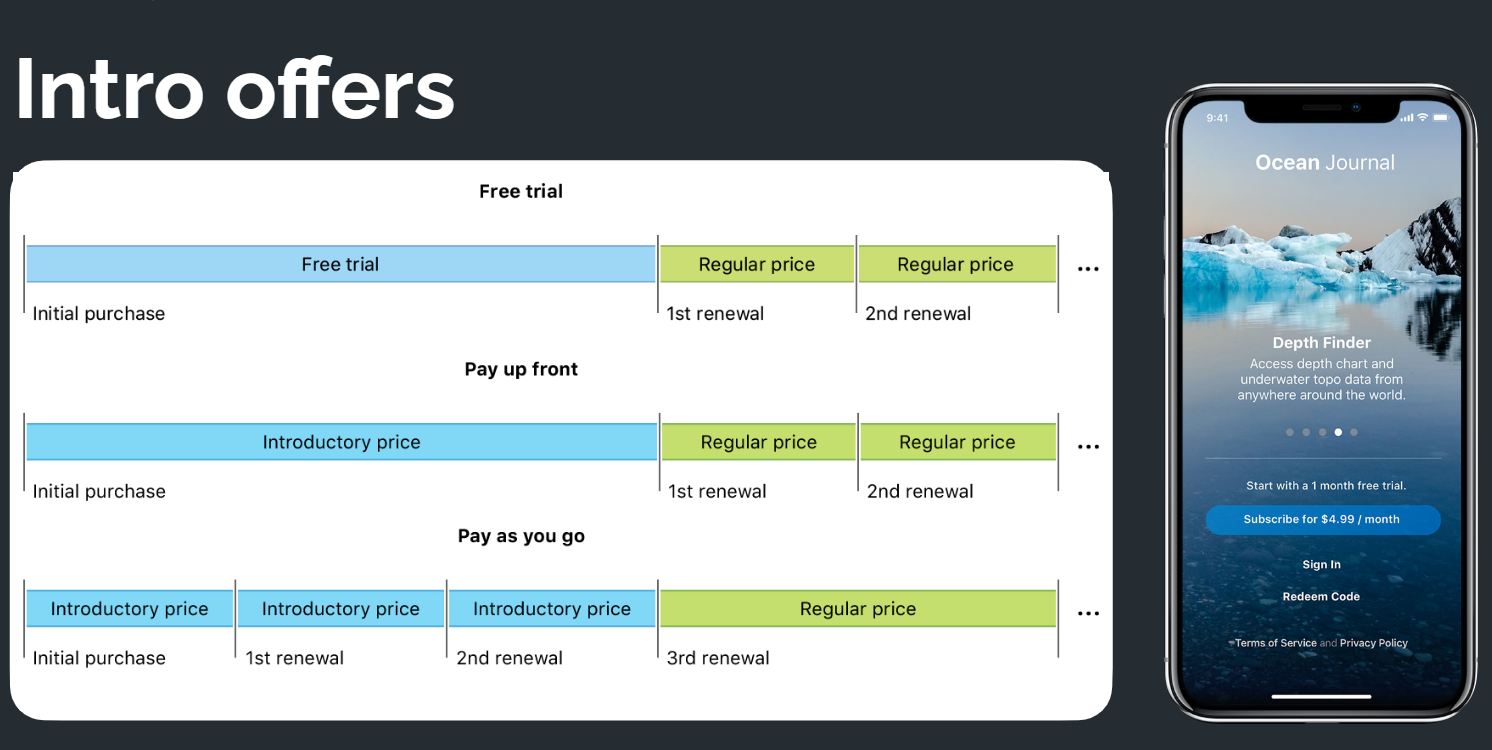
Free trial is the most common and popular type of intro offer as it helps demonstrate the benefits of using your app, thus hooking the user and making them want to pay for the full version. If you’re already using it, you may want to try testing a different number of trial days. Sometimes giving more time to use your app for free may hook the user even more, providing higher retention and resulting in a higher trial to purchase conversion rate.
Apart from free trial there are also two intro offers that imply proposing introductory prices: Pay as you go and Upfront. In the former case, you offer your new subscribers a special low introductory price for a specific duration (e.g. $1 per month for the first 3 months), in the latter – just a one-time introductory price. Paying a small sum of money to get access to all the features right away is not that big a deal for most users, but it’s a rather effective way to hook them up and gradually get them into further renewals. These two offers always look intriguing and tempting, but make sure the user understands the true value of your app before they’re offered to pay, which means you should take care of making a proper onboarding process, as well as provide all the necessary and valuable information on the paywall.
Finding the right number of products
One of the main advantages of the paywall A/B testing is the opportunity to try different numbers of products. Of course, to choose wisely the number of products for your paywall you should consider many factors, such as the app’s longevity and its overall quality, amount of traffic and potential subscribers, relevance on the market, etc. But sometimes it just wouldn’t hurt to refresh your paywall and try something drastically new. So let’s have a quick recap of pros and cons of the most popular variants.
1 product
Pros
- Looks neat and user-friendly
- Usually presents the list of all advantages of the app
- Doesn’t make users decide which plan to choose
Cons
- You have to choose one and only pricing option
- Difficult to understand the paying capacity of your subscribers
2 products
Pros
- Provides more freedom to experiment
- Allows to mix any pricing options: from weekly to lifetime
- With the right approach may be more profitable that the previous one
Cons
- You have to understand your users’ psychology for it to work properly
- Products’ prices should adequately correlate with each other and not be higher than the average prices in your niche
3 products
Pros
- Huge possibilities for experiments
- Allows anchoring (i.e. making the user lean towards the option that is more profitable for you)
- Convenient structure to learn more about your users’ behavior
Cons
- Can be hard to control
- Requires creating at least three products in your app
- Depending on design, may look overloaded with textual information
Design matters
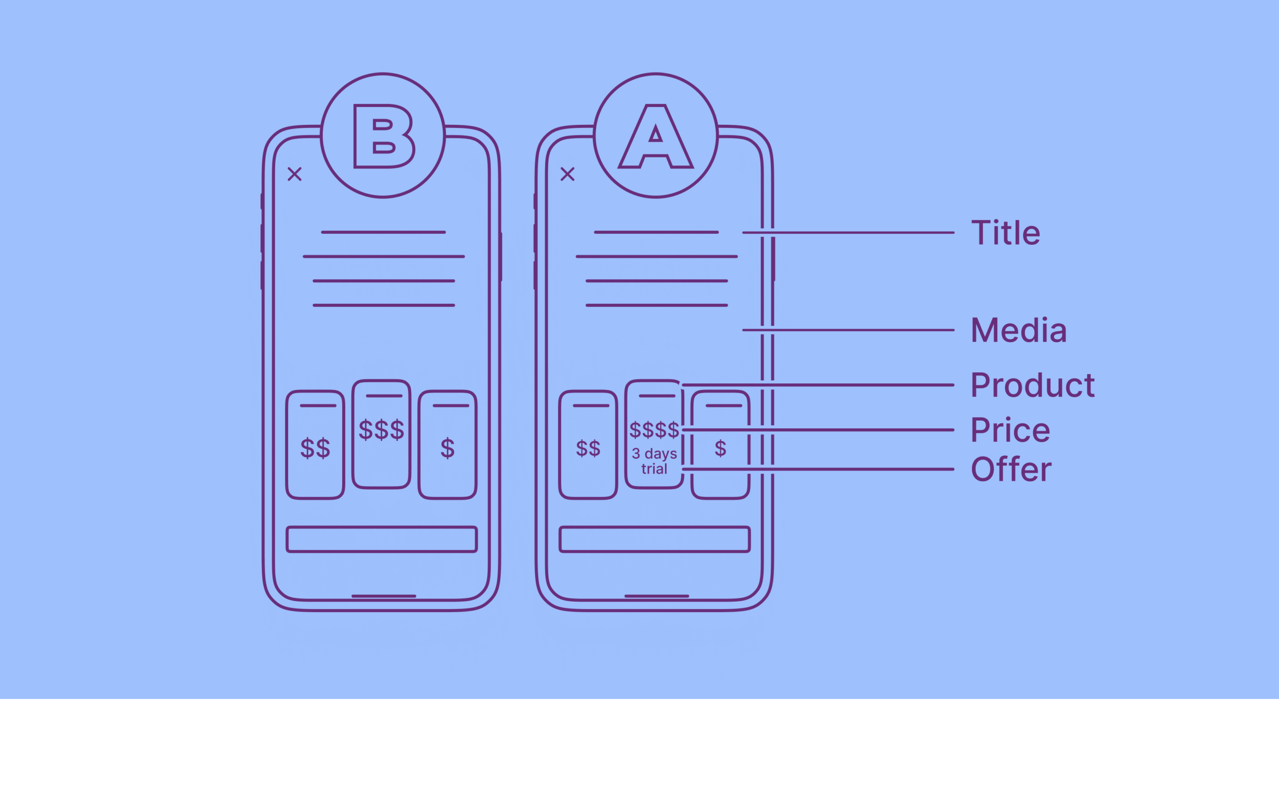
Design of your app’s paywall is crucial as it communicates directly with your potential subscriber. If your paywall looks beautiful but the user gets lost and confused – mission failed. The main idea behind testing design elements is to make the paywall more user-friendly and improve certain conversion rates (trial to subscription, install to trial, etc.) The approach to building a solid paywall depends on the number of products and intro offers you want to demonstrate. But there are common elements that are present on almost any paywall, and they all can be tested.
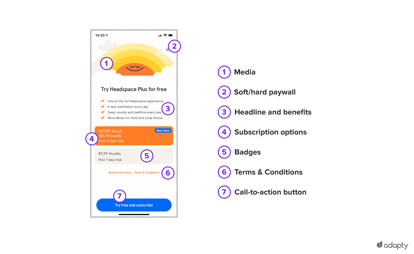
- Media – any graphical images, animation or even videos that you want to use as a background or as a demonstration of your product’s capabilities.
- Soft/Hard paywall – depending on when your paywall appears, it may be skippable or not, and if it is, you should think about the way it can be closed.
- Headline and benefits – your paywall should point out all the benefits of your app, so that the user could make the decision in your favor.
- Subscription options – textual information about your offers.
- Badges (or cards) – cards or even buttons with subscription options.
- Terms and conditions – links to the terms of use, privacy policy, and other legal documents, if needed.
- Call-to-action button – button that invites the user to proceed and confirms their choice.
All these elements can be tested the way you want, and it’s up to you to find what works best for your app. However, there are a few common ideas to take note of.
If you use the free trial, you can inform the user in different ways: by making a toggle, by adding a piece of text somewhere on the paywall, or by adding a note to the subscription card/button. It may only be a personal preference, but it’s worth a shot.
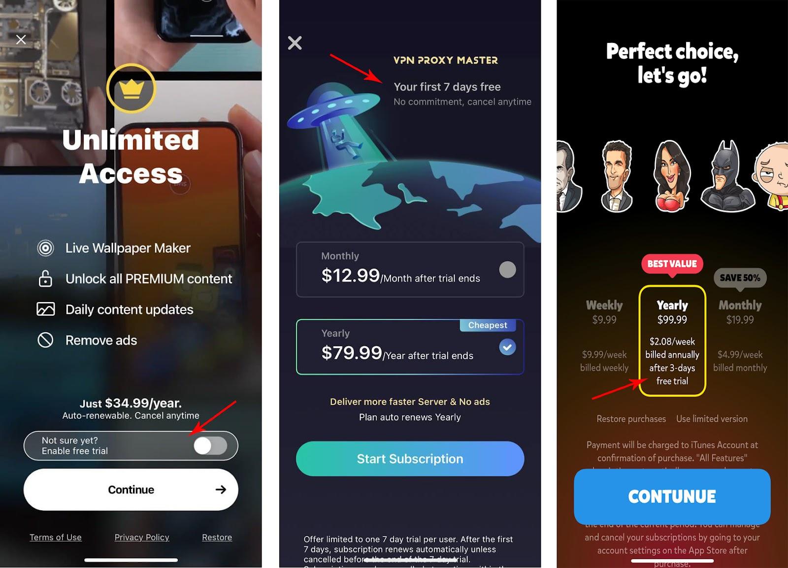
There are also different ways to present your products and engage the user to proceed further down the funnel. Your product cards could act as buttons, so that the user could just tap the product they wanted and proceed to purchase it. Another popular way is to write down “Continue” on the purchase button. If you want to keep away from using banal badges, there’s a stylish variant of turning your subscription options into selectors. In this case, the user must tap the option first and only then the button.
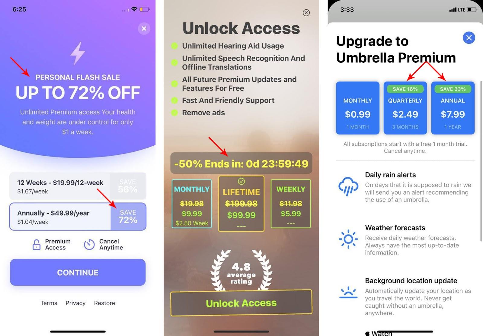
Don’t be afraid to “decorate” your paywall with marketing niceties, but don’t get carried away, users don’t like to feel manipulated. Many use “personalized” discounts, fake timers, notes on how beneficial this or that option is, etc. Adding just one of those elements may boost your paywall, but you’ll never know until you test it.
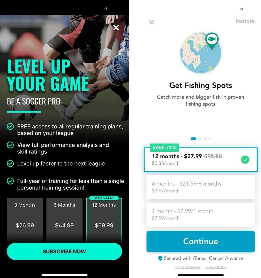
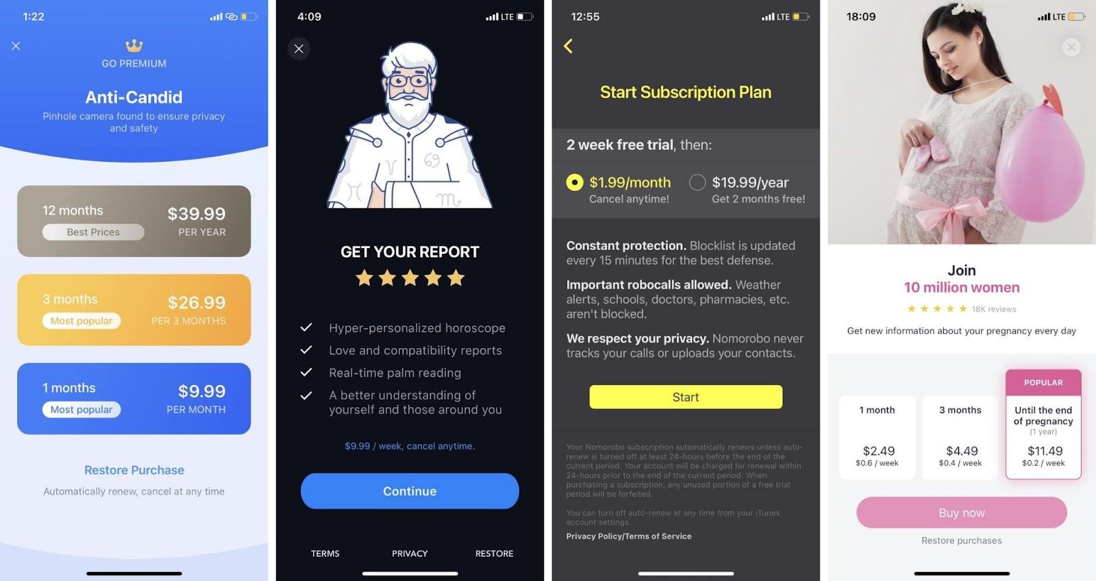
As you may have noticed from the screenshots, every paywall is unique and intriguing in its own way. But it doesn’t mean that we’re not allowed to seek inspiration in other apps. That’s why we’ve gathered the biggest collection of mobile paywalls that you can thoroughly examine and find things to experiment with on your own paywall. Now we can move to the next article to learn how A/B tests are actually launched.
