Product matrices – and mobile app product matrices, in particular – come in many forms, each designed to address a specific aspect of your product strategy.
For example, a product feature matrix for your app helps you visualize its upgrade paths by mapping out the differences in features across its different subscription plans. A monetization matrix, in contrast, enables you to assess different revenue streams and create a balanced approach to monetization. Meanwhile, a competitor research matrix provides a comprehensive view of how your app stacks up in your target market.
But what exactly is a product matrix? And how do you create one? And why does it matter? Let’s now see what a product matrix is and how you can build your own. We’ll also see how you can put these to use. Here goes.
What is a product matrix?
A product matrix is essentially a grid or a table that allows for side-by-side comparisons of your different product dimensions. In general, your product matrix’s rows represent the comparison or evaluation criteria, while the columns represent the different entities across which you’re making the comparisons. These entities can be anything from competitors in a competitive matrix to user segments in a user segmentation matrix and product versions or subscription plans in a product feature matrix. Let’s dive straight into the different types of product matrices now, and all this will get even clearer.
Types of product matrices
1. Brand product matrix
A brand product matrix aligns your product offerings with your overall brand identity. In this matrix, the rows represent key branding dimensions – such as visual identity, messaging, and tone – while the columns represent the entities you want to evaluate. For example, you can assess how your messaging changes across different stages of the buying journey, evolves between your various product plans or user segments, or even compares to the messaging of your competitors. Ultimately, this matrix lets you see how consistently your branding is applied across all touchpoints.
This matrix is highly flexible.
- For instance, a user segmentation matrix can also serve as a type of brand matrix if you’re looking to compare how your brand is perceived across your different target user groups.
- Similarly, a customer journey matrix can be viewed through a brand lens if you evaluate how well your brand elements – like visual design, messaging, and tone – are maintained from the discovery phase through retention.
- Additionally, a competitive benchmarking matrix can also function as a brand matrix by comparing your brand’s visual identity and messaging (among other factors) against those of your competitors, helping you identify areas where your brand stands out and where it might need further refinement.
However, the core idea remains the same: You are measuring how consistently and effectively your brand is communicated and identifying areas where it can be strengthened.
2. Product value matrix
A product value matrix helps you determine whether your product’s features, benefits, and overall offering justify its price. It provides a clear, side-by-side comparison of different plans or versions, enabling you to assess value from the customer’s perspective and make informed decisions about product optimization and pricing strategies.
It helps you determine if each upgrade is truly worth the extra cost by addressing questions such as:
- Does the additional set of features or benefits justify the upgrade?
- How do the features, benefits, and overall user satisfaction compare across various subscription plans?
- Is there a clear incremental value that motivates users to upgrade from a free or lower-tier plan to a more premium option?
Additionally, the product value matrix reveals whether your pricing structure is competitive and aligned with market expectations, while also indicating if the overall user experience is perceived as valuable compared to industry benchmarks.
A sample product value matrix would look like this:
| Value metric | Free plan | Standard plan | Premium plan |
| Features | Basic analytics, limited integrations | Advanced analytics, more integrations | Full analytics, priority support, AI insights |
| Benefits | Try the platform for free, no commitment | Access to core features for growing businesses | Full access to all tools for scaling enterprises |
| Pricing | $0/month | $19.99/month | $49.99/month |
| Customer satisfaction | Good for testing, limited usability | High satisfaction for growing businesses | Excellent for enterprises & high-volume users |
| Perceived value alignment | Best for individuals & small startups | Ideal for SMBs & mid-size businesses | Designed for large businesses & power users |
Product feature matrix
A product feature matrix allows you to visually compare the core functionalities and benefits of your mobile app across different versions or subscription plans.
In a product feature matrix, the rows represent individual features or functionalities while the columns represent the various product tiers, like free, basic, and premium.
This layout lets you quickly see which features are included, included in a limited or “lite” capacity, or absent in each plan, helping to inform decisions on how to optimize your upgrade path.
Using a product feature matrix can help answer key questions such as:
- Is there a clear progression of value from one plan to the next that encourages users to upgrade?
- Are there any critical features missing from lower tiers that need to be introduced?
- How do the feature sets align with user needs and competitive benchmarks?
This matrix not only clarifies your current feature distribution but also serves as a roadmap for product improvements. By visualizing these comparisons side by side, you can decide about which features to prioritize in upcoming development cycles, ensuring that each product plan delivers a clear and compelling value proposition to your users.
3. Monetization matrix
A monetization matrix for your mobile app provides a detailed view of how different revenue streams are doing or can do for you. You can use it to evaluate monetization channels—such as subscriptions, in-app purchases, ad placements, and more—against their revenue potential, user acceptance, ease of implementation, market alignment, and more.
A monetization product matrix can help inform your long-term revenue strategy by pinpointing your optimal monetization mix. It helps you answer questions like:
- Which revenue streams best align with your business model?
- Are you capitalizing on emerging trends that suggest a shift in consumer behavior?
- How are users responding to your monetization methods?
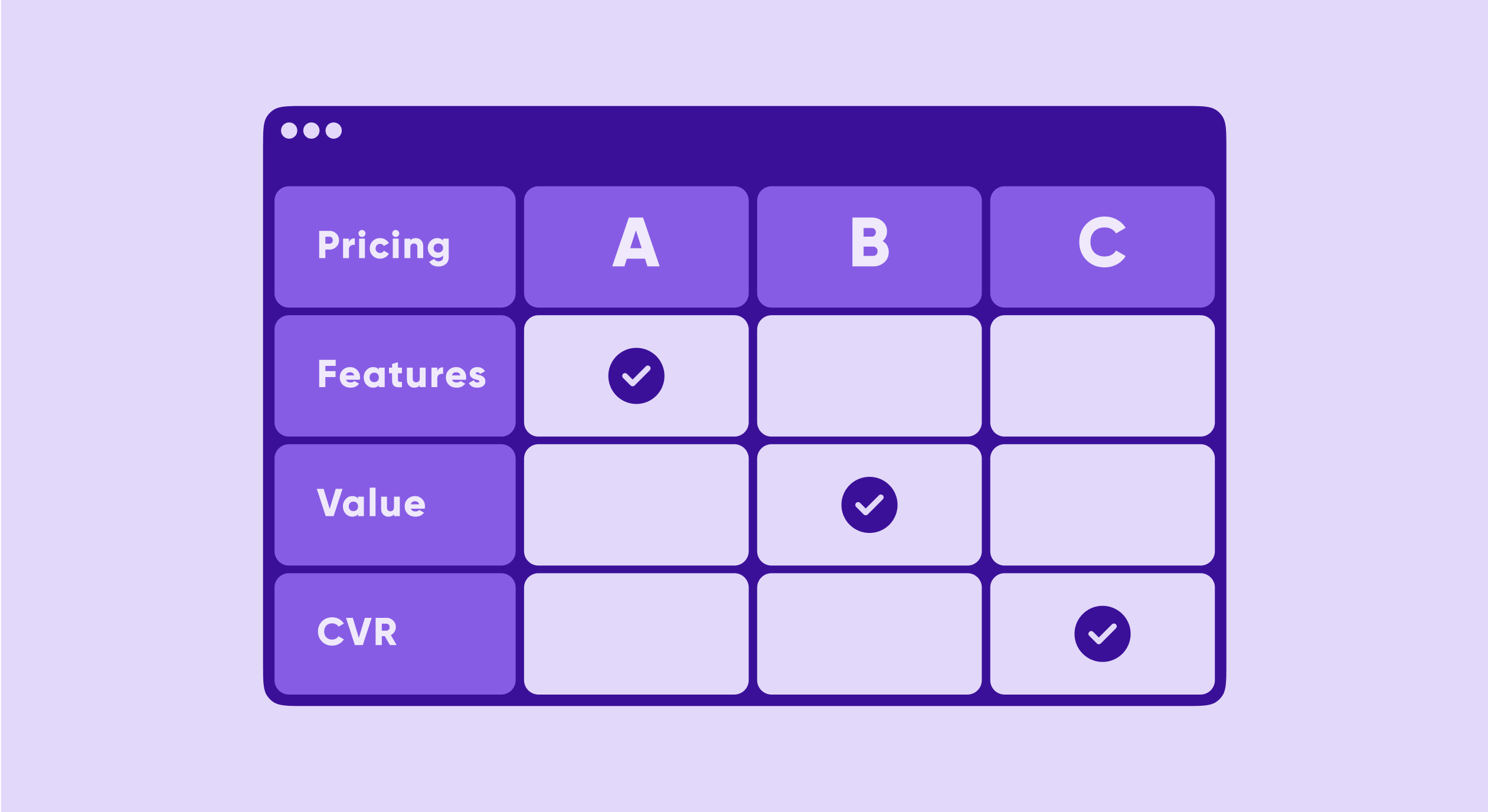
4. Pricing strategy matrix
A pricing strategy matrix helps you evaluate and compare your pricing plans side by side. You can use it to analyze key metrics such as feature coverage, price point, value perception, conversion rates, and user feedback across your different pricing strategies.
In the pricing strategy matrix, the rows represent key pricing factors while the columns represent the different pricing models or plans you are evaluating. With this visual framework, you can determine if your pricing is competitive, whether each plan delivers sufficient value, and how different models impact your revenue.
By using a pricing strategy matrix, you can answer several questions such as:
- Which pricing model delivers the optimal balance between revenue and user satisfaction?
- How do conversion rates compare across different pricing models?
- What does user feedback reveal about the perceived value of each pricing tier?
Here’s a sample pricing strategy matrix:
| Pricing factor | Plan A | Plan B | Plan C |
| Feature coverage | Limited features, basic support | Most features, standard support | All features, priority support, AI insights |
| Price point | $9.99/month | $19.99/month | $49.99/month |
| Value perception | Entry-level, budget-friendly | Best value for most users | Premium experience, top-tier value |
| Conversion rate | High free-to-paid conversion, low retention | Moderate conversion, stable retention | Lower conversion, but high retention |
| User feedback | Good for beginners, lacks advanced tools | Well-balanced, meets most needs | High satisfaction, best for power users |
By analyzing this matrix, you can gain actionable insights to guide your pricing decisions and prompt immediate adjustments to maximize both revenue and user satisfaction. You can even experiment with newer products or paywalls to test your hypothesis. Adapty’s experimentation features can be handy here.
Van Westendorp price sensitivity analysis
The Van Westendorp method helps you discover the acceptable price range for your subscription by asking users four key questions:
- At what price would you consider this product to be so expensive that you wouldn’t consider buying it? (Too expensive)
- At what price would you consider this product to be priced so low that you’d question its quality? (Too cheap)
- At what price would you consider this product to be getting expensive but still worth considering? (Expensive/High side)
- At what price would you consider this product to be a bargain—a great buy for the money? (Cheap/Good value)
Plotting the cumulative distributions of these responses reveals the Optimal Price Point (OPP) and the Indifference Price Point (IDP), giving you a data-driven foundation for your pricing strategy matrix.
MaxDiff analysis for feature prioritization
MaxDiff (Maximum Difference Scaling) helps you understand which features users value most—critical information when deciding what to include in each pricing tier. Users are shown sets of features and asked to identify the most and least important in each set. The statistical analysis reveals a clear hierarchy of feature importance, helping you:
- Determine which features justify premium pricing
- Identify features that should be included in lower tiers to drive adoption
- Discover features users don’t actually care about (candidates for removal)
Conjoint analysis for package optimization
Conjoint analysis is the most sophisticated pricing research method, testing different combinations of price, features, and benefits to understand how users make trade-offs. Users evaluate complete “packages” rather than individual attributes, revealing:
- The relative importance of price vs. features in purchase decisions
- Willingness to pay for specific feature combinations
- Optimal bundle configurations for different user segments
This method is particularly valuable for subscription apps where you’re designing multiple tiers, as it helps you understand how changes to one tier affect the perceived value of others.
5. Customer journey stages matrix
A customer journey stages matrix maps out the various phases of your user’s experience with your app, allowing you to evaluate and optimize key touchpoints.
In this product matrix, the columns typically represent the different stages your user goes through – such as discovery, onboarding, engagement, and retention – while the rows list the critical elements that contribute to the user experience. These elements might include visual design, messaging, tone, offers, and engagement strategies.
This matrix answers questions like:
- How consistent is your brand experience across the customer journey?
- Are users receiving the right messaging during onboarding to encourage further use?
- What adjustments can be made during the engagement phase to drive higher retention?
And so on.
6. User segmentation matrix
A user segmentation matrix lets you visualize and analyze how different groups within your user base interact with your app. It provides insights into the behaviors, preferences, and performance metrics of various segments, which can help guide personalized marketing, product development, and overall strategy.
In this matrix, the rows typically represent key metrics or attributes you want to compare across your user base—for example, engagement levels, conversion rates, customer satisfaction, and retention. The columns, on the other hand, represent the different user segments. These segments could be defined by demographics (age, location), behavioral criteria (new users, active users, premium subscribers), or any other grouping relevant to your business.
By using a user segmentation matrix, you can answer critical questions such as:
- Which user segment shows the highest engagement with your core features?
- How do conversion rates differ between new, active, and premium users?
- Which segments report the highest levels of customer satisfaction or retention?
- Where do gaps or opportunities exist for targeted improvements in user experience?
- What specific attributes drive success or challenges within each segment?
Here’s how a user segmentation product matrix could look like:
| Metric/Attribute | Segment A: New users | Segment B: Active users | Segment C: Premium users |
| Engagement level | Low – exploring features, trial users | Medium – regularly using core features | High – frequent usage of advanced features |
| Conversion rate | 5-10% – free to paid conversion | 25-40% – upsell to higher plans | 70-90% – strong retention on premium plans |
| Customer satisfaction | Moderate – learning curve, early feedback | High – satisfied with core product | Very high – benefits from premium features |
| Retention rate | 20-40% – high churn potential | 60-75% – stable retention | 85-95% – strong loyalty and lifetime value |
| Average session length | 3-5 minutes – quick exploration | 10-15 minutes – engaged usage | 20-30 minutes – deep feature interaction |
7. Competitive benchmarking matrix
A competitive benchmarking matrix helps you assess how your app stacks up against the competition. It provides a side-by-side visual comparison of key metrics, enabling you to identify strengths, weaknesses, and opportunities for differentiation in your niche.
In this matrix, the rows represent critical competitive metrics—such as core functionality, feature set depth, pricing model, user interface and design, customer support, and overall user satisfaction. The columns represent your app alongside your primary competitors. This format allows you to quickly gauge where your product stands relative to others and which areas may require further investment or improvement.
Using a competitive benchmarking matrix, you can answer important questions like:
- How does your core functionality compare with that of your competitors?
- Are there gaps in your feature set that competitors are capitalizing on?
- Is your pricing model competitive and aligned with market expectations?
- How does your user interface and design measure up against industry leaders?
- How actively do you add new features to your app compared to your competitors?
And so on.
Here’s a sample competitive benchmarking matrix:
| Competitive metric | Your app | Competitor A | Competitor B | Competitor C |
| Core functionality | Subscription management, analytics, paywalls | Subscription tracking, limited paywalls | Billing & invoicing, API support | All-in-one monetization platform |
| Feature set depth | Advanced analytics, AI-based insights, A/B testing | Basic reporting, no A/B testing | Moderate reporting, custom invoices | Comprehensive tools, automation, AI analytics |
| Pricing model | Freemium, $9.99/month, $29.99/month | $19.99/month, no free plan | $15/month, enterprise pricing available | Custom pricing, revenue-based model |
| Visual design | Modern UI, intuitive onboarding | Outdated interface, steep learning curve | Simple but lacks customization | Highly polished, best UX |
| User ratings/reviews | ⭐ 4.6 – praised for ease of use | ⭐ 4.0 – complaints about UI | ⭐ 4.2 – good support but lacks features | ⭐ 4.8 – best in class but expensive |
| Development velocity | Weekly updates, fast new feature rollout | Quarterly updates, slow bug fixes | Monthly updates, steady improvements | Bi-weekly updates, highly responsive to feedback |
8. Product roadmap matrix
A product roadmap matrix helps you align your app development efforts with your strategic goals by prioritizing features and improvements over different time frames. This product matrix organizes planned enhancements and new functionalities into a clear visual framework—typically segmented into short-term, mid-term, and long-term initiatives. This structured approach not only highlights immediate priorities but also ensures that your long-term vision is maintained as your app evolves.
At a high level, the roadmap matrix answers important questions such as:
- Which features should be launched in the next few months to address urgent user needs?
- What enhancements are necessary to stay competitive in the current market?
- And… which innovative developments will drive growth in the future?
By addressing these questions, the matrix serves as a bridge between strategic planning and day-to-day development activities.
The rows in this matrix represent individual features, improvements, or projects, while the columns denote the timeline – short term (for example, next 3 months), mid term (next 6-12 months), and long term (beyond one year). This layout allows you to visualize your development pipeline and make adjustments as priorities shift, new market trends emerge, or user needs change.
Classic strategic matrices
While the product matrices covered earlier focus on operational aspects of your app, classic strategic matrices provide a higher-level view of your product portfolio and growth opportunities. These time-tested frameworks remain essential tools for product leaders making investment and expansion decisions.
BCG Matrix (Growth-share matrix)
Developed by the Boston Consulting Group in the 1970s, the BCG Matrix helps you analyze your product portfolio based on two dimensions: market growth rate and relative market share. Products are categorized into four quadrants:
- Stars (high growth, high market share): Your best-performing products that require continued investment to maintain their position. In mobile apps, these might be your flagship subscription products in growing categories.
- Cash cows (low growth, high market share): Mature products generating steady revenue with minimal investment. These fund development of new initiatives.
- Question marks (high growth, low market share): Products in growing markets but without strong positioning. These require strategic decisions – invest heavily to capture market share or divest.
- Dogs (low growth, low market share): Products in declining or stagnant markets with weak positioning. Typically candidates for discontinuation unless they serve a strategic purpose.
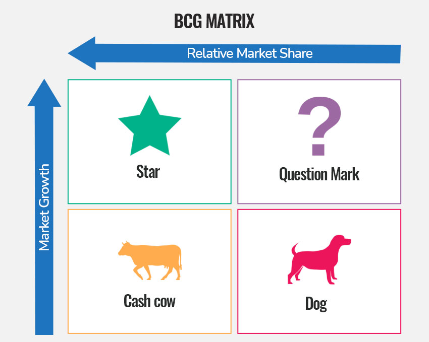
When to use the BCG Matrix: Use this matrix when deciding how to allocate resources across multiple products or app variants. It’s particularly useful for companies with diverse product portfolios or multiple apps targeting different markets.
Ansoff Matrix (Product-market growth matrix)
The Ansoff Matrix, developed by Igor Ansoff in 1957, helps you identify growth strategies based on whether you’re working with existing or new products and markets. The four strategic options are:
- Market penetration (existing product, existing market): Increase market share with your current product in your current market. This is the lowest-risk strategy—think improving conversion rates, reducing churn, or increasing usage among existing users.
- Market development (existing product, new market): Take your existing product to new markets—new geographic regions, new user segments, or new platforms (e.g., expanding from iOS to Android).
- Product development (new product, existing market): Create new products for your existing user base. For subscription apps, this might mean launching complementary apps or significantly new features.
- Diversification (new product, new market): The highest-risk strategy—entering new markets with new products. This requires both product innovation and market development capabilities.

When to use the Ansoff Matrix: Use this matrix when planning your growth strategy and evaluating different expansion options. It’s excellent for strategic planning sessions where you need to decide between deepening current market presence versus exploring new opportunities.
GE/McKinsey Matrix
A more sophisticated alternative to the BCG Matrix, the GE/McKinsey Matrix evaluates products on two composite dimensions:
- Industry attractiveness: Combines factors like market size, growth rate, competitive intensity, profitability, and regulatory environment.
- Competitive strength: Combines factors like market share, brand strength, production capacity, profit margins, and technological capability.
This creates a 3×3 grid (High/Medium/Low for each dimension) offering more nuanced strategic guidance than the BCG Matrix’s simple 2×2 framework.
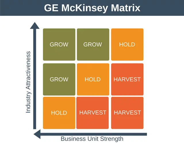
When to use the GE/McKinsey Matrix: Use this when you need deeper analysis than the BCG Matrix provides, particularly when evaluating products in markets where “growth” and “share” don’t tell the complete story. It’s valuable when comparing opportunities across very different markets or product categories.
Strategic matrix comparison table
| Matrix | Primary purpose | Best used when | Key focus |
|---|---|---|---|
| BCG matrix | Portfolio resource allocation | Deciding investment priorities across products | Market share + Market growth |
| Ansoff matrix | Growth strategy selection | Choosing between expansion options | Product (new/existing) + Market (new/existing) |
| GE/McKinsey matrix | Multi-factor portfolio analysis | Complex strategic decisions requiring nuance | Industry attractiveness + Competitive strength |
| Product feature matrix | Plan/tier comparison | Optimizing subscription upgrade paths | Features across pricing tiers |
| Competitive benchmarking matrix | Market positioning | Understanding competitive landscape | Your metrics vs. competitor metrics |
| Pricing strategy matrix | Price optimization | A/B testing and price research | Price + Value + Conversion |
| User segmentation matrix | Audience analysis | Personalizing strategy by user type | Metrics across user segments |
| Customer journey matrix | Experience optimization | Improving touchpoints and retention | Elements across journey stages |
| Monetization matrix | Revenue stream evaluation | Balancing multiple revenue sources | Revenue potential + Implementation ease |
| Product roadmap matrix | Development prioritization | Planning feature releases over time | Features across time horizons |
Matrix selection checklist
Not sure which matrix to use? Start with the question you’re trying to answer:
| Your question | Recommended matrix |
|---|---|
| “Which product should we invest in, and which should we discontinue?” | BCG matrix |
| “Should we expand to new markets or develop new products?” | Ansoff matrix |
| “Why aren’t users upgrading to our premium plan?” | Product feature matrix |
| “How do we compare to our competitors?” | Competitive benchmarking matrix |
| “What price should we charge?” | Pricing strategy matrix |
| “Which user segments are most valuable?” | User segmentation matrix |
| “Where are we losing users in the funnel?” | Customer journey matrix |
| “How should we monetize our app?” | Monetization matrix |
| “What should we build next?” | Product roadmap matrix |
| “Is our branding consistent across touchpoints?” | Brand product matrix |
| “Does our pricing reflect the value we deliver?” | Product value matrix |
Pro tip: Most strategic decisions benefit from multiple matrices used in combination. For example, use a Competitive Benchmarking Matrix to identify feature gaps, a Product Feature Matrix to plan how to address them, and a Pricing Strategy Matrix to determine how to price the enhanced offering.
AI-powered tools for product matrix analysis
The landscape of product matrix creation and analysis has been transformed by AI-powered tools. These solutions automate data collection, generate insights, and help product teams make faster, more informed decisions. Here’s how AI is reshaping product matrix workflows:
Automated competitive intelligence
AI tools can now automatically track competitor pricing changes, feature updates, and market positioning. Instead of manually updating your competitive benchmarking matrix, AI agents can monitor competitor app stores, websites, and review platforms to keep your matrix current in real-time.
Predictive pricing optimization
Machine learning models analyze historical conversion data, user behavior patterns, and market conditions to recommend optimal price points. These AI systems can predict how pricing changes will impact your conversion rates and LTV before you implement them, making your pricing strategy matrix more than just a snapshot – it becomes a predictive tool.
Dynamic user segmentation
Traditional user segmentation matrices rely on predefined categories. AI-powered segmentation tools discover hidden user clusters based on behavioral patterns, creating more nuanced and actionable segments. These tools continuously refine segments as user behavior evolves, ensuring your user segmentation matrix reflects current reality.
AI-assisted A/B test analysis
When running pricing or paywall experiments, AI tools can analyze results faster and with greater statistical rigor. They identify winning variants earlier, detect unexpected user segment behaviors, and recommend follow-up experiments—all of which feed directly into your pricing strategy and monetization matrices.
Key AI tools for product matrices
- Adapty’s AI paywall generator: Automatically creates and tests paywall designs optimized for your user segments
- Predictive LTV models: Forecast customer lifetime value by segment to inform your product value matrix
- Automated feature tracking: Monitor competitor feature releases to keep your competitive matrix updated
- Smart price testing: AI-driven experimentation platforms that optimize pricing across regions and segments
How to create a product matrix
Here’s how to create a product matrix by selecting the right type, gathering essential data, and organizing everything nicely into a visual grid (the matrix basically!).
Step #1: Decide which product matrix (or matrices) to develop
As you now know, you can create a variety of product matrices depending on the aspect of your app that you want to analyze. So start by choosing the type of product matrix you want to create.
Step #2: Draw your product matrix
Once you’ve chosen the type of product matrix you want to create, the next step is to lay it out so you can organize all the relevant data to populate it.
For the columns, you’ll typically use the different variations or dimensions that you’re comparing. For example, if you’re building a product feature matrix, your columns might represent the different product plans (such as free, basic, and premium). Alternatively, if you’re developing a competitor analytics matrix, each column might represent a different competitor’s product. Likewise, for a brand product matrix, columns would represent your different products/plans.
For the rows, you’ll list the specific metrics, features, or attributes that you want to compare across those variations. In the case of a product feature matrix, this might include your app’s functionalities. For a competitor analytics product matrix, the rows would represent competitive factors—things like the breadth and depth of features offered, pricing models, user interface and design quality, customer support responsiveness, overall user ratings, and unique selling propositions. If you were doing a brand product matrix instead, your rows might be elements like visual design, messaging, tone, and customer support quality.
Let’s take a product feature matrix as an example. Here’s how you might break it down:
| Feature | Plan A | Plan B | Plan C |
| Feature 1 | Basic analytics | Advanced analytics | AI-powered insights |
| Feature 2 | Limited paywall templates | Customizable paywalls | Full design customization |
| Feature 3 | Email support | Priority support | 24/7 dedicated support |
| Feature 4 | Single user account | Up to 5 team members | Unlimited team access |
| Feature 5 | Monthly reports | Weekly reports | Real-time reporting |
Step #3: Fill out your product matrix
Once you’ve laid out your product matrix grid, your next task is to collect data for each of its cells.
Your data gathering will look different depending on the type of product matrix you’re developing.
For example, if you’re creating a product feature matrix, you can find all the objective, binary data you need—essentially a “yes or no”—to fill out your matrix. Your internal product specifications, engineering documents, and technical manuals typically provide all the necessary information here.
In contrast, when you’re building a brand product matrix, the data you gather needs to capture both objective elements and more nuanced user feedback. Not only do you need to determine whether certain brand elements like visual design or messaging are in place, but you also need to understand how your users perceive these elements. This means incorporating survey responses, customer reviews, and other forms of qualitative feedback alongside the binary data.
Similarly, for a competitive research matrix, your focus shifts to external sources. Here, you’ll draw heavily on competitive analysis, industry benchmarks, and market trend reports to see where your product stands relative to others.
Also, the type of data you can enter varies widely depending on what you’re measuring and the matrix’s purpose. Here’s a breakdown of the most common types of data a product matrix could use:
- Binary data
This is the most straightforward type of information, where the answer is essentially “yes” or “no.” For example, in a product feature matrix, you might indicate whether a feature is present or absent using check marks or crosses. This objective data is great for clear, quick comparisons. - Quantitative data
Numbers are incredibly useful for precise comparisons. Your quantitative data might include metrics like user ratings, usage statistics, or conversion percentages, among others. - Qualitative data
Not every aspect of your product can be neatly reduced to numbers. Qualitative data helps here. So it’s okay to use descriptive labels or short phrases that capture the quality or impact of an attribute. This data adds context that numbers alone might not convey.
Together, these data types form a comprehensive foundation for your product matrix, enabling you to make well-informed, balanced decisions based on both hard metrics and contextual insights.
Wrapping it up…
Above everything else, product matrices provide a visually intuitive way to capture the complexities of your product strategy, allowing you to quickly identify your strengths and areas for optimization.
This approach is far more effective than merely crunching numbers, sifting through disparate dashboard data, or wading through extensive research material. Moreover, product matrices can be created for every key aspect of your app – from branding, development, and competitive analysis to monetization and retention.
If you haven’t tried product matrices yet, now is a good time. And be sure to check out Adapty – Adapty delivers all the revenue data and insights you need to power your different matrices.