Paywall Newsletter #18

Updated: December 10, 2024
4 min read
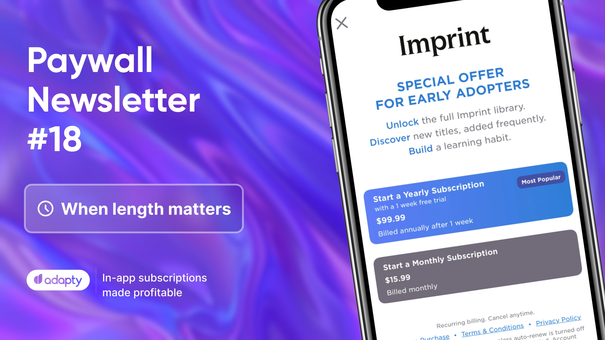
We know it’s been a while, but Paywall Newsletter is finally back! Welcome the 18th issue with tips on how to use paywall length, multiple plans, trial toggles, and other features to boost your paywall.

Paywall analysis provided by:
Nathan Hudson, a 2x former
Head of Growth & CEO at Perceptycs
We handpicked 5 paywalls from different categories with MRR between $100k – $2M. Nathan outlines their strengths and suggests areas for improvement.
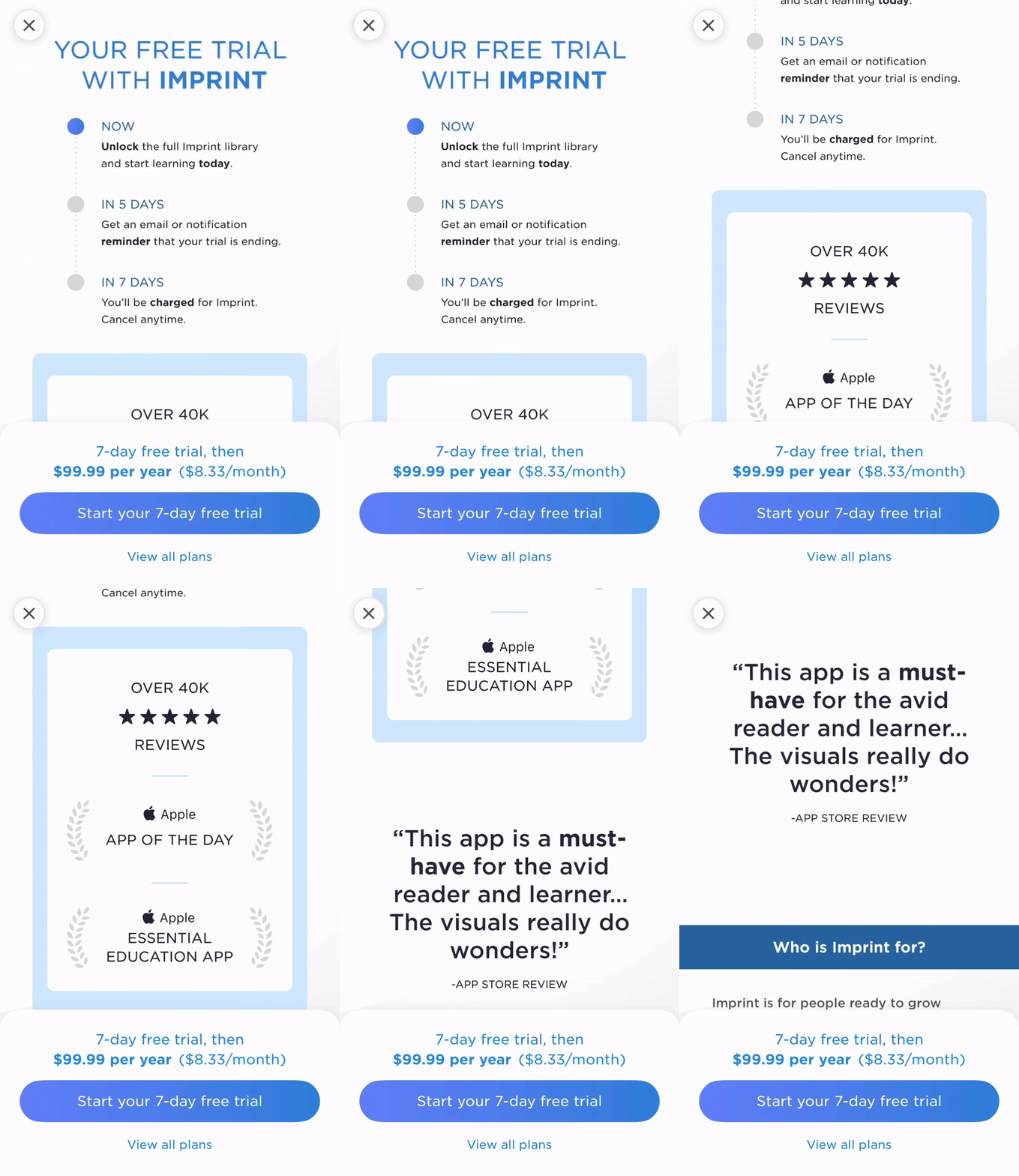
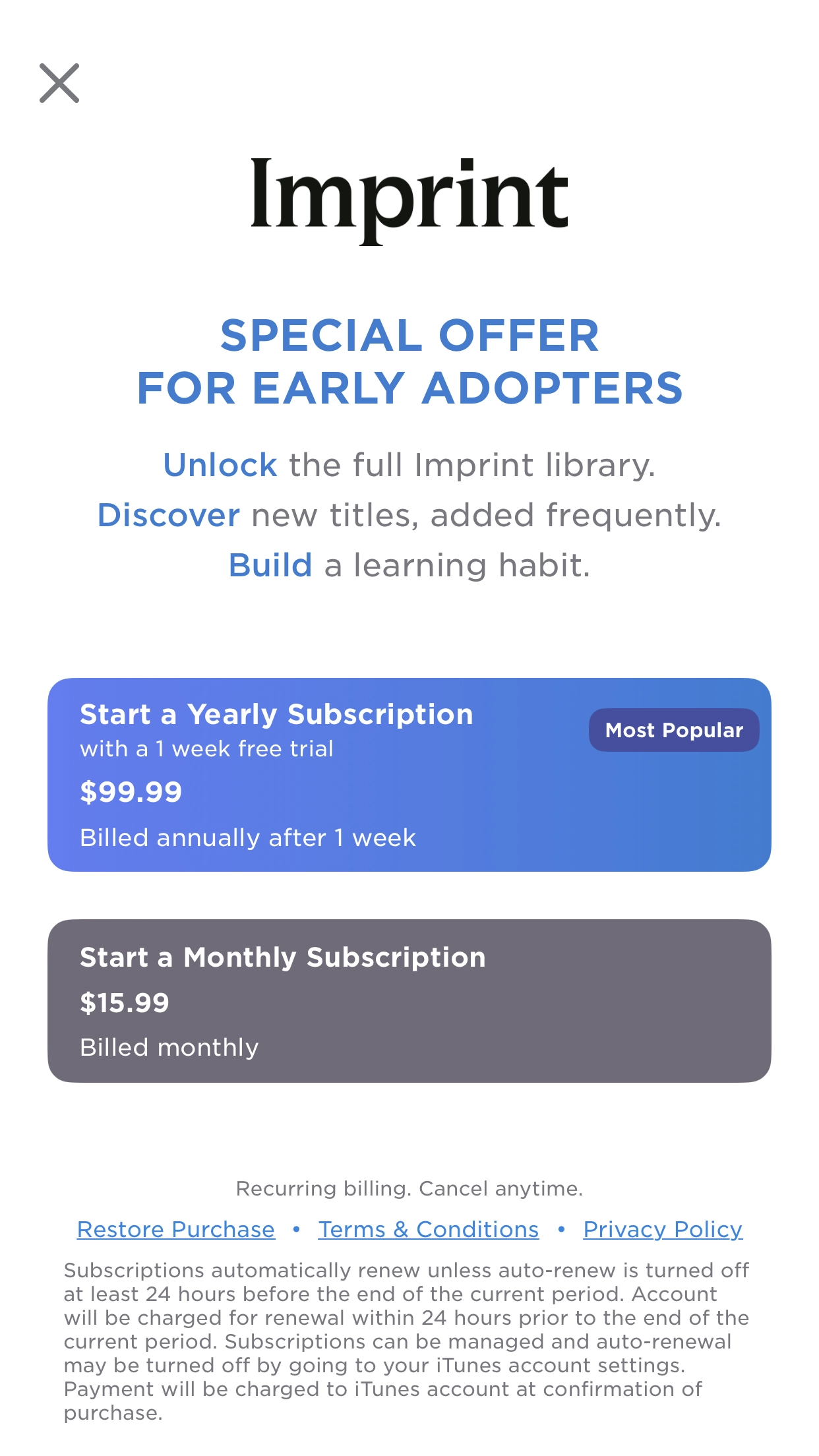
1. When length matters
What’s good
- The paywall highlights the wealth of available content.
- It adeptly addresses the questions users are likely pondering.
- It’s very similar to a strong web landing page.
Potential for testing
- Try shortening the paywall to focus on user-selected onboarding use cases.
- Customize content and headlines to align with specific user needs for a clearer value proposition.
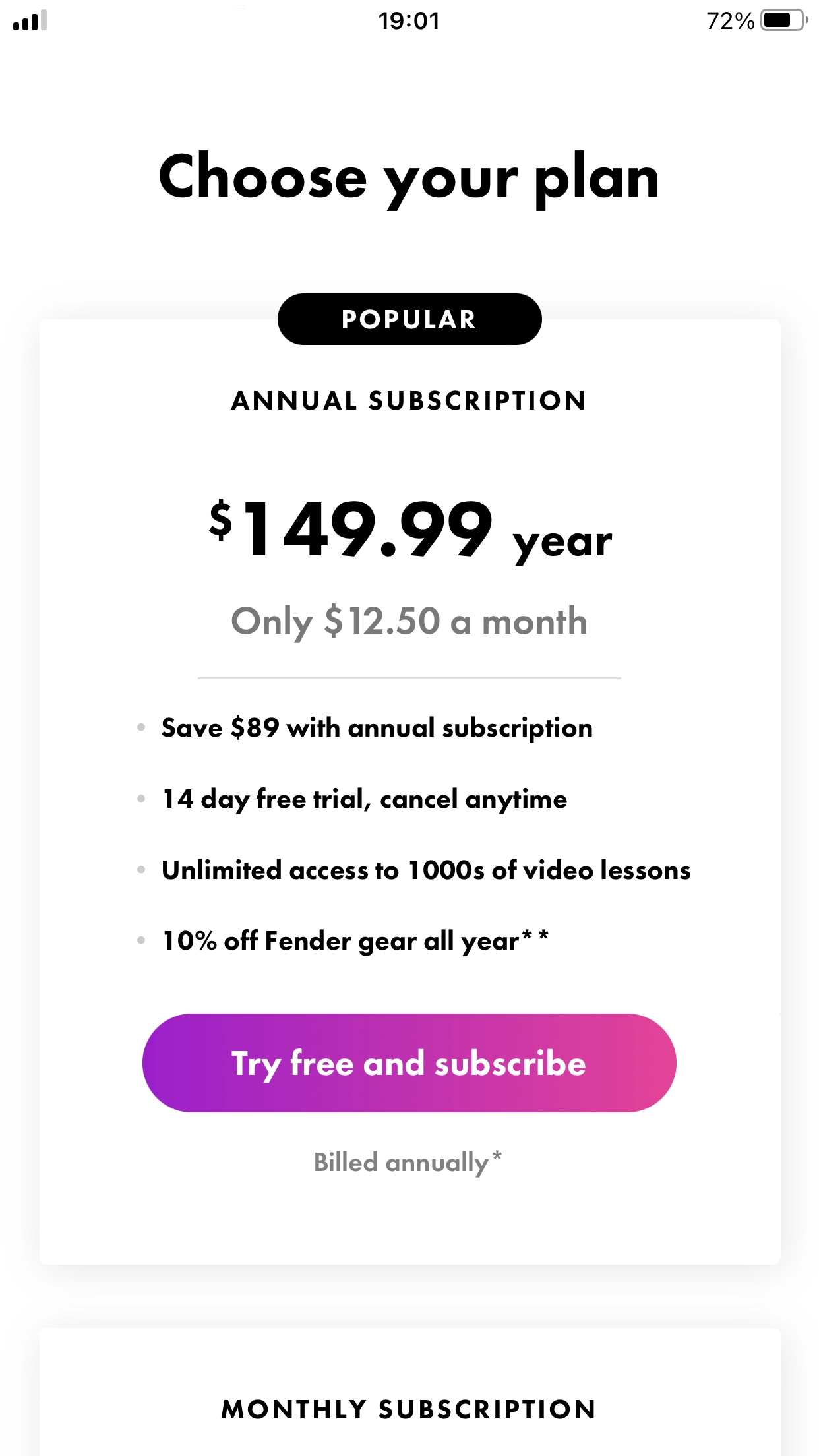
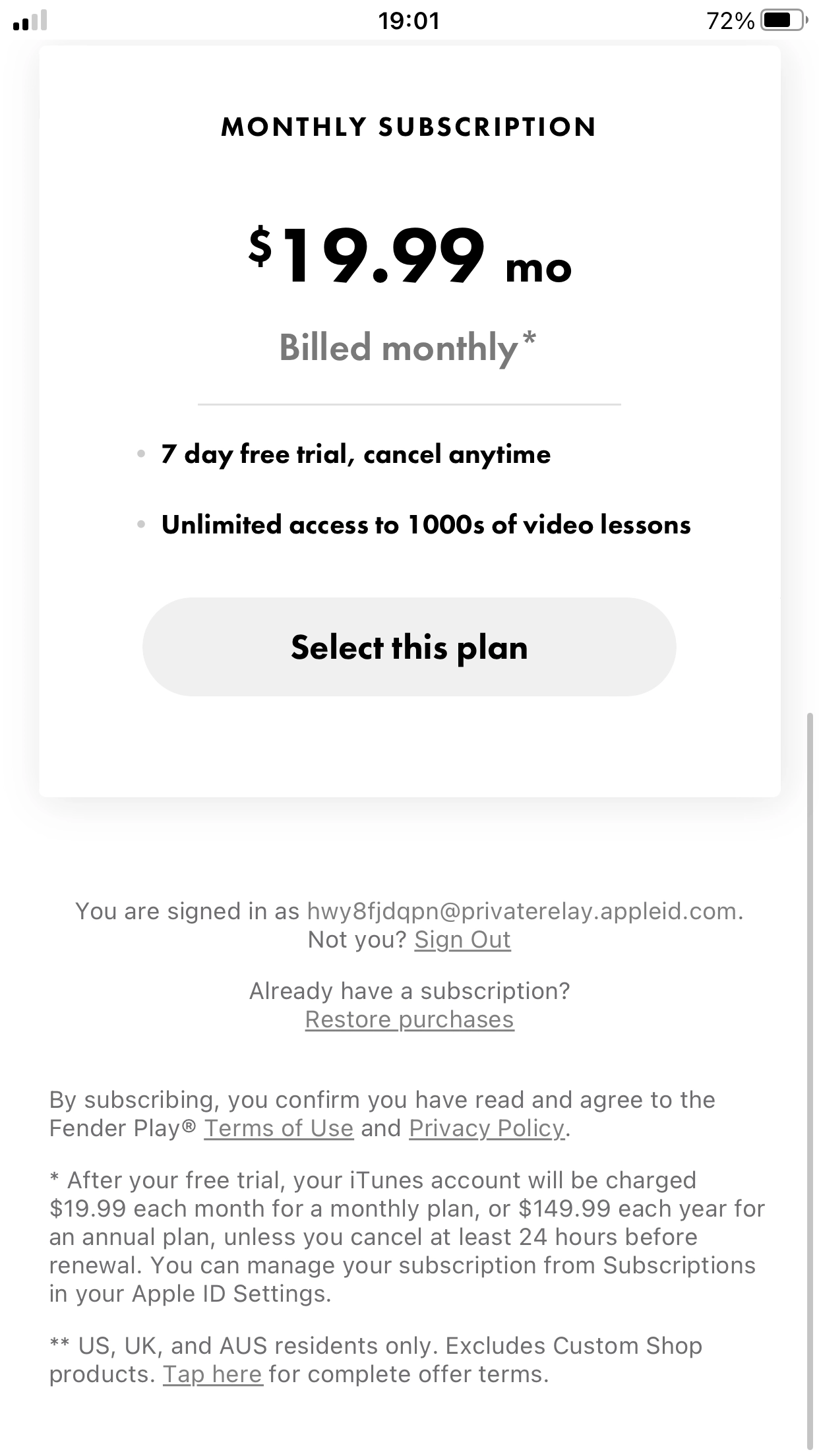
2. Drawing users to the annual plan
What’s good
- This hard paywall directs users to the annual plan well. They have to scroll to see the monthly plan, where it’s obvious that the annual plan is over $7 per month cheaper.
- The ‘Try free and subscribe’ button on the annual plan stands out in purple compared to the unselected ‘Select this plan’ button.
- The listicle view on the annual plan emphasizes the longer trial and total yearly savings.
Potential for testing
- It’s worth trying to highlight a core benefit in the headline instead of ‘Choose your plan’.
- Maybe using ‘Unlimited access to 1000s of video lessons’ from the listicle as the headline.
3. Can’t get enough of social proof


What’s good
- This paywall offers 3 subscription variants, each with 2 options, and leverages social proof well with 9 points of social proof in total.
- It’s clear how much a user can save with the annual plan, both in monetary amount and percentage.
Potential for testing
- It’s good to test moving the headline ‘strengthen your friendship through training’ higher up to reinforce the value proposition for those who don’t scroll.
- The number of plans and subscription types can overwhelm users. But it seems to be effective for this app.
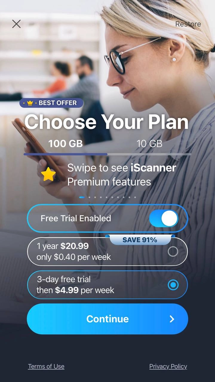
4. Trial toggle at its best
What’s good
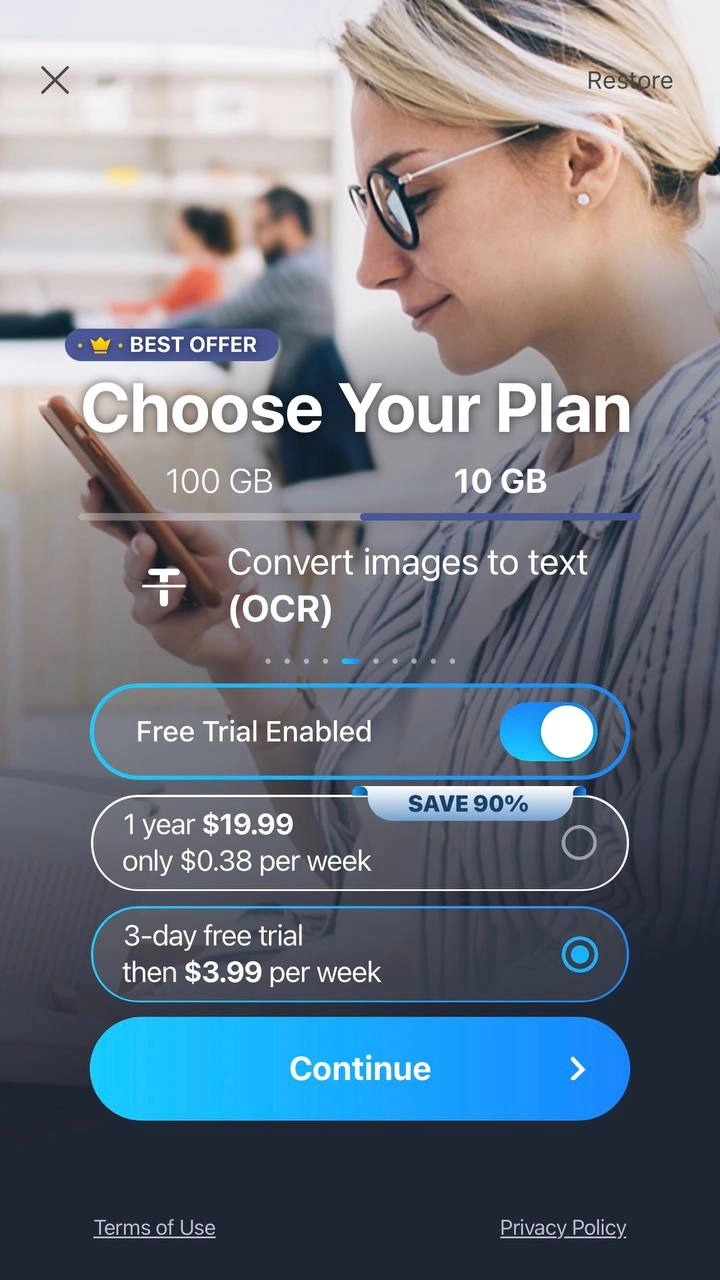
- iScanner’s paywall presents two subscription variants based on GB number, each with 2 options. It features an animated slider with premium features.
- Few apps use the ‘Enable Free Trial’ toggle, but it can decrease the payback period effectively.
Potential for testing
- Making the feature carousel more obvious and improving contrast in the paywall design for better readability and copy legibility could be beneficial.
5. Wise choice of the exit copy
What’s good
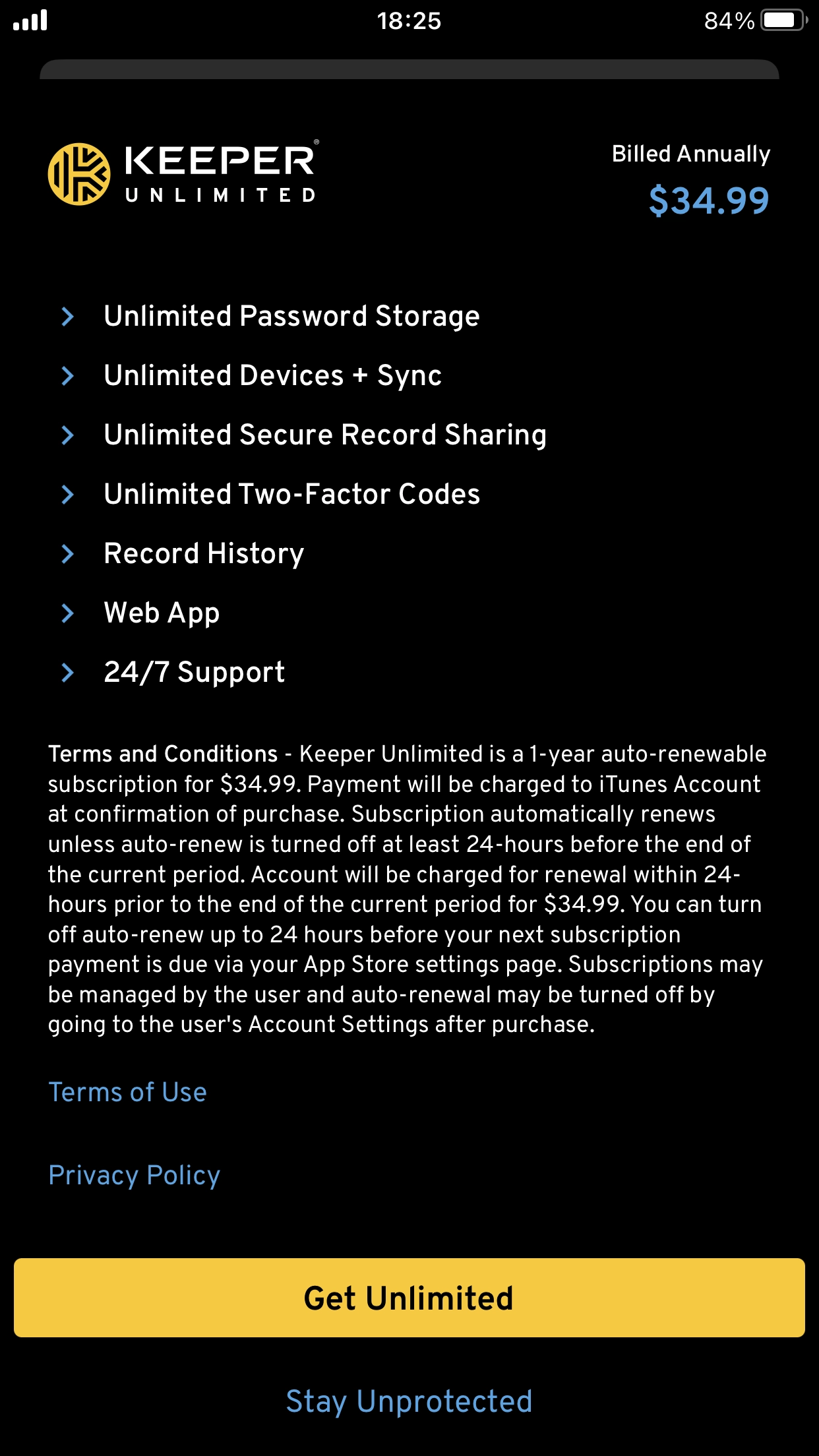
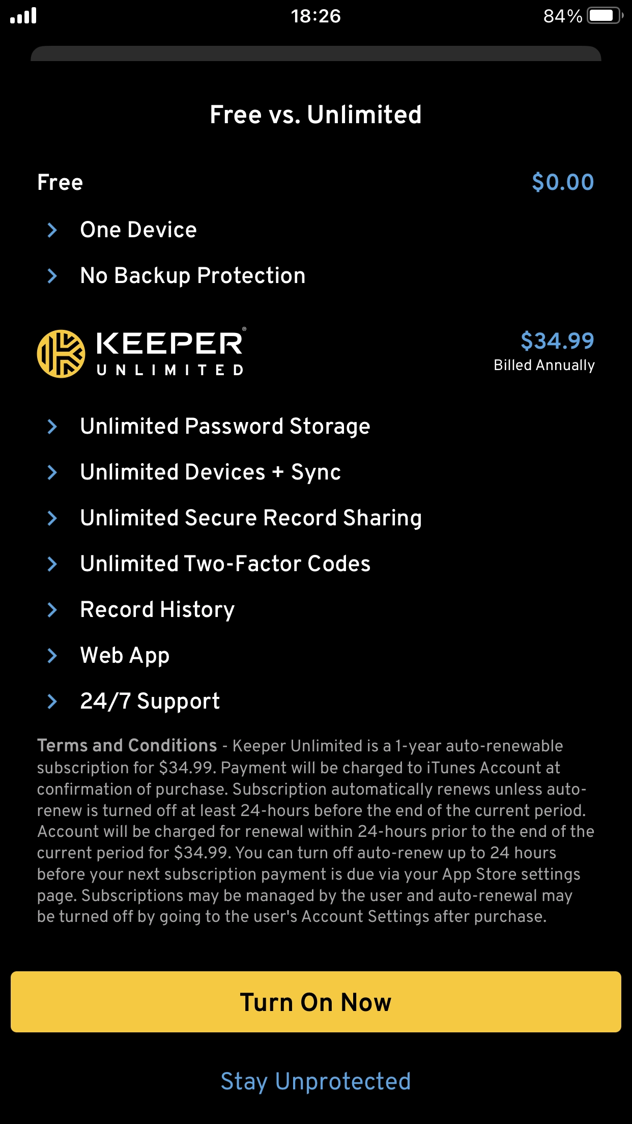
- This paywall demonstrates how concise feature comparison paywalls can be leveraged for functional apps.
- It effectively highlights additional security features available with the paid plan compared to the free plan.
- The exit copy ‘Stay Unprotected’ is compelling and creates internal friction in users’ minds, which could be advantageous.
Potential for testing
- The CTA ‘Turn on Now’ is unique but a little unclear. Experimenting with alternatives like ‘Protect your passwords’ could improve clarity.


