Paywall Newsletter #12
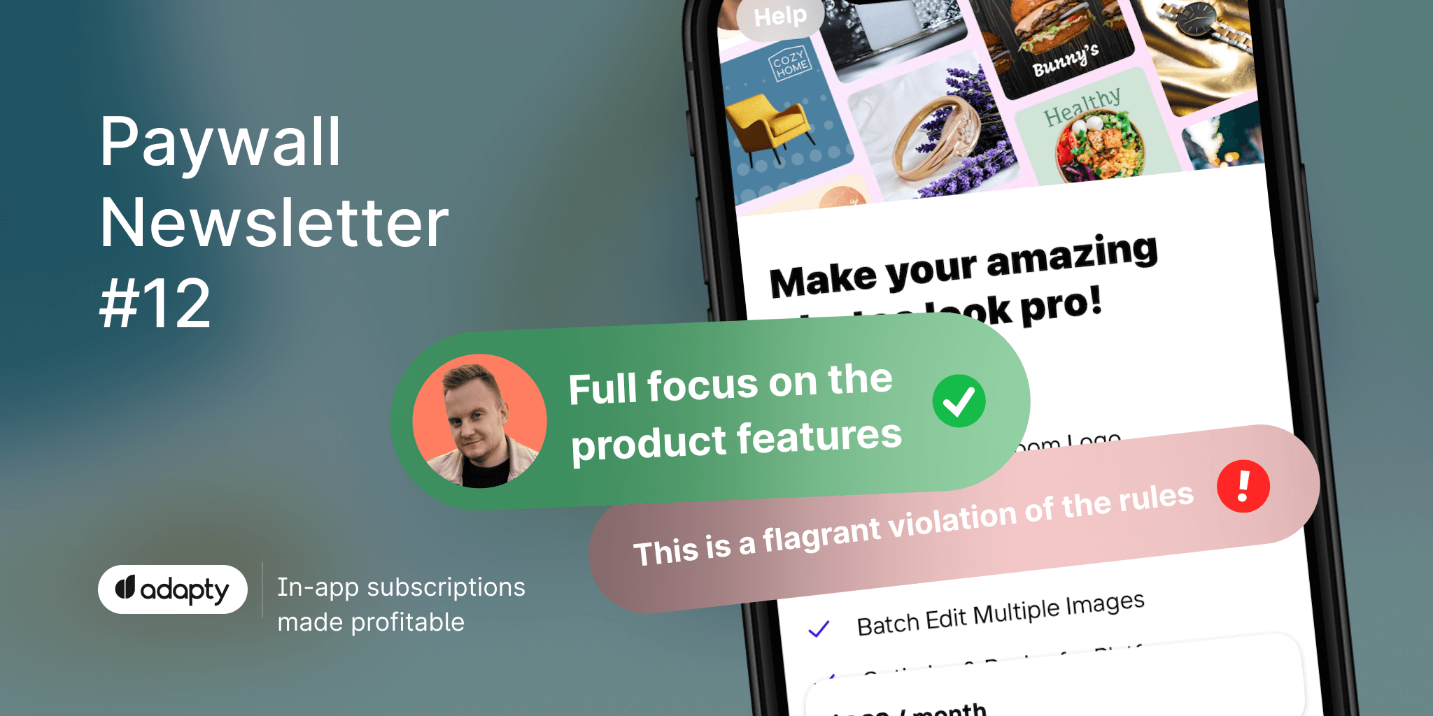
In the 12th issue of the paywall newsletter, we review paywalls of AI-based apps. Let's see how they sell their subscriptions!

Paywalls of the issue are commented by…
Anton Kuzmin, User Acquisition Group Head at AdQuantum. Anton has over 7 years of experience in digital and mobile advertising, including 4 years as a UA team leader.
This is how the AI champions sell subscriptions
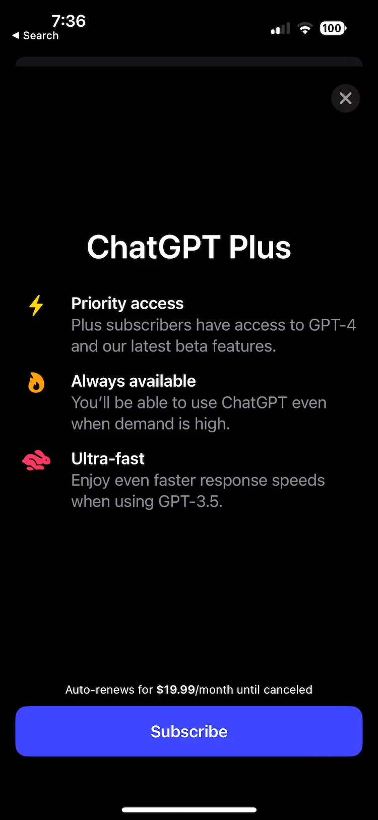
Overall impression
Full focus on the product features. It offers a single type of monthly subscription with no trial, presented with concise clarification on renewal.
Overall, it is the most discreet paywall that emphasizes only the fact that it works for the original product as if it doesn't want to force you to buy anything.
What I would experiment with
The background lacks contrast and brightness. I would definitely experiment with background colors and consider adding a row of videos with a darkened transparent effect.
The readability of the product highlights is not perfect – it's worth increasing the font size and making it slightly thicker.
Similarly, the button should have a larger font size, and it might be beneficial to find a more contrasting color for it in relation to the background. They could also try adding an emoji to make it more engaging.
Consider trying more explicit descriptions for the subscription benefits.
Before/After video would look nice
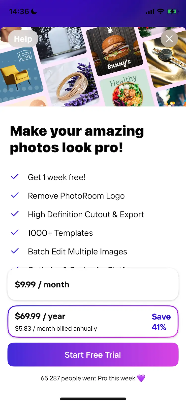
Overall impression
The paywall's overall design is well executed. It's not a hard paywall, as there's a barely noticeable close button at the top.
Before encountering the paywall, there's a brief demonstration of the product's functionality, allowing users to practice object extraction from photos. Such onboarding is a definite plus, as it helps users familiarize themselves with the product's capabilities.
The description of paid features is convincing, and the highlighted annual subscription option with a percentage discount serves as a great incentive for conversion.
Another positive aspect is the social proof, indicating the number of people subscribed to the pro version.
What I would experiment with
On the larger iPhone screen, there appears to be some extra space below the features section (currently displaying 5 features when there's room for 6). It would be possible to rearrange and move the higher-priority options and enlarge the "Start Trial" button.
To further emphasize the button and the annual subscription plan, I would suggest adding a subtle shine or a blinking animation around them, drawing more attention to these elements.
In the header section above the feature list, it might be worth considering adding a before/after video to demonstrate the results of using the product. This visual demonstration would help users make a more informed decision, showcasing the potential outcomes in addition to the features already presented before the paywall.
Nice design but unclear subscription benefits
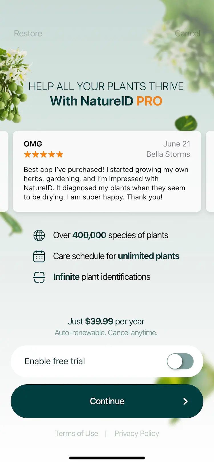
Overall impression
In my opinion, the paywall is of very high quality in terms of design and execution. The choice of fonts, dynamic background, and color scheme is visually pleasing.
It's a nice touch to include reviews in a carousel as social proof.
The toggle activation of the trial is an interesting solution, providing both interactivity and attraction.
What I would experiment with
The benefit of purchasing a subscription is not immediately obvious. It is only revealed when you skip the paywall and encounter a new offer of 60% off, along with a list of benefits and restrictions that will be removed. This information is presented immediately after closing the paywall, without even the opportunity to utilize some of the available features in the free version. This approach feels intrusive and could be improved.
A double paywall that might be confusing
Overall impression
Overall, it's a rather complicated paywall that can potentially confuse the user. At first, you see the explanation of the trial period in days (a common feature) and a "Start Free Trial" button with a price explanation (7 days trial + 1 year). But that's not all; below, there's an additional "Show all trial" button, offering three subscription options for one year, one month, and a lifetime plan.
What I would experiment with
It would be interesting to see how a streamlined onboarding process with a better demonstration of the interface and functionality would work, or if the user is allowed to process a couple of photos before encountering the paywall. This could potentially reduce unnecessary steps, such as the video and survey, and provide a more intuitive user experience.
A premium toggle could be a good thing to try
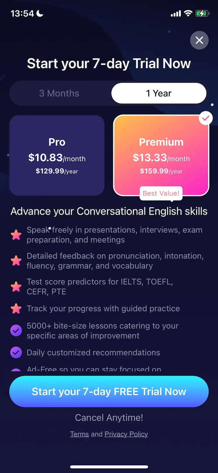
Overall impression
The paywall itself appears overloaded with descriptions and details. It compares two versions of plans, spanning three months and one year, each further divided into Pro and Premium. This arrangement seems to be a solution that should be revisited after using the app, as it is difficult to comprehend at first glance.
Additionally, it's unclear why the best value offer is more expensive and highlighted as advantageous.
Moreover, it feels a bit unconventional to have the prices displayed at the top.
What I would experiment with
I would suggest incorporating a Premium toggle that activates a Premium mode. The basic version of the paywall could be presented in light colors, featuring two price options for 3 months and 1 year, indicating the basic features. Upon clicking the Premium toggle, the background could change to a more expensive, dark theme, adding premium features and adjusting the prices accordingly. This visual transformation would provide a clearer differentiation between the two versions and enhance the understanding of the value offered by the Premium option.