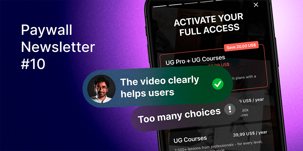
In the 10th issue, we included apps with millions and hundreds of thousands MRR, and all of them still have room for improvement.

Paywalls of this issue are commented by…
Karan Tibdewal, a Growth Consultant working with Blinkist, Soundcloud, Deezer, and others. He is also a host of the podcast “LTV Talks with Karan“.
Ultimate Guitar: Less is more

Pros:
Emphasis on the “saving” with the highest plan.
Cons:
Too many choices. In my experience, instead of showing users all the options available to them, it’s better to show the option that is personalized, based on their onboarding inputs or usage. The expected impact (based on my first-hand experience) is ~20-50% uplift in trial conversion.
Additional comments:
Too many numbers on this screen, although it’s a best practice to add numbers in the paywall. I feel that this paywall has a lot of content fit into it, including numbers. “1.4+ million ad-free tabs & chords” would scare me as a newbie, whereas “Interruption free learning experience” might be more enticing.
“Activate your full access” is a great way to present the paywall. However, with that, I’d expect a free option here as well with the notes such as “With ads, etc.”. Just for the users to be able to compare what they “activate” other than the chords & lessons.
Making the terms all outlined in a clickable terms & conditions section might help de-clutter the paywall.
Bazaart: Room for improvement where implementing best practices would already be a great start!

Pros:
The video clearly helps the users see the benefits, although it seems like the app’s only function is to remove objects. It would be better to have more use cases and features included.
Cons:
The design is not seamless and seems like stacked boxes.
The copy is transactional and does not encourage action. For example, “Get started with your 7-day full-access trial,” along with the call-to-action, “then $11.99/month,” would be a good start. This is similar to many other apps out there.
Additional comments:
Having more common object removal video illustrations might be better since few users would want to remove dogs from the first picture or the father tossing his kid in the next one.
Promeo: Unique elements with some potential opportunities

Pros:
I love how the prices and options are displayed on this paywall. As a user, this makes my decision very easy. The call-to-action (CTA) makes the offer very clear and visible.
Cons:
I am not a big fan of the headline on the image/video as it is a bit hidden and wastes a substantial amount of screen space. Instead, I would opt for a cleaner look on the headline and more focus on the feature carousel below.
Showing how the app works in the header could also be a good strategy for a design-aid app.
Additional comments:
I feel that the experience of using the carousel as a video was a bit laggy and didn’t feel smooth. If the paywall is the storefront, it needs to be flawless to get users to trust the app.
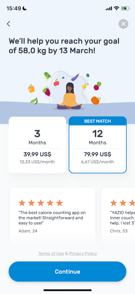
Yazio: Great design, packed with a lot of powerful elements!
Pros:
I love the dated goal outline. It helps the user to draw a very clear line to how this app will help them and how quickly. Having a social cue via a testimonial here is also a great addition without making the screen cluttered.
The monthly rate comparison between 3 and 12 months is also a great subheadline as it helps me see very clearly that the annual subscription is a much cheaper option. Perhaps having “x% less” could be an interesting test here.
Terms of use are also organized via a link rather than putting the entire text in there.
Cons:
There is no trial. Offering a trial for this subscription could be a powerful motivator in my opinion.
Additional comments:
Having a video/GIF showing the progress weight loss chart with the user’s desired target weight would be an interesting test to run as it would help the user visualize their journey.
Relive: Clean & clear with potential to improve

Pros:
The UI is clean with minimal background noise.
The CTA is positioned as “Redeem,” which typically performs better than “Continue” or “Start your trial,” etc.
Cons:
Only using emojis in the paywall is a bit limiting. Adding more imagery or product feature demonstrations here could go a long way, especially if this is the paywall that the new users see on their first session.
“Cancel anytime” should be a point for the CTA, not the product feature list.
Additional comments:
“1-month free” is a clear heading here. I wonder if this drives more users to use the app and then cancel their subscriptions sooner than later.
