Adapty August Update: Server notification status, A/B testing CSV, and SDK 1.18-beta
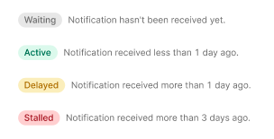
Server notification status
Real-time data from your app is constantly coming to the Adapty server. The connection status is essential in this case, so we’ve created 4 colored labels for the current state tracking. The gray “Waiting” status is usually shown when the notifications are configured but there are no events yet. The green “Active” one stands for a well-set regular server messaging . The yellow “Delayed” label is not a reason for panic, but you should be aware that there have been no notifications for more than a day. If you see the red “Stalled” status , there have been no notifications for more than 3 days which is a rare situation, so you should probably check your connection by sending a Sandbox event or contact the technical support.
A/B testing CSV
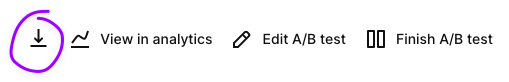
Why do we love A/B tests? Because they can make numbers significant and make data speak. After you’ve collected the priceless statistics reflecting the behavior of your actual target audience, it’s time for interpretation. Adapty shows the results in the interface automatically, but now there’s more to it: you can download the raw data to use alternative algorithms and analyze it further. We’ve added the CSV download option to the A/B tests recently, so, please, feel free to use the results of your experiments to the maximum.
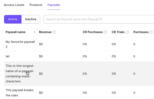
Resizable columns
Now you can adjust the width of the table columns to see the data just the way you need. For example, even when your paywall’s name is “This-is-the-longest-name-of-a-paywall-containing-many-characters”, it’ll be possible to display it in two lines just by moving the border of the column.
SDK 1.18-beta
For those innovators who like to try the best features first, we offer a new Adapty SDK version
Why should one try it?
- The starting responses are now twice faster. Instead of sending all the paywalls, you get just the necessary one using its id. You can present the paywall to your customer faster than before, which usually means higher conversions.
- New onboarding events are added. Start sending them today to see the historical data when the funnel of Adapty analytics is updated. This way you can see what steps of your onboarding cause the churn.
- Visual Paywalls and Promo Campaigns features are no longer supported starting this version, so please consider removing the calls to the corresponding methods, if there were any;
- Some of the analytics calls are optimized;
- We’ve updated our sample apps to make the use of our SDK clearer.
Update to the latest version and/or see the example of how to do it.