In this issue of the paywall newsletter, our expert shares his experience on:
- what the best combination of products is for a Health and Fitness App’s paywall,
- which apps a weekly option serves best,
- how to place plans to make them work better.

Paywalls of this issue are commented on by…
Steve P. Young, Founder of an agency focusing on the entire app funnel called App Masters, and a podcast host.
Remove objects: They Make $100k but Probably Can Make More
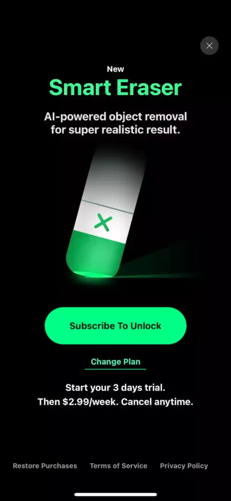
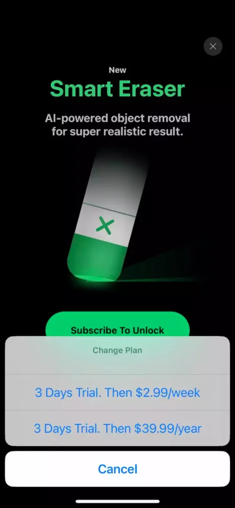
Who’s to argue with an app that is making $100K MRR, but I would add a monthly option without any trial to make the yearly option more enticing.
I personally like to show all the prices on the paywall to allow users to easily compare which plan makes the most sense for them.
However, given the nature of this app, weekly might be the best option for them.
Productive: the Best Version of the Trial Toggle
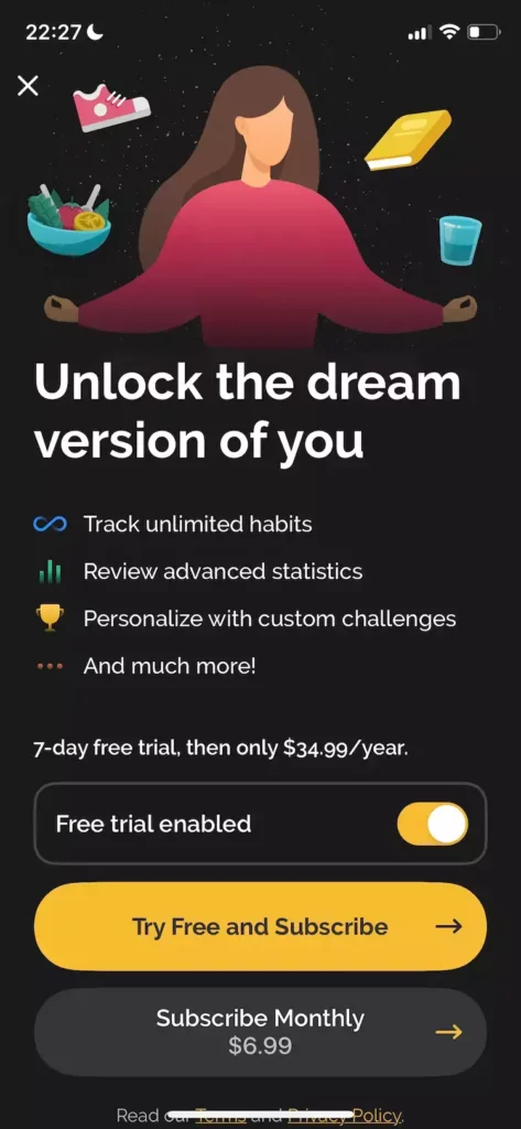
This is the best version of the “free trial enabled” button. I don’t have enough data to determine its effectiveness, but I like that the monthly option is there to make the yearly more interesting.
I think giving users a discount by NOT enabling a trial is the way to go with these paywalls, but that’s just my guess.
Productive
Glo: Three Plans Could Work Better
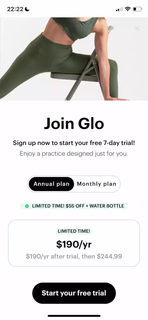
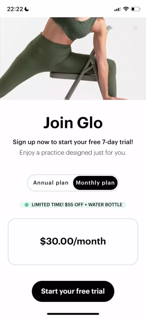
I personally like to show all plans on one page instead of forcing users to tap on the plan to see the pricing. From our experience, 3 plans convert better than 2 plans and within the Health and Fitness category, I’ve seen Monthy, 6-Month, and Yearly perform very well.
Imagine having a 6-month option for $180/year on this paywall. What plan do you think most users will pick?
Lastly, why is the athlete’s head cut off? Is this supposed to insinuate something? ?
Pocket Translator Can Instantly Increase Revenue
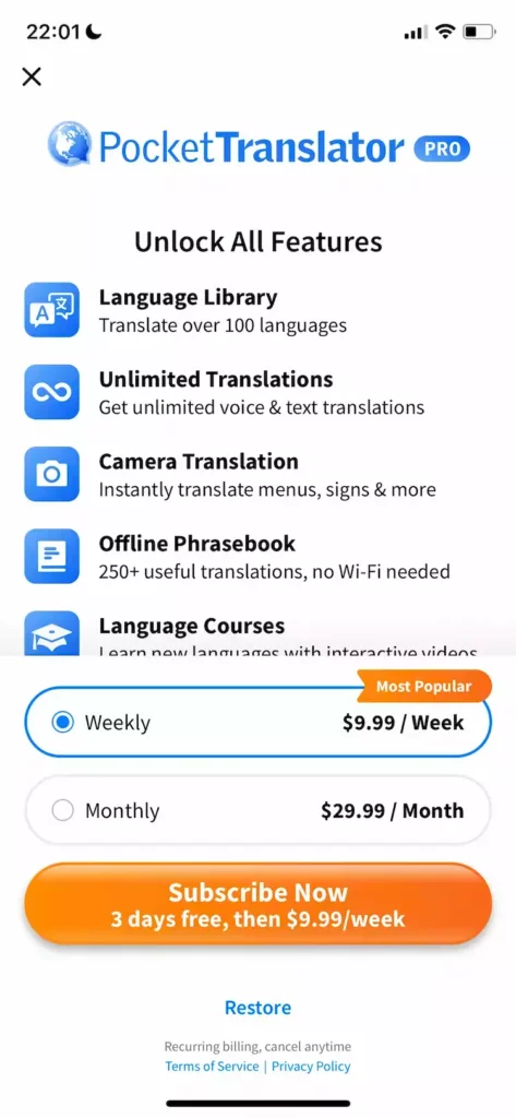
I think this app can instantly increase revenues by adding a yearly option. They can do the math on the LTV of a weekly user but if it’s less than $40, then I’d add a yearly option for $39.99.
Mematic: Weekly Option Would Make a Lot of Sense
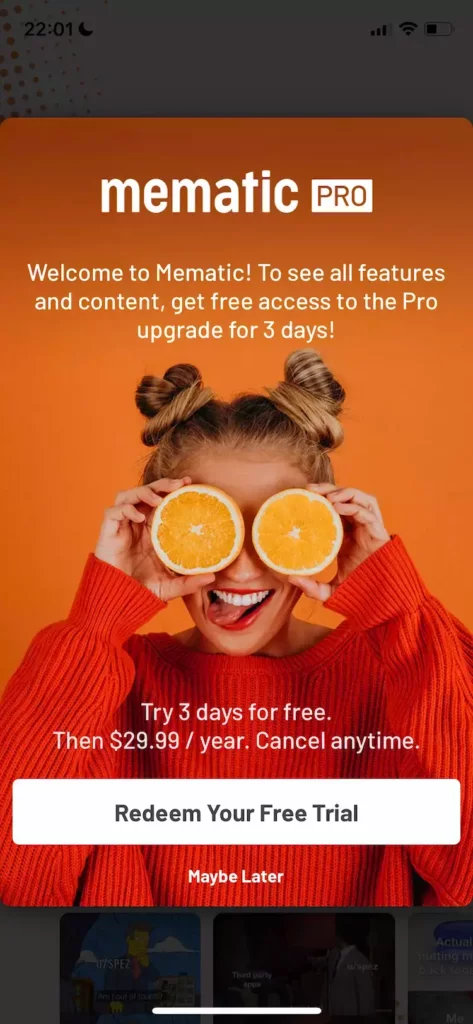
Remove the “Maybe Later” text right underneath the button. And add a weekly and a monthly offer where the monthly acts as a complete decoy.
For apps like these where users may want to use it once or twice, a weekly option makes a lot of sense.
Mematic
Vids: Can Win From Adding a Biannual Subscription


Again who am I to argue with an app making $50K a month, but I would say move the yearly option up so that it’s the first one and then add a 6-month for $39.99 (which is $10 less than the annual).
I would bet $100 that my way would win over the current way. Shall we reach out to Vids? ?
