Paywall Newsletter #13
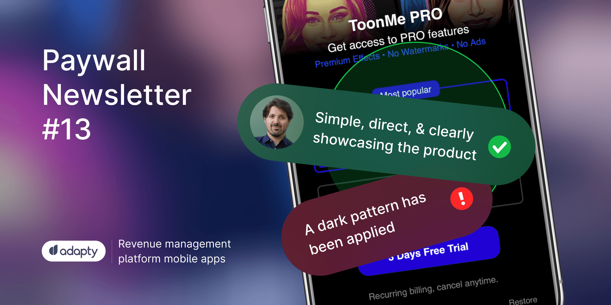
In the 13th issue of the paywall newsletter, we have:
- a question to avoid on a paywall,
- a paywall that looks like it was developed through numerous tests,
- a fantastic example of applying animation on the paywall,
- a little dark pattern we haven't seen before.

Paywalls of the issue are commented by…
David Sánchez-Camacho García who worked in Fintech, EdTech, and HealthTech startups for the last 5-6 years. His greatest desire is to help apps monetize and retain their users more effectively.
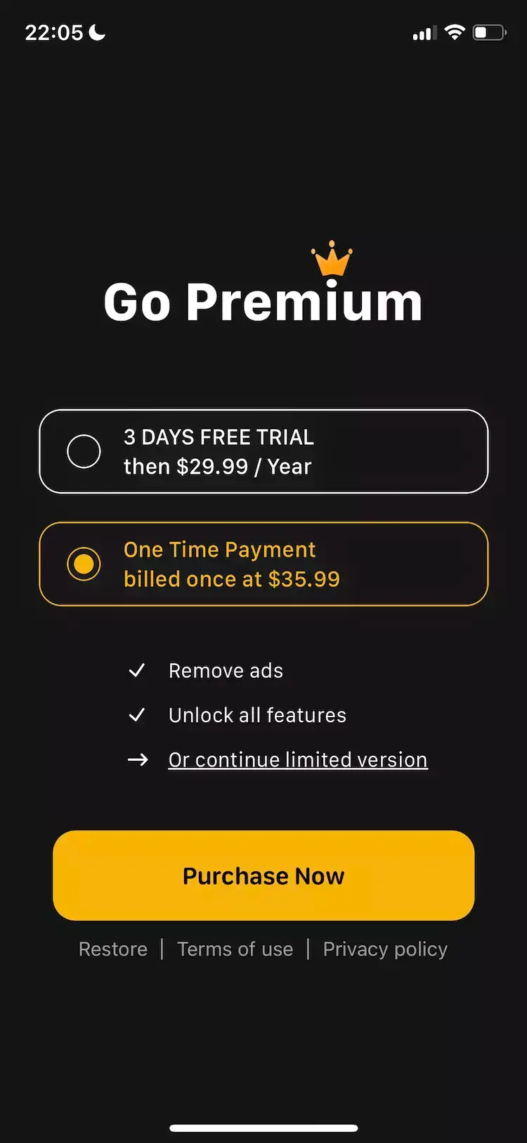
Simple, direct, and clearly showcasing the product
It's evident that they have tested MANY paywalls. This paywall is as straightforward as it gets (at least qualitatively; we would need to see the numbers). It displays only the bare minimum information that users need and anchors them by mentioning "Most Popular".
Moreover, they use the visual part of the paywall effectively, where they don't overwhelm the user with a logo or claim but instead show the output of what they can create with the app: cartoon avatars. Additionally, I'm very interested how the CTA copy changes based on the selected subscription type (annual, monthly).
If there's one thing that doesn't quite sit right with me, it's that I fail to comprehend why they offer a 3-day free trial to users who choose the weekly subscription. In my humble opinion, it would make more sense to offer it to those who opt for the annual subscription instead, although I'm pretty sure they have already tested this and dismissed it as an option.
Chaos and reinvention of the wheel using dark patterns
This paywall seems to have been created with little love and care. Not only does the Premium option with the crown design receive countless criticisms, but the way they force users to exit the paywall is reinvented.
Multiple font weights, various of colors... and a strange order of presenting information. For instance, the trial period is mentioned before stating that it's a one-year plan in the first option. And in the second option, it would be helpful to understand how much I save annually compared to the annual plan. Don't make me think, just tell me directly that I'll save X% in the first year.
On the other hand, we can clearly see that a dark pattern has been applied to prevent users from quitting the paywall. Instead of making it effortless with a simple 'X' button, following the widely accepted design conventions of most paywalls, the SPV team tries to reinvent it... in a bad way. It raises (so many) suspicions.
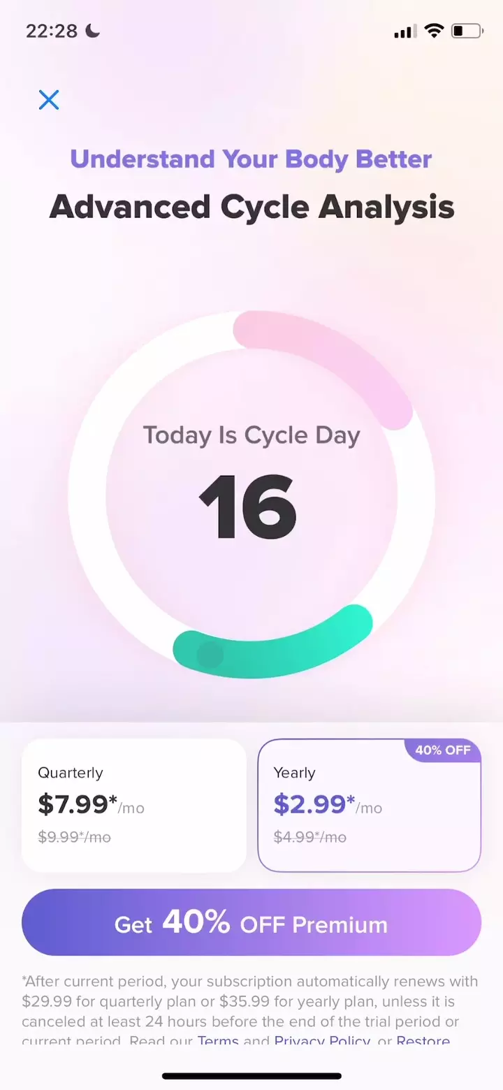
Don't show that you don't know, dude
The first issue with this paywall is that Momento could benefit from utilizing the available space more effectively by reducing the amount of unnecessary visual identity. It's worth considering that users who reach your paywall have likely already gone through the onboarding process where you had the opportunity to explain your app, and they may have been using your app for some time now.
However, in my humble opinion, the biggest concern here lies in the user status management. The inclusion of the "Already Paid?" button on this paywall raises more questions than it answers.
Why are you asking me if I've already paid or not? Shouldn't you already have that information? Wait a moment... but to whom exactly am I giving my money? There are numerous uncertainties you wouldn't want the user to experience at such a critical moment when they're about to entrust you with their most valuable possession, their money.
Momento
Order, visual hierarchy, and... a pinch of smoke and mirrors
A reasonably well-structured paywall that aligns with the overall visual aesthetics of the app. The content blocks are neat, presenting the expected information for users to consume, and implementing anchoring practices to emphasize potential savings with the annual plan.
Moreover, the structure of each content block is clear and follows a coherent order:
- Subscription type (annual/monthly),
- Indication of trial availability,
- Display of price/selected period,
- Inclusion of relevant secondary details (monthly cost, cancellation option, etc.).
Additionally, they boldly emphasize the ability to cancel at any time.
However, if I were to suggest an alteration, it would likely involve the first bullet point, "Unlock the Full Evergreen experience." It would be more effective if it were integrated at the top section of the paywall, blending with the tree element. As it stands currently, this benefit lacks substantial value and could be perceived as a deceitful tactic rather than a genuine offering.
Evergreen
A great combination of a product tour and a paywall
They have done a good job of combining two needs into one. I'm (almost) certain that they have realized that conversion rates improve when you invest some dynamic space in explaining why a user should pay for a product.
The pacing of the video could use some enhancement, but overall, I think it's the best combination of narrative and paywall I've seen.
If I were to suggest an area for improvement, it would involve integrating the pricing more seamlessly and toning down the "clickbait" nature of the CTA (there's no need for visually intrusive typography).
Glow