This is the special issue with Thomas Petit, in which we compare paywalls of top-grossing apps with their smaller competitors.

Paywalls of this issue are commented by…
Thomas Petit, Mobile Growth Consultant, aka @Thomasbcn
Story making
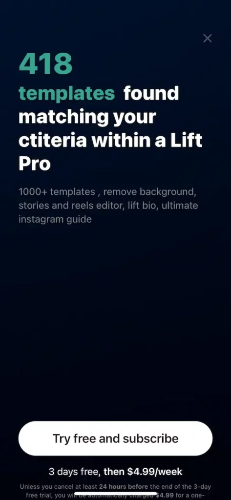
I can see what the developer is aiming for, showcasing the depth of content the subscription provides, but I’m not that convinced.
There’s a couple of details I would question: low font contrast of the additional benefits, too much empty space, and quite curiously, a problematic typo in the text (“ctiteria”?). I’ve seen that voluntary typos sometimes work in advertising, but having it on the paywall makes it quite unprofessional.
But my biggest surprise here is that we are in a vertical that is all about visual effects and imagery (story making), and this paywall is text only?! I’m sure there are ways to showcase examples of templates with beautiful results to give a sense of how good the app is. It’s even more obvious when a half of the screen was left empty of any elements.
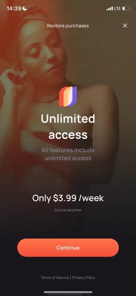
Templify might not be generating as much revenue as Lift, but I found this paywall more attractive, with background imagery, contrast logo, and, overall, a very simple layout that drives towards pushing that “Continue” button.
The overall sensation was good, but some aspects might be improved:
- I’m not sure the imagery is the most representative of what a story can be. It might work for the target audience, but I’d try to test it against pictures that are more common in stories, I’m sure the developer has a ton of data and examples to pick from.
- I wouldn’t have placed the “Restore purchases” option so high up.
- The description of the benefit is redundant and not very clear: what are those features exactly? Too often, developers prioritize features over benefits in their communication (I often use this explanation when giving this recommendation), and I would have loved to see what the app can do for me with a subscription.
Meditation
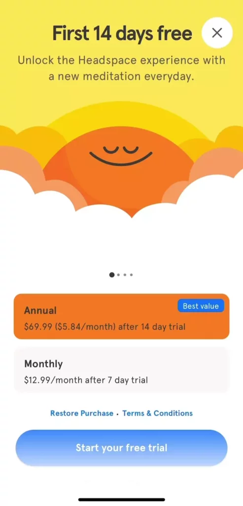
A classic strong paywall layout for Headspace, with many proven elements, such as a strong contrast, pre-selection of the yearly plan, and a lot of emphasis on the free trial (title, description, call to action).
What I find really worth highlighting here is that we see 2 themes with day & night: assuming the app adapts to when the users are activating the paywall, this is a brilliant example of personalization that too few apps are using. The takeaway here: you don’t have to show the same paywall all the time to everyone.
The skip button is very visible, which might affect instant conversions a bit, but offers a way to retain the users who aren’t ready to immediately enroll in the subscriptions and convince them later. If Headspace not only adapts the paywall based on time of day but also past behavior, this opens up the opportunity to present a different paywall to the users who have skipped this one, something I also see too few apps experiment with.
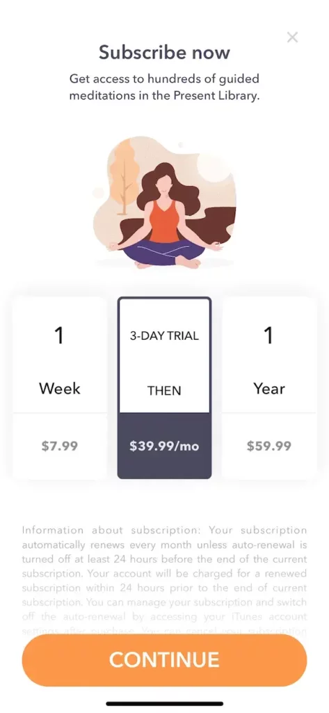
While not fundamentally wrong, there are a number of potential areas of improvement here:
- The color palette looks a bit too bland to me, too many white elements (especially if you compare with the strong contrasts Headspace is using).
- The benefits of the subscription are too hidden, only some small text mentions the “access to hundreds of…”, but little else to differentiate.
- The legalese is not mandatory and definitely offputting on top of the CTA.
More debatable, but sometimes more choices is counterproductive, and while many apps have 3 plans like here, I prefer to have just 1 or 2 options (potentially offering more in a subpage or later).
I’ve seen the “Continue” button work well for various apps, but personally I’m not a fan either, as it’s slightly misleading (this is not a hard paywall) and lacks convincing power to me.
Finally, I find the choice of price points curious, with $40/month and $60 per year this is clearly a decoy strategy.
Intermittent fasting
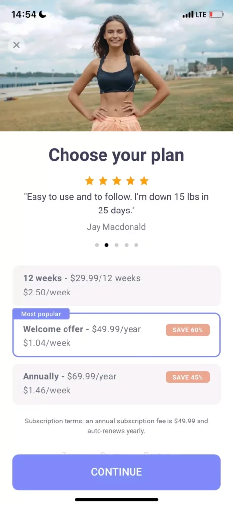
A good first feeling from this paywall, very possibly due to the use of a human photo making the social proof more relatable. This tactic of using real people has worked great for me in other contexts.
The way the plans are highlighted (most popular) with favoring the yearly option (save 60/45%) is probably effective. But with such a strong pre-selection, I wouldn’t have used the title that implies the user should check alternatives. There is potential to replace the biggest text on the screen by a more convincing copy, or at least one that directs towards getting started rather than thinking about it twice.
I’m not really sure the text just above the CTA is necessary, if not removed, I would consider replacing it.
The price points are very discreet with grey small text, but that’s likely OK with the pre-selection well done.
I’m curious about the drop-off rate on the screen due to the fairly discreet skip button, which took me a little while to see.
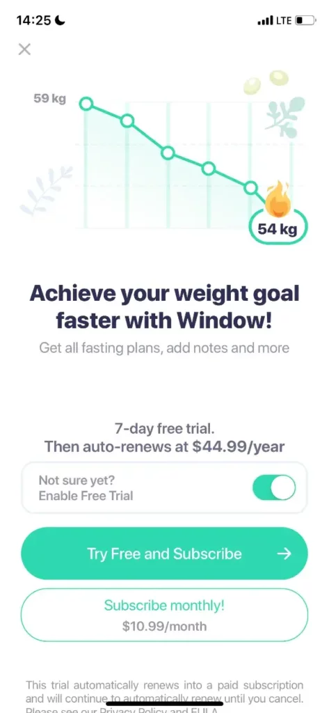
I really like the upper part of this paywall: simple and effective. When talking about “Present” above, I mentioned I was missing some convincing benefits, but we have a very good example here: a graph showing progress towards the goal, accompanied by a high contrast emoji, and a big strong text that I found very compelling, given the nature of the app.
The bottom part was slightly more confusing to me, but still pretty good. I’ve never tried the “enable free trial” myself, but that could work well in this particular case.
Again the legalese could be removed or at least shortened, so that you don’t have to scroll below to see what’s hidden there. I’m going to guess the “restore purchase” and terms are below the fold, which is fine.
Maybe the one thing I didn’t like was the complexity added by having the monthly alternative. Right when I was quite convinced, I’m given something to think twice about, and make me calculate the benefits of the yearly plan (which is still very beneficial at 66% discount, which isn’t written!). The price is a bit curious (10.99) but I would consider removing this entirely, or at least pushing back in another subpage.
Period tracker
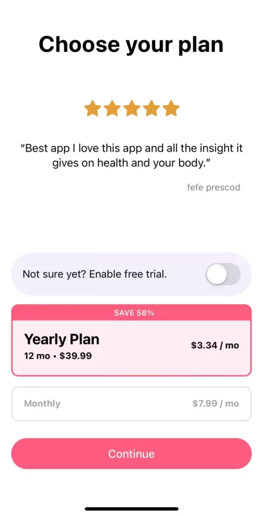
The Flo growth team is well known to be strong at experimenting, so this screen had many iterations. The result looks very strong to me, one I wouldn’t hesitate to copy in testing.
It’s got a number of solid elements mentioned previously, like social proof through review, optional free trial toggle, clearly selected plan with 58% discount, “Continue” button…
On the aforementioned “Window” paywall, I found the alternative plan an issue, this looks fairly similar, but somehow I find it clearer here with very limited text.
The position & font size of the monthly equivalent of the yearly price are put quite cleverly to both follow guidelines (total price at least looks big enough) and put the $3.34/mo in a very obvious way to see it first.
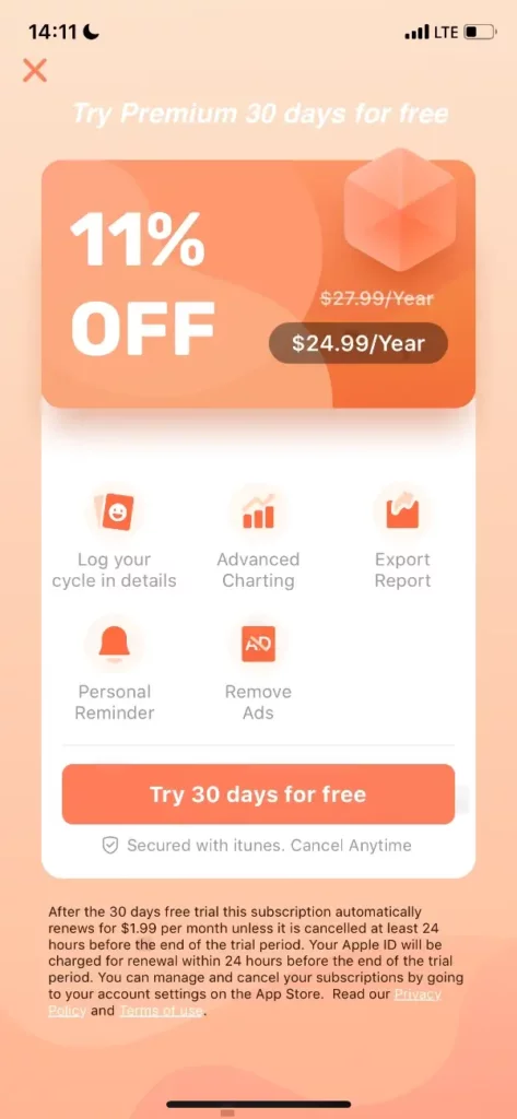
There are some good ideas in this fairly unusual paywall. It’s quite visually driven overall, despite not having big pictures.
The discount is put first and is very big –although 11% off doesn’t feel really big, given many apps showcase 50-80% off compared to monthly prices.
The developer tried to put the benefits in the centre but they may deserve slightly darker font or bigger size.
As I mentioned in the previous cases, the legalese is not necessary, it creates fear, while taking space and overloading the screen. This might be the first change I would make here.
Last but not least, I don’t think the wording on the CTA is compliant, so I would have a backup option available at every release in case Apple rejects it.
Calorie tracker
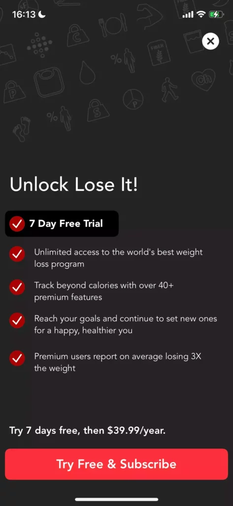
“Lose it!” is using a variant of the “Calm” paywall, with a list of benefits in bullet point, then showing prices, and then the classic “Try Free & Subscribe”. “Free” is mentioned 3 times too.
This layout has been very successful for many apps, I still personally found the top space left unused a waste of opportunity, as the background images doesn’t really add much in my opinion.
I would also try to reduce the length of text for each benefit, which could allow to make them bigger, more readable, and have more opportunity to convince.
The “X” button on the top right has a high contrast, which is a double-edge sword: it’s a high risk to take as it might reduce instant conversions, but it may also enable unconvinced users to continue their experience rather than churn, and convert later. I would be curious to see the testing data on the short & long terms for variants of that button.
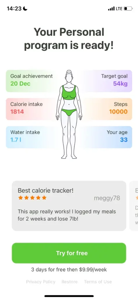
The overall first sensation wouldn’t put the Food Tracker’s paywall screen in my favourite options, yet it cumulates a number of well thought details:
- The title is a solid one, making think of personalization (caps lock on Personal).
- The first element about goal deadline and target goal are likely very strong conversion triggers.
- There is a number of color/contrast elements, with the CTA being the most prominent one.
- Social proof through reviews was made very visible by being placed just above the paywall.
- Legalese is added at minimum, in a very discreet grey text.
There are a few things I find more questionable, but they might be effective for the developer:
- I don’t think the copy on the CTA is compliant, and sooner or later Apple may reject it
- The price is very discreet, which is probably good for the conversion rate but not particularly transparent from the developers’ side. At this high price point ($10 per week is the equivalent of $520 per year!!) some users may get a very bad surprise
- I assume this is a hard paywall (no skip button visible): again possibly a high conversion rate with potential negative side effects on cancellations and refunds, but also instant churn for 90+% users who can’t continue their experience without entering a very short trial.
