The 7th issue of the paywall newsletter featuring:
- Psychological paywall in four screens
- AI girlfriend
- How to spook your clients with an inadequately big discount.
Paywalls of the issue are commented by…
Nikita Maidanov, a mobile subscriptions expert, ex-CPO at Adapty.io. Grew several apps to $2M+ ARR.

Yet another trial reminder, but this time with a date
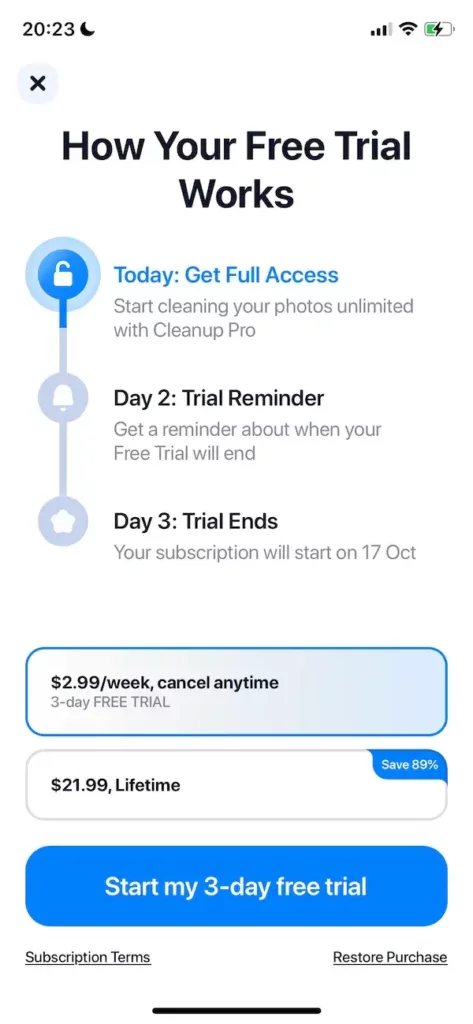
This is a classic example of Blinkist-like paywall with a trial reminder. Usually this type of paywall has only one “Start trial” CTA button. In this case, developers offer a weekly subscription and a lifetime purchase option. It’s not clear if the trial works for the lifetime option (if made with the Apple’s tools, it should not, as there are no trials for one-time purchases). I really like the indication of the exact subscription start date on Day 3, usually developers just explain how it works without specific dates. I think it improves the feeling of safety and control, which is the goal for this type of paywall. To sum it up,
What I like:
- Indication of the exact date the trial ends;
- Clean and simple design, visible prices, and close button.
What I dislike
- Not clear if the lifetime option also has the trial.
Multiple screen paywall with personalization
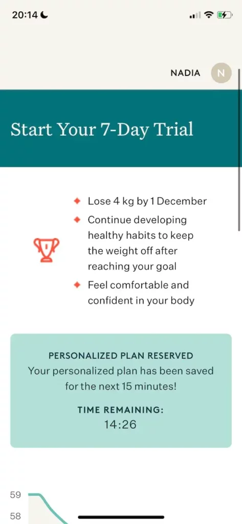
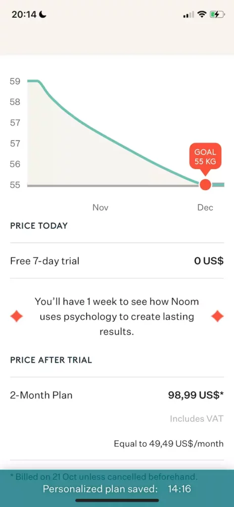
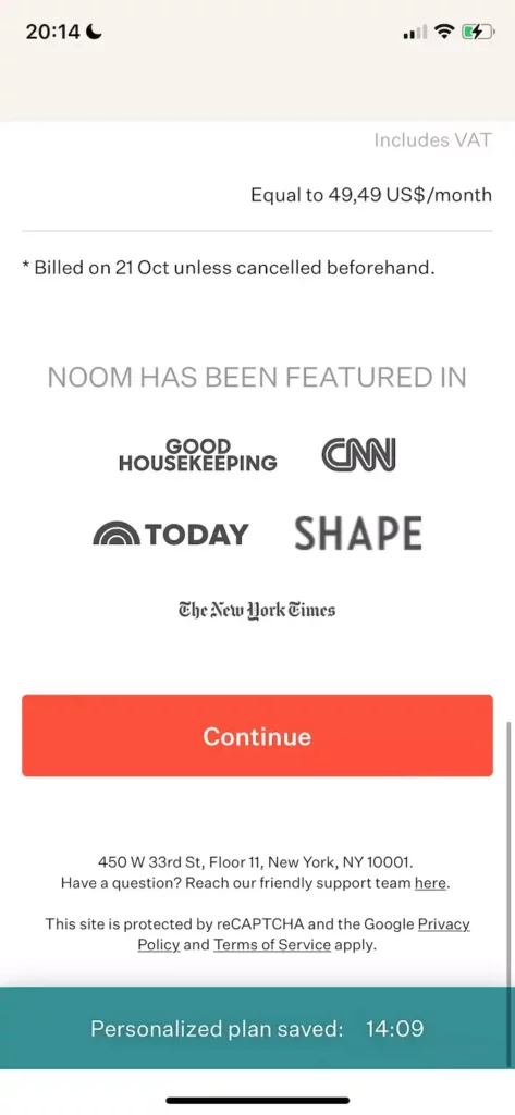
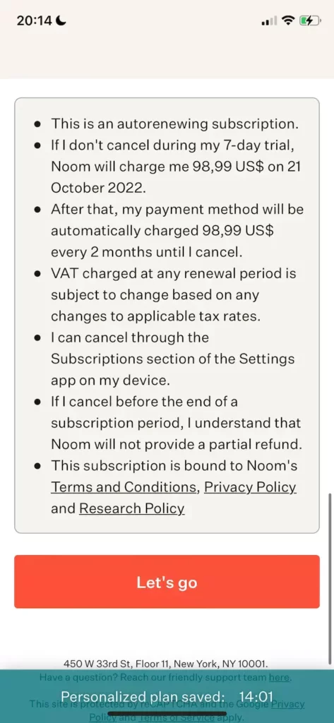
The app offers a psychology-based approach to weight loss.
This paywall is shown after a very long quiz about body parameters, habits, experience with diets, thoughts on weight loss, etc. The paywall is personalized and based on the answers given previously. Here are four screens because the paywall is four-screen long.
An interesting multi-screen paywall, like in Duolingo. It’s a nice way to incorporate in your paywall all the proven techniques: social proof, personalization, timers, etc. It’s a classic example of the paywall personalization after a long onboarding with quiz-like questions. In my experience, in that case the onboarding is even more important for the conversion rate than the paywall itself. The timer also triggers a FOMO, which is surely a fake.
What I like:
- Personalization and social proof (the “featured in” logos).
What I dislike:
- Too much text, no images/video at all;
- Confusing: timers, graph, $0 price, terms (why?);
- A cheap fake FOMO timer.
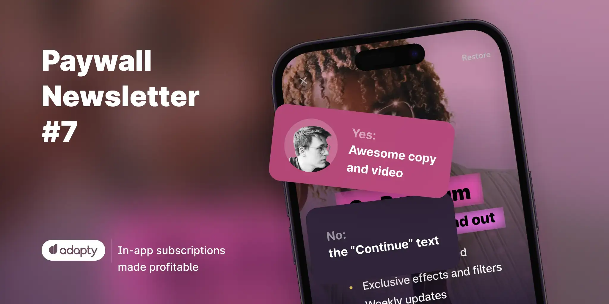
Beautiful design and a nice video
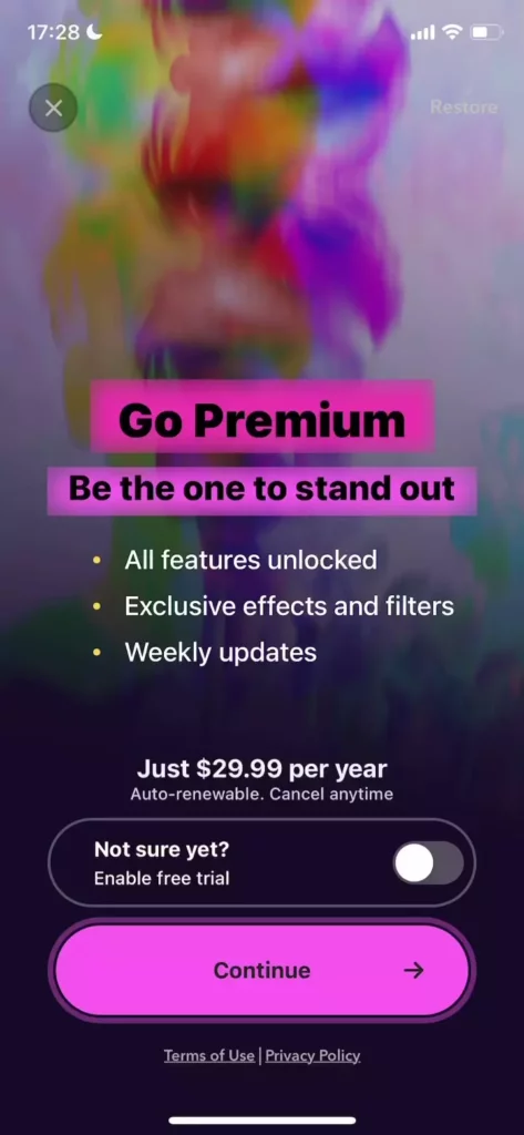
I love it when developers sell the value, not features! “Be the one to stand out” sounds like an amazing copy for a product like this. The video is nice too, demonstrating the effects that you can use in the paid subscription. A very bright CTA button with animation, but I’m not so sure about the “Continue” text. I think they’re lucky to have passed the Apple review with this text. They also could’ve added the price per month ($29.99 divided by 12).
What I like:
- Awesome copy and video;
- Clean and bright design.
What I dislike:
- The “Continue” text on the CTA button.
Where did they get $390 from?
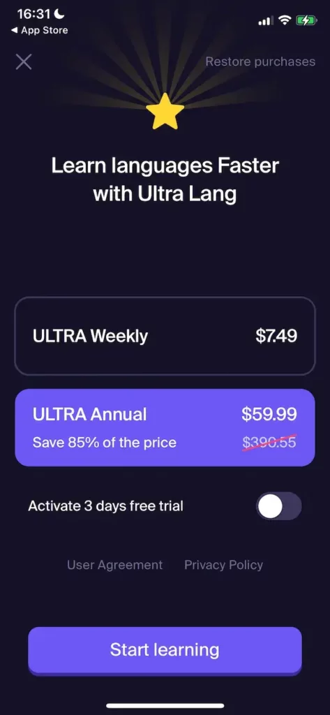
The crossed-out price of $390/year is outrageous. I don’t think it’s a great idea to spook people with a price like this, even if it’s not a real price. Who knows, maybe this is the price for the second year? (thinking like the user here, I know that it’s not the case). And what am I paying for? What is Ultra Lang? Sorry, but it just looks like a lazy paywall for me.
What I like:
- Well, it’s clean
What I dislike:
- Spooky price;
- No features, social proof or anything that could sell this subscription to me.
How to sell an AI girlfriend
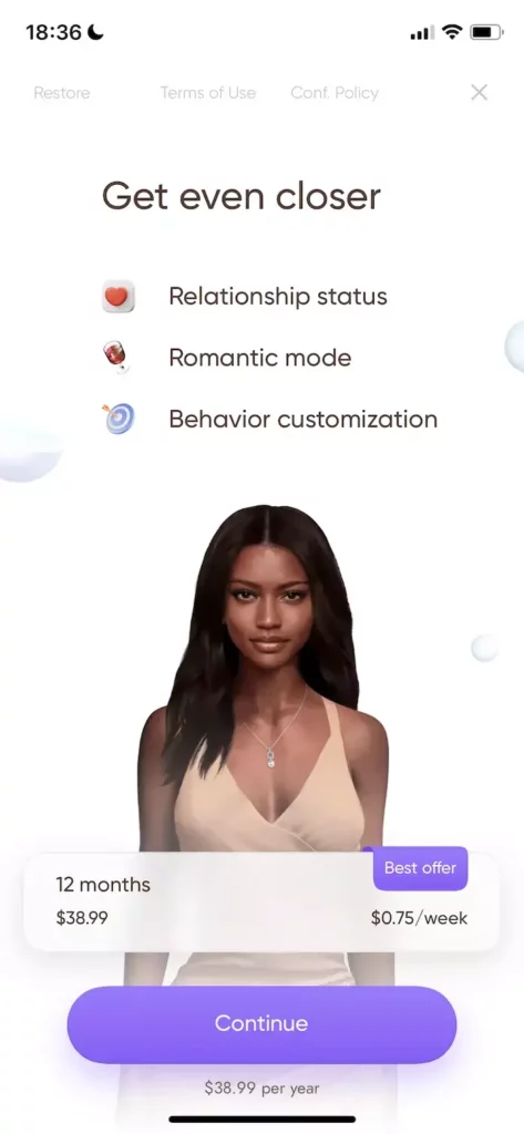
The user customizes their virtual girlfriend during the onboarding, and she appears on the paywall later.
Oh my, AI is really on the rise, now you can even subscribe to an AI girlfriend ? Well, speaking about the paywall, it’s not bad. I don’t get the “Best offer” text as I don’t see any other offers. The “Continue” button appears again. But the features are listed, and they are not overly explained to leave a necessary curiosity gap.
What I like:
- Clean design with a person (avatar?), which is usually good for the conversion rate;
- The feature list that makes the user wonder.
What I dislike:
- The “Best offer” for the only offer;
- The “Continue” button;
- The idea of the product (but I guess there’s demand for this kind of supply).
Every plan is special
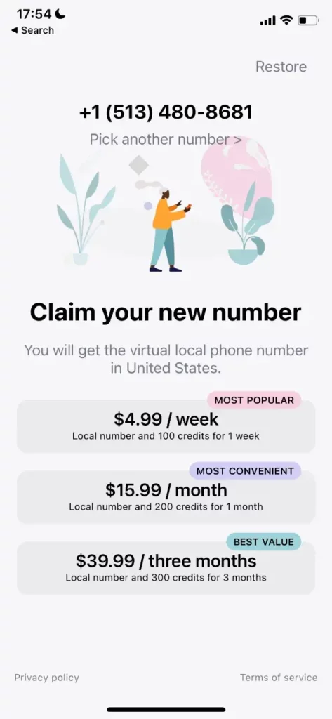
No onboarding, just this paywall right after the user launches the app for the first time. I like the design and that the phone number is incorporated in the paywall. Too much bubbles with the “Most X” and “Best X” to my taste. It’s a bit confusing for users. Choose the best one, make it a default option, don’t make it hard for the user!
What I like:
- Beautiful design;
- It’s a paywall with a phone number, not a generic one.
What I dislike
- 3 products are fighting for my attention
- I don’t get the “credits” and which one is best for me. It should’ve been explained during the onboarding.
