Android UI layouts and views: all you need to know
TL;DR:
Master Android UI layout and views with our comprehensive guide, detailing the types, attributes, and best practices for creating seamless and intuitive app interfaces.
Welcome to our comprehensive guide on mastering Android UI layouts and views. The Android UI landscape has evolved significantly, with developers now choosing between traditional XML-based layouts and modern Jetpack Compose. This guide covers both approaches, helping you make informed decisions for your projects.
Whether you're maintaining legacy code or building new apps, understanding both XML layouts and Jetpack Compose is essential for modern Android development. Let's dive in!
What is an Android View?
In Android, a View (public class View) is the basic building block for creating UI components. Think of it as a rectangle on the screen that can display content or respond to user interactions. Each View is a fundamental element for creating various types of interactive and display components.
Basic view types
- TextView — displays text to the user with customizable appearance (color, size, font, alignment)
- Button — triggers events when tapped, allowing the app to respond to user input
- ImageView — displays and manipulates images (resizing, aspect ratio changes)
- EditText — interactive text input field for forms, search bars, and messaging
- CheckBox — multiple options that can be independently checked or unchecked
- RadioButton — single selection from a group of mutually exclusive options
- Switch — two-state toggle for on/off settings
- ProgressBar — displays operation progress (spinning wheel or horizontal bar)
- SeekBar — draggable thumb for setting values within a range (volume, brightness)
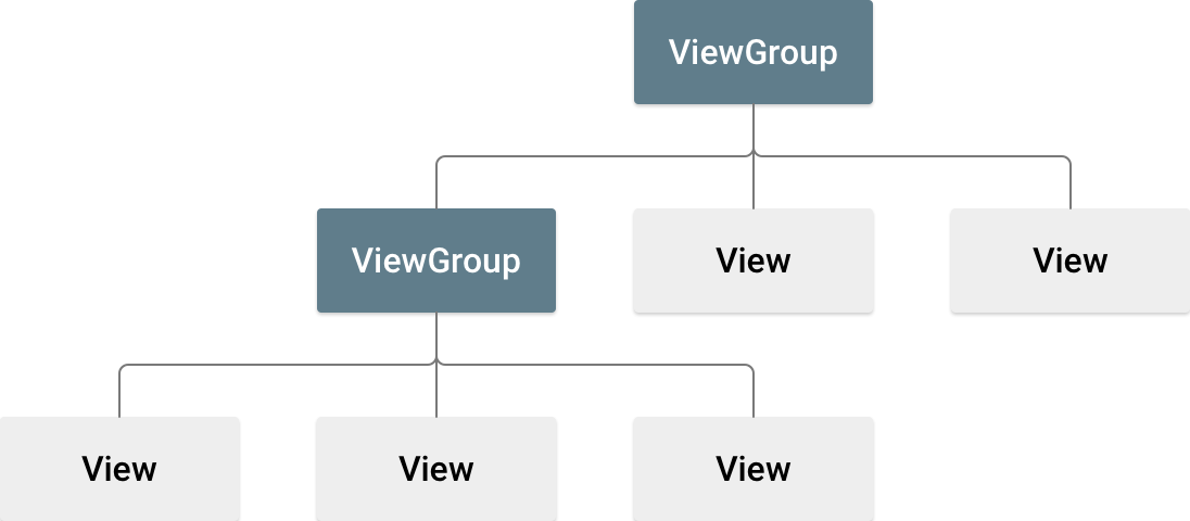
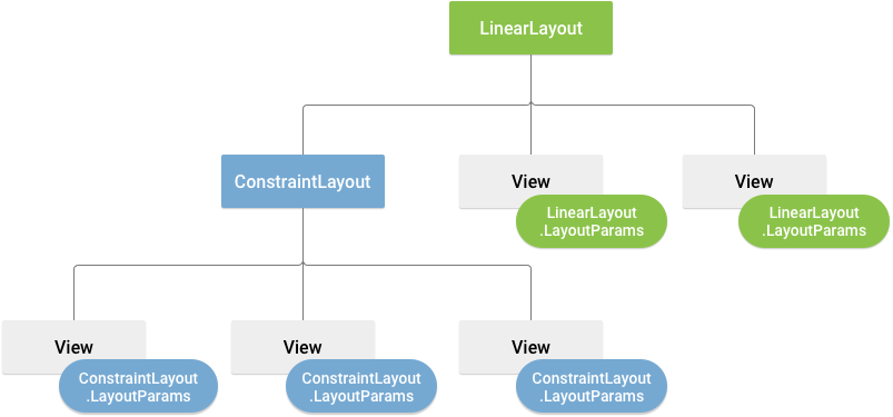
What is a ViewGroup?
A ViewGroup holds together other Views or even other ViewGroups. It's a container that organizes and manages child Views without displaying content of its own. ViewGroups provide the structural framework for arranging Views within a screen, enabling hierarchical and multi-layered layouts.
Traditional XML layouts
XML layouts have been the standard approach for Android UI development since 2008. They define UI structure in separate XML files, keeping layout information separate from code logic. While Jetpack Compose is now recommended for new projects, understanding XML remains essential for maintaining existing codebases.
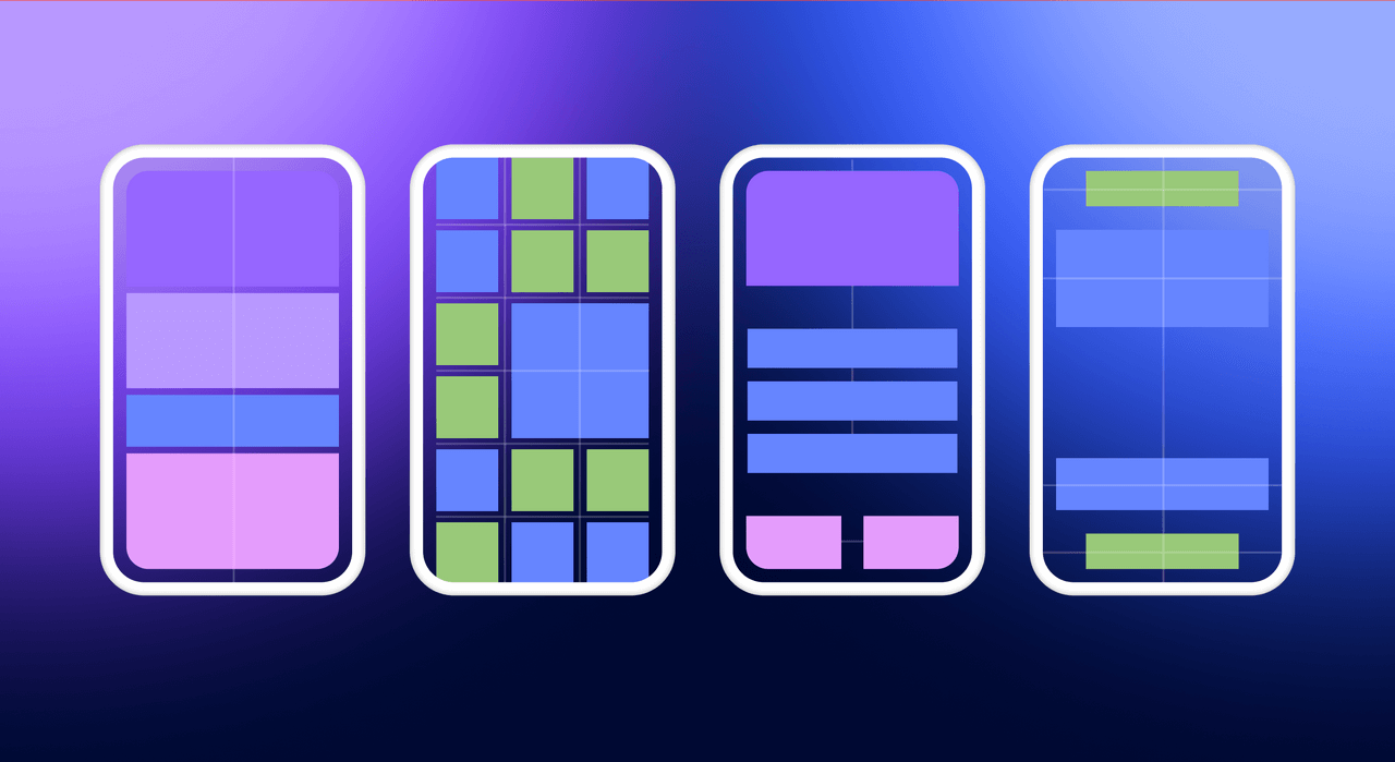
Types of Android layouts
LinearLayout
Organizes Views in a linear order, either horizontally or vertically. Ideal for forms, toolbars, and sequential arrangements.
ConstraintLayout (recommended)
The most powerful and flexible layout in Android. It allows you to create complex layouts with flat hierarchies, improving rendering performance. Views are positioned relative to each other or the parent using constraints. ConstraintLayout 2.2.1 (released February 2025) is the current stable version.
FrameLayout
Simple container designed to hold a single child View. Multiple children stack on top of each other. Often used for loading spinners or fragment placeholders.
RelativeLayout
Positions Views relative to each other or the parent container. While flexible, ConstraintLayout is generally preferred for complex layouts due to better performance.
TableLayout
Arranges Views in a grid-like table format with rows and columns. Useful for calculators, timetables, or tabular data.
Layout selection guide
| Task | Recommended layout | Compose alternative |
| Simple linear list | LinearLayout | Column / Row |
| Complex adaptive UI | ConstraintLayout | Box with Modifier |
| Image grid | RecyclerView + GridLayoutManager | LazyVerticalGrid |
| Overlapping elements | FrameLayout | Box |
| Animated transitions | MotionLayout | AnimatedContent |
| Scrollable list | RecyclerView | LazyColumn |
ConstraintLayout 2.x deep dive
ConstraintLayout 2.0+ introduced powerful features that make it the go-to layout for complex UIs. Here's what you need to know:
MotionLayout
MotionLayout is a subclass of ConstraintLayout that provides a rich animation system for coordinating animations of multiple views. It allows you to animate between different constraint sets, handling gestures and physics-based animations with seekable, reversible transitions.
Use cases: collapsing toolbars, swipe-to-reveal effects, parallax scrolling, and complex multi-element animations.
Flow
Flow is a virtual layout helper that creates chains which automatically wrap to the next line when running out of space. Perfect for tags, chips, and dynamic content where the container size isn't known at design time.
CircularFlow
CircularFlow organizes views in a circular pattern around a center point, useful for radial menus or clock-like interfaces.
Adding ConstraintLayout to your project
implementation "androidx.constraintlayout:constraintlayout:2.2.1"Modern approach: Jetpack Compose
Jetpack Compose is Google's modern, declarative UI toolkit for Android. First announced in 2019 and stable since 2021, it has rapidly become the recommended approach for new Android projects. Instead of defining UI in XML, you write UI directly in Kotlin code.
Key advantages of Compose
- Less boilerplate: No adapters, ViewHolders, or XML inflation
- Declarative syntax: Describe what UI should look like, not how to build it
- Built-in state management: UI automatically updates when state changes
- Easier animations: Built-in support for complex animations
- Better testing: Composables are easier to test in isolation
- Live previews: Real-time preview in Android Studio
Compose example
@Composable
fun Greeting(name: String) {
    Text(text = "Hello, $name!")
}XML vs Jetpack compose comparison
| Aspect | XML + Views | Jetpack Compose |
| Paradigm | Imperative | Declarative |
| Language | XML + Kotlin/Java | Kotlin only |
| Learning Curve | Lower | Medium-High |
| Boilerplate | More | Less |
| Code Reuse | Harder (custom views) | Easier (composables) |
| Live Preview | Limited | Yes |
| Memory Usage | ~157 MB (typical) | ~168 MB (typical) |
| Best For | Legacy projects | New projects |
When to choose each approach
Choose Jetpack Compose when:
- Starting a new project in 2025
- Building dynamic, state-driven UIs
- Prioritizing development speed and clean code
- Your team is comfortable with Kotlin
Choose XML layouts when:
- Maintaining legacy codebases
- Working with complex third-party SDKs
- Team lacks Compose experience
- Extremely performance-critical static UIs
ViewBinding and DataBinding
When working with XML layouts, modern Android development requires ViewBinding or DataBinding instead of the deprecated findViewById() method.
ViewBinding
ViewBinding generates a binding class for each XML layout, providing direct, type-safe references to views. It offers null-safety (no NullPointerException risks), type-safety (no manual casting), and better performance than findViewById().
Enabling ViewBinding
android {
    buildFeatures {
        viewBinding = true
    }
}Using ViewBinding in Activity
class MainActivity : AppCompatActivity() {
    private lateinit var binding: ActivityMainBinding
    override fun onCreate(savedInstanceState: Bundle?) {
        super.onCreate(savedInstanceState)
        binding = ActivityMainBinding.inflate(layoutInflater)
        setContentView(binding.root)
        binding.textView.text = "Hello ViewBinding!"
    }
}DataBinding
DataBinding extends ViewBinding with two-way data binding capabilities, allowing you to bind UI components directly to data sources. It's ideal for MVVM architecture where the UI automatically updates when underlying data changes.
View access methods comparison
| Method | Null-safe | Type-safe | Performance | Status |
| findViewById() | ❌ | ❌ | Low | Deprecated |
| Kotlin Synthetics | ✅ | ✅ | Medium | Deprecated |
| ViewBinding | ✅ | ✅ | High | ✅ Recommended |
| DataBinding | ✅ | ✅ | Medium | ✅ For MVVM |
| Jetpack Compose | N/A | ✅ | High | ✅ Modern Standard |
Lists: RecyclerView vs LazyColumn
Note: ListView has been superseded by RecyclerView and should not be used in new projects. RecyclerView provides better performance through view recycling and supports complex layouts with different view types.
RecyclerView (XML)
RecyclerView efficiently displays large datasets by recycling views as the user scrolls. It uses the ViewHolder pattern to minimize expensive findViewById() calls and supports different layout managers (Linear, Grid, Staggered).
LazyColumn (Compose)
LazyColumn is Compose's declarative alternative to RecyclerView. It only renders visible items, similar to RecyclerView, but with significantly less boilerplate code. No adapters or ViewHolders are needed.
LazyColumn example
@Composable
fun ItemList(items: List<String>) {
    LazyColumn {
        items(items) { item ->
            Text(text = item)
        }
    }
}XML layout syntax
For XML-based layouts, understanding proper syntax and structure is essential. Here are the key rules:
- Every layout file must have a single root element (ViewGroup)
- Include the Android XML namespace: xmlns:android="http://schemas.android.com/apk/res/android"
- Avoid deep nesting — use ConstraintLayout for complex layouts
- Assign meaningful IDs with android:id="@+id/name"
- Use dp for dimensions (density-independent pixels)
Common XML attributes
| Attribute | Purpose |
| layout_width | View width: match_parent, wrap_content, or specific size |
| layout_height | View height: match_parent, wrap_content, or specific size |
| layout_gravity | Position of View within parent ViewGroup |
| padding | Space inside View boundaries |
| margin | Space outside View, around the View |
| id | Unique identifier for programmatic access |
| orientation | Direction in LinearLayout (vertical/horizontal) |
| gravity | Alignment of View's content |
XML example with ViewBinding
<!-- activity_main.xml -->
<LinearLayout
    xmlns:android="http://schemas.android.com/apk/res/android"
    android:layout_width="match_parent"
    android:layout_height="match_parent"
    android:orientation="vertical"
    android:padding="16dp">
    <TextView
        android:id="@+id/textView"
        android:layout_width="wrap_content"
        android:layout_height="wrap_content"
        android:text="Hello World!" />
    <Button
        android:id="@+id/button"
        android:layout_width="wrap_content"
        android:layout_height="wrap_content"
        android:text="Click Me" />
</LinearLayout>Best practices
Performance optimization
- Use ConstraintLayout for complex layouts to minimize view hierarchy depth
- Prefer RecyclerView or LazyColumn for lists — never use ListView
- Reduce overdraw by removing unnecessary backgrounds
- Use Layout Inspector in Android Studio to analyze view hierarchies
- Optimize images with libraries like Glide or Coil
Responsiveness
- Use density-independent pixels (dp) for consistent sizing across devices
- Leverage match_parent and wrap_content appropriately
- Test on multiple screen sizes and orientations
- Use resource qualifiers for different screen configurations
Accessibility
- Ensure sufficient color contrast between text and backgrounds
- Make touch targets at least 48dp × 48dp
- Add contentDescription to images and icons for screen readers
- Support dynamic text sizing (user font preferences)
- Ensure logical navigation order for TalkBack
Migration guide: XML to Compose
If you're migrating an existing app from XML to Compose, you don't need to rewrite everything at once. Compose supports interoperability with the View system.
Using Compose in XML
Add a ComposeView to your XML layout:
<androidx.compose.ui.platform.ComposeView
    android:id="@+id/composeView"
    android:layout_width="match_parent"
android:layout_height="wrap_content" />Then set its content in Kotlin:
binding.composeView.setContent {
    Greeting("World")
}Using XML Views in Compose
Use AndroidView to embed traditional Views in Compose:
AndroidView(
    factory = { context ->
        LayoutInflater.from(context)
            .inflate(R.layout.legacy_view, null)
    }
)Conclusion
Android UI development in 2026 offers two distinct paths: traditional XML layouts and modern Jetpack Compose. For new projects, Compose is the recommended approach, offering cleaner code, better tooling, and faster development. For existing codebases, XML knowledge remains valuable, and the interoperability between both systems allows for gradual migration.
Regardless of which approach you choose, focus on creating accessible, performant, and responsive interfaces. Use ConstraintLayout for complex XML layouts, leverage ViewBinding instead of findViewById(), and always test on multiple device configurations.
The future of Android UI is declarative, but understanding both paradigms makes you a more versatile and effective developer.


