Comparison in charts
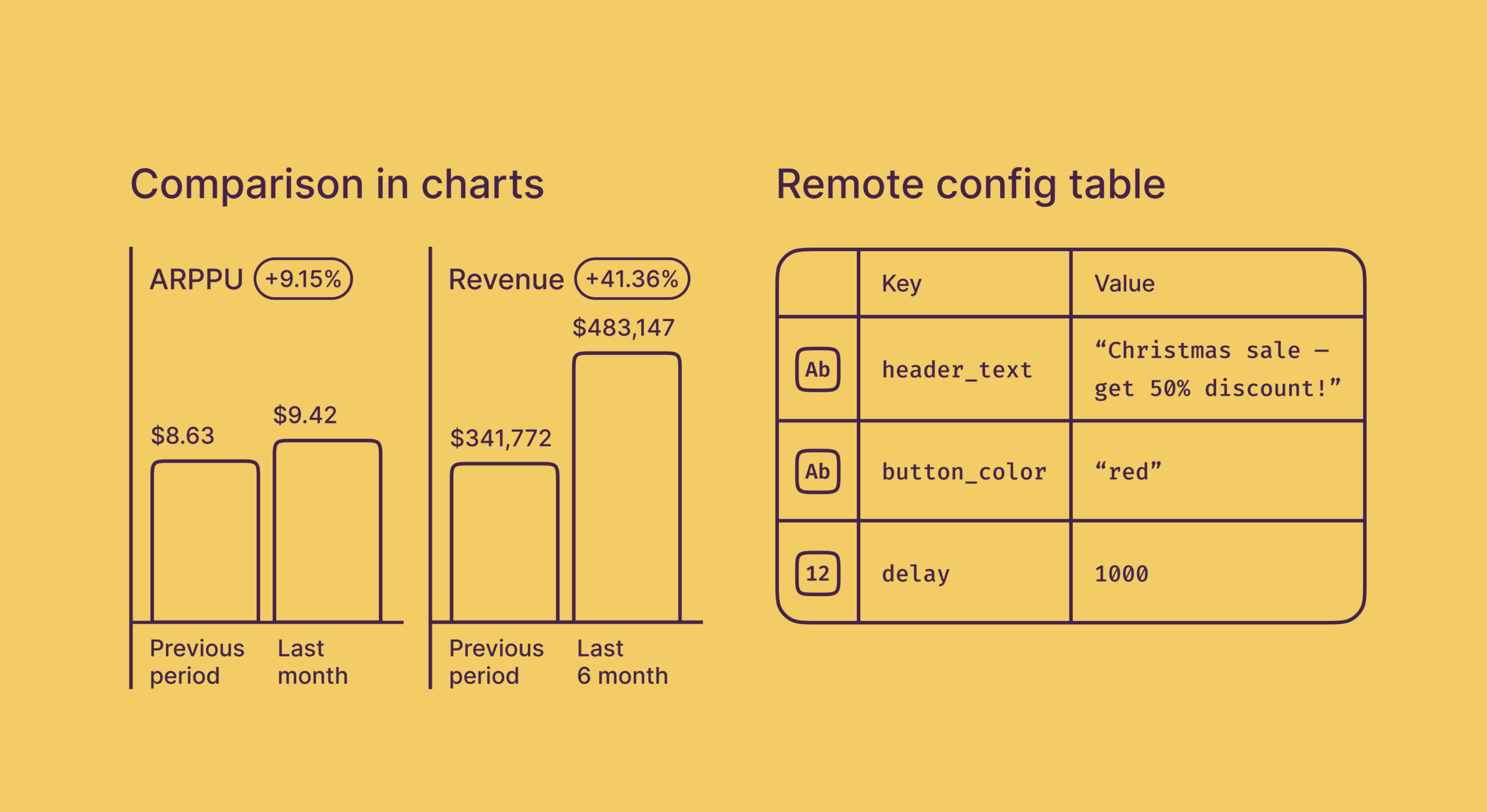
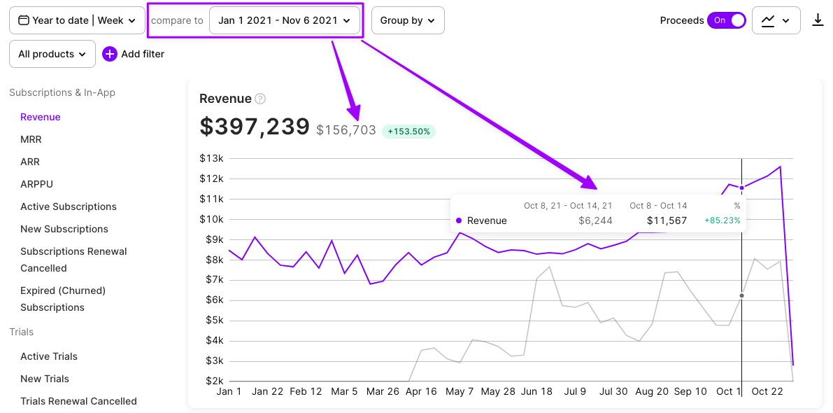
What can be more informative than observing charts with advanced filters and grouping? Of course – comparing results with the previous period. The actual data is one of the best possible benchmarks for further development and growth, so please feel free to use this for measuring your progress.
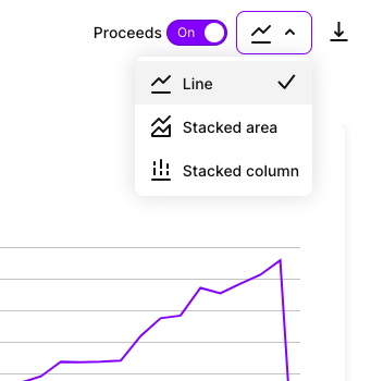
A nice addition is that now you can choose the type of chart. Bars, lines, and areas are available in the drop-down above.
Paywall metrics dashboard
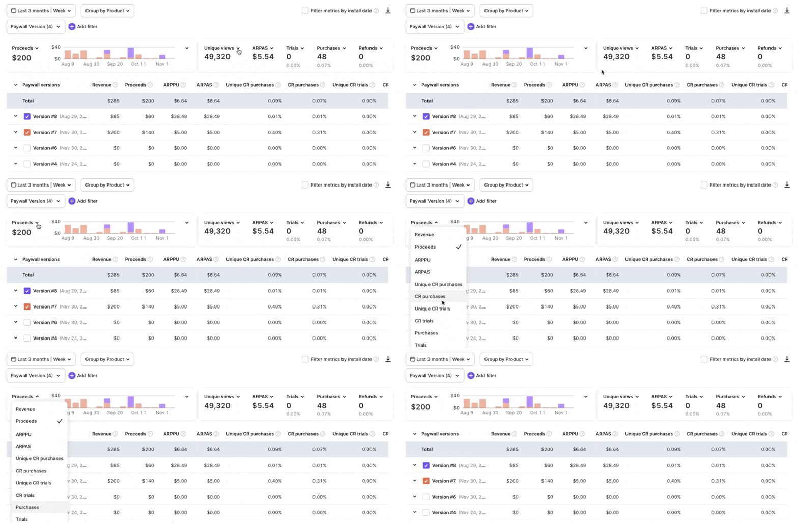
Growth teams constantly improve conversions by testing new paywalls. Now you can see the results of different paywall versions in one chart together with the core metrics dashboard. Customize both the chart and the dashboard as you like, and view all the necessary info just with one glance.
Remote config table and the Screenshot feature
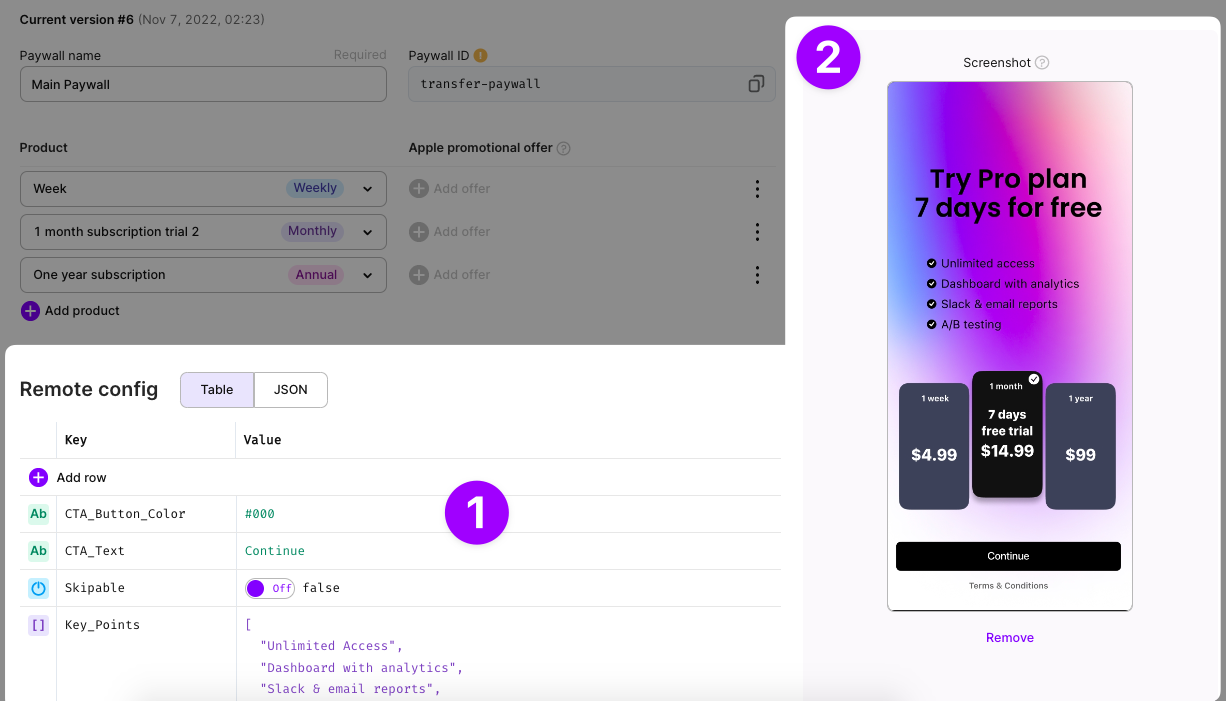
Adapty users test dozens and thousands of paywalls in a row. We want to make this process easier to manage. So the first update is the remote config table view. It’s formed row by row with the auto check of value types making the process more like low-code and preventing you from making mistakes, especially if one corrects the existing JSON.
In addition to this, as a second update supporting our paywall management, we present the Screenshot feature. You may upload a picture of a paywall which may be a screenshot from your actual app build or a design asset. The main goal is to have this picture as a reference that should remind you of what the layout looks like. It will be displayed on the paywall editing page and as a pop-over in the list of paywalls.
