Why 45% of users delete your app in 24 hours — and how onboarding can save you
Based on a webinar by Lorenzo Rossi, co-founder of Replug, an app marketing agency specializing in mobile user acquisition and ASO. Watch the full recording on YouTube.
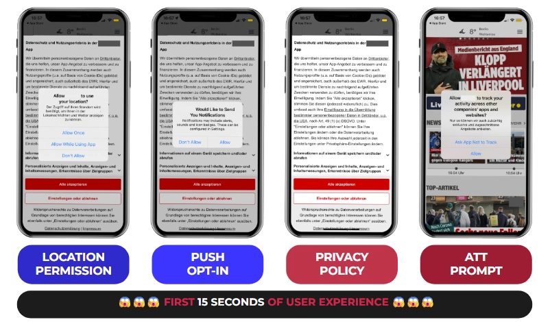
Picture this: Bill downloads your app, excited to try it out. Within 15 seconds, he's hit with an ATT prompt, a privacy policy screen, a push notification request, a location access ask, and a camera permission — all before he's seen a single feature.
Bill's face goes from curious to annoyed. He closes the app. He deletes it.
You paid to acquire Bill. You'll never see him again.
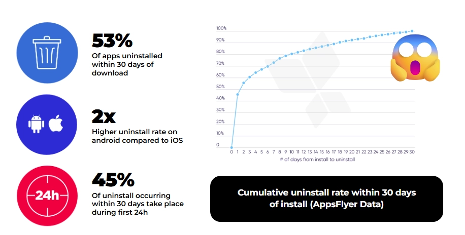
According to recent data, 53% of apps get uninstalled within 30 days of download — and 45% of those deletions happen within the first 24 hours. The culprit in almost every case isn't the product. It's the onboarding.
Why the first 60 seconds are a conversion event, not a UX nicety
Three forces have converged to make onboarding more critical — and more difficult — than it's ever been:
Users arrive with zero patience. They don't know how your app works. They downloaded it with a vague idea and expect immediate clarity. You have seconds, not minutes, to make things click. If the value isn't obvious fast, they're gone.
Privacy requirements have exploded. ATT on iOS, evolving changes on Android, GDPR across Europe. Every platform now demands explicit permission for nearly everything. These interruptions fracture the user experience — unless you design around them intentionally.
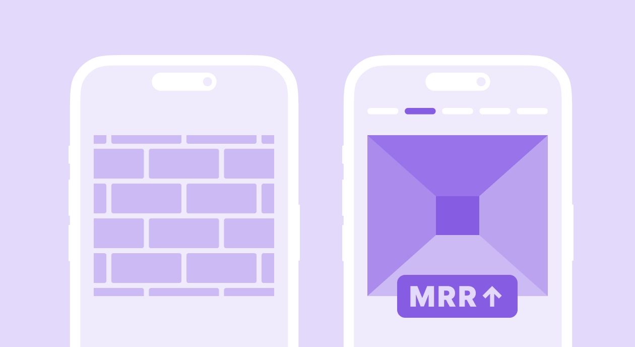
Monetization can't wait. The old model — let them use it for weeks, then ask for money — doesn't survive in competitive markets. Onboarding has become your first real monetization window, and data shows that 80% of subscription revenue comes from the first paywall.
Get onboarding wrong, and you lose users before they've seen your product. Get it right, and you unlock better retention, higher trial conversion, and sustainable revenue — from the same traffic.
What good onboarding actually does
Let's break down the concrete impact, from both a product and marketing lens.
It makes users feel welcomed — before making demands
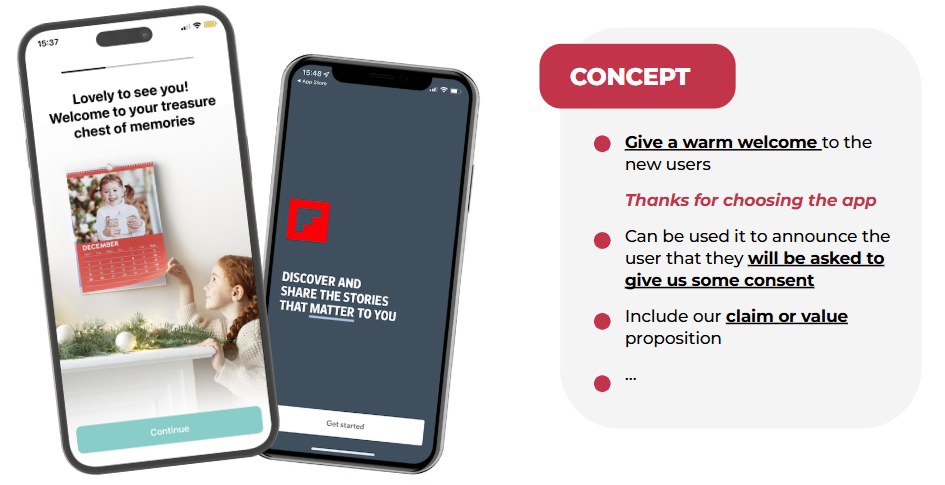
This seems obvious, but most apps skip it entirely. A simple "Thanks for choosing us" screen sets the tone. When PhotoSì greets users with "Lovely to see you — welcome to your treasure chest of memories," it's warm before it's functional. That matters. You're establishing goodwill before making requests.
It surfaces your stickiest feature early
One of Lorenzo's clients had a feature that dramatically improved retention — but users rarely found it organically. They added one onboarding screen explaining it. Discovery went up. Stickiness went up. The insight: if something is core to your value proposition, don't hide it behind exploration. Show it immediately.
It reduces day-1 churn before it happens
When users understand what they downloaded and feel welcomed, they stick around. Apps with structured onboarding see significantly lower day-1 churn.
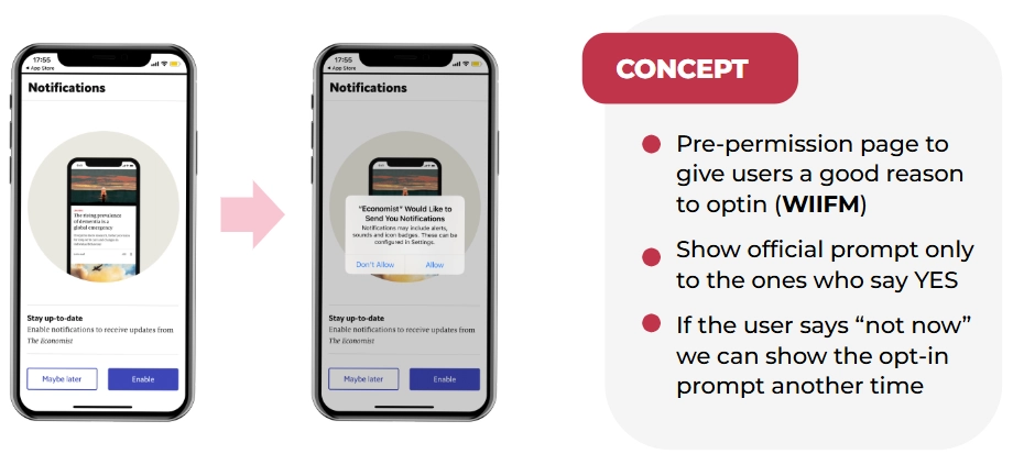
It requests permissions intelligently
Here's where pre-authorization screens become your best friend. Instead of immediately showing Apple's ATT prompt, show your own screen first explaining what IDFA tracking means and why accepting benefits them.

Adidas Runtastic nailed this. They literally explained the technical concept of IDFA before asking for permission. This approach:
- Creates awareness and knowledge
- Gives you a chance to explain the "what's in it for me"
- Lets users who will say "no" skip without triggering the official prompt (which you can only show once)
It dramatically improves permission opt-in rates
Roughly 50% of iOS users decline push notifications by default. That means half your audience is immediately unreachable for re-engagement. Pre-permission screens — showing your own screen before triggering the official Apple prompt — flip this dynamic.
The Economist uses a simple screen: "Stay up to date — enable push notifications." If users skip, the official prompt isn't shown yet. You wait for a better moment — after they've read their first article, placed their first order, completed their first session. The same logic applies to ATT tracking requests.
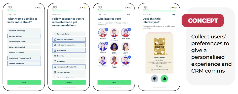
It creates personalization data you can use forever
When you know what users care about, you can personalize everything — their feed, your push notifications, your email campaigns, your product recommendations.
Blinkist asks what type of books you like and what you want to learn about. E-commerce or fashion apps can ask about favorite brands and sizes. All this can be used for future communication. One clever trick: after users spend time selecting preferences, present the account creation page with "Sign up to save your interests." It's a small nudge that converts remarkably well.
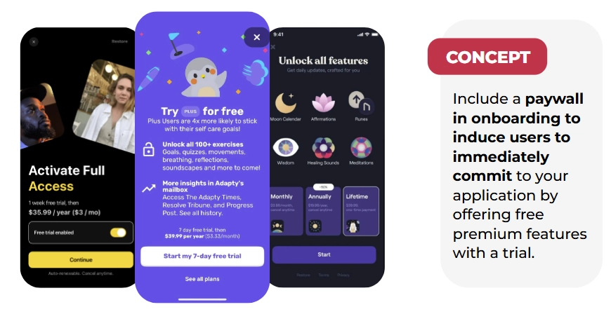
It opens your first monetization window
Subscription apps increasingly present paywalls during onboarding — after explaining value but before full app access. Research shows that onboarding paywalls with trials convert at 1.35% on average — the highest of any placement. And 44.5% of all purchases happen on Day 0. The implication is clear: if you're waiting until after onboarding to ask for money, you're waiting too long.
Real examples: bad onboarding vs. onboarding that converts
The bad: permission overload
An app that immediately hits users with a location request, push notification opt-in, privacy policy acceptance, and ATT prompt — all within 15 seconds — is making a critical mistake. You're burning through one-time prompts before establishing any value. Users aren't prepared, don't understand why you need access, and haven't been given a reason to say yes.
The good: Blinkist
Blinkist's flow is worth studying:
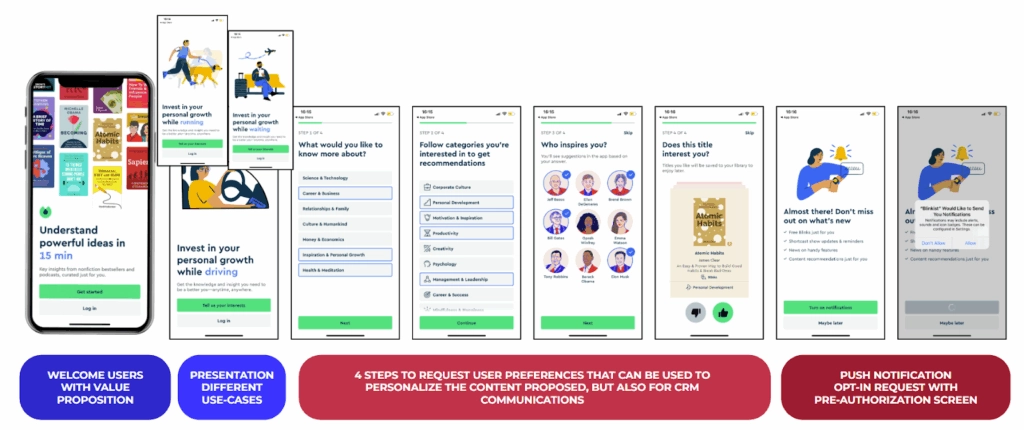
- Welcome page: "Understand powerful ideas in 15 minutes" with visuals of their best books
- Use cases: Shows when you can use the app (while driving, running, waiting)
- Preference collection: What topics interest you? What categories? (Using a Tinder-style swipe interface for book selection)
- Push notification request: Pre-permission screen saying "Don't miss out on what's new"
- Registration: Only after establishing value
Each screen builds on the previous one. By the time they ask for permissions or registration, users understand the app and want to say yes.
The good: hvv switch (Hamburg mobility app)
Hamburg's mobility app built trust through radical transparency:
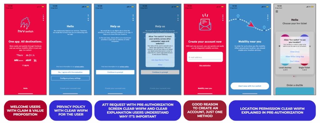
- Welcome page: "One app, all destinations"
- Privacy + ATT: Pre-permission screen that says "Help us — we'd like to use digital ads to draw the attention of other Hamburg residents to our app." They're explicitly appealing to local pride
- Account creation: Clear value proposition for why you need an account
- Location permission: Pre-screen explaining "See vehicles around you"
They explicitly appealed to local identity to explain why they wanted ATT access. Users appreciate honesty. It works.
The good: Paired (relationship app)
Paired's flow combines preference collection, trust-building, and conversion seamlessly. Their paywall moment: "7-day free trial. In 5 days we'll remind you. In 7 days you'll be charged."
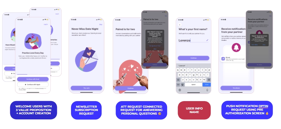
- Welcome with three value propositions
- Immediate account creation (essential for their use case)
- Newsletter opt-in
- ATT request with pre-screen
- Personal information collection
- Push notification request: "Notifications from your partner — you don't want to miss those"
- Paywall with transparent trial: "7-day free trial. In 5 days we'll remind you. In 7 days you'll be charged."
That transparency — telling users exactly when they'll be charged — builds trust rather than eroding it. The best paywalls don't feel sneaky.
The 37% improvement that changed everything
One of Lorenzo's clients was running paid acquisition but seeing poor trial conversion. Users were downloading and not starting trials. After analyzing the onboarding, the problems were clear: a visually unappealing registration page, an unclear value proposition, and confusing permission requests stacked back to back.
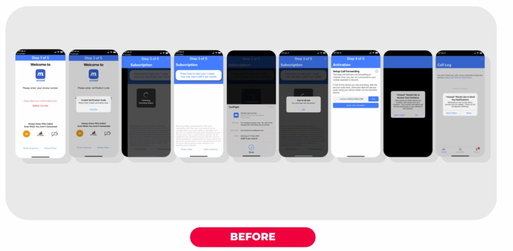
The redesigned onboarding included a clear welcome screen, simplified registration, a paywall emphasizing "Don't miss calls ever again — start your 30-day free trial," and contextual permission requests.
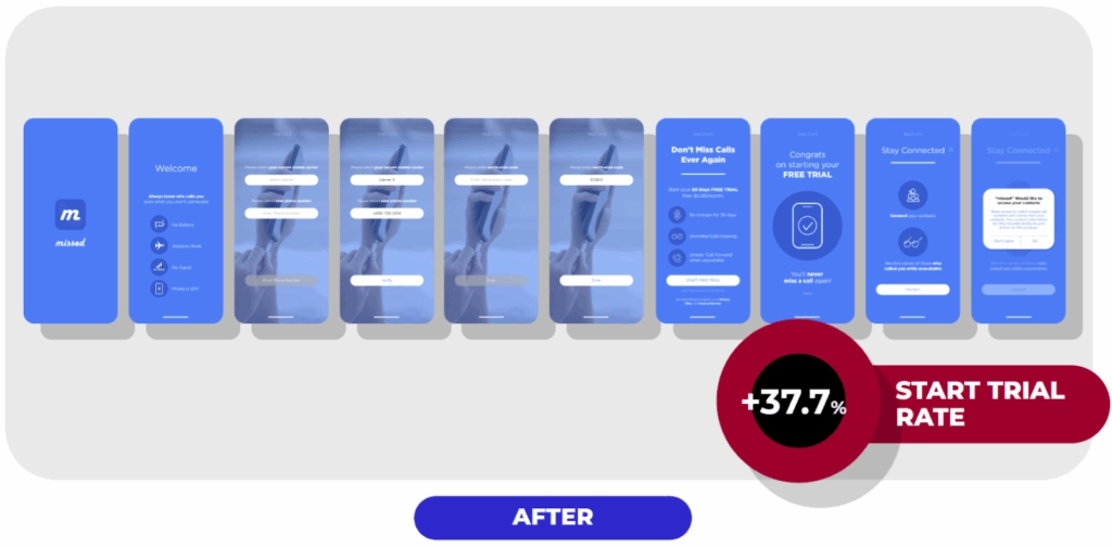
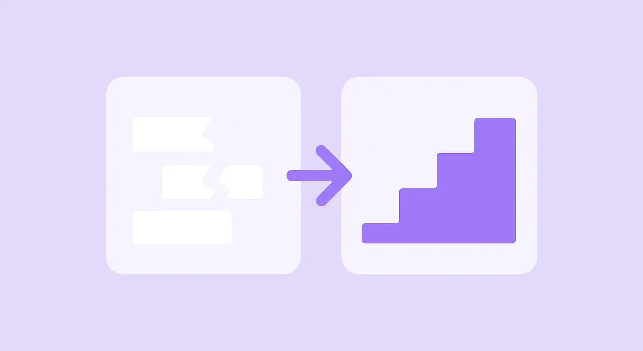
Result: 37% increase in trial start rate. Same traffic volume. Completely different outcome.
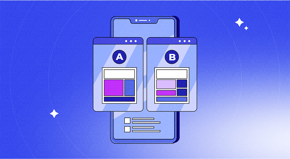
This is what A/B testing your onboarding makes possible — you don't need a better product or more budget. You need to know which version of your flow converts, and iterate from there.
📋 Want to run your own onboarding experiments?
We've compiled 81+ onboarding A/B test ideas — covering flows, messaging, permission screens, personalization, social proof, UI previews, and first-task activation — into a free checklist used by mobile growth teams.
Download the onboarding A/B testing checklist
The principles behind every high-performing onboarding
Based on patterns across hundreds of apps, here's what consistently works:
Be polite and welcoming first. Your users chose you over competitors. Acknowledge that before making demands.
Always answer "what's in it for me." Every request — permissions, registration, payment — needs a clear user benefit. Don't just ask for push notifications; explain what valuable information they'll receive.
Use pre-permission screens for everything. ATT, push notifications, review requests. Pre-screens let you explain context, filter out definite decliners (preserving your one-time official prompt), and find better moments to re-ask.
Use personalization as a conversion tool. Asking for a user's name — even if you don't immediately use it — can lift activation by 13%. Asking for preferences creates investment before you ask for anything in return.
Add a loading screen before your paywall. "Analyzing your preferences, building your plan..." with social proof while it loads. It makes personalization feel earned, and social proof at a high-attention moment reduces trust friction right before purchase.
Give users control, always. A "skip" or "maybe later" option makes users feel respected — even if most don't take it. Control reduces resistance.
Don't stack permission prompts. Space them out. Provide context. Never bombard users in the first 15 seconds.
Test everything. A gaming app needs different onboarding than a fitness app. A subscription app differs from an e-commerce app. What works for one app fails for another. The only way to know is to experiment — and building onboarding flows that convert requires iteration, not guesswork.
Remember Bill
Bill deleted your app. But the version of Bill who experienced a well-designed onboarding — one that welcomed him, explained the value, asked intelligently for permissions, and made the paywall feel like a natural next step — that Bill is now a paying subscriber.
The difference between those two outcomes isn't your product. It's the 60 seconds between download and first real session.
Your job is to design those 60 seconds deliberately. Onboarding is where retention, monetization, and user trust are all won or lost at once.
Want to build and test onboarding flows without writing code? Adapty's onboarding builder lets you ship variants, run A/B tests, and track 20+ metrics — all without an app update.