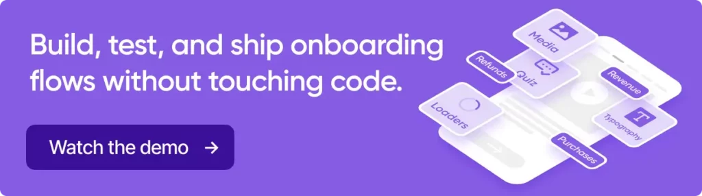
This article is based on a webinar presented by Lorenzo Rossi, co-founder of Replug, an app marketing agency specializing in mobile user acquisition, CRM, and app store optimization. Adapty hosted the webinar as part of the series on mobile app monetization strategies. Watch the webinar recording on our YouTube channel.
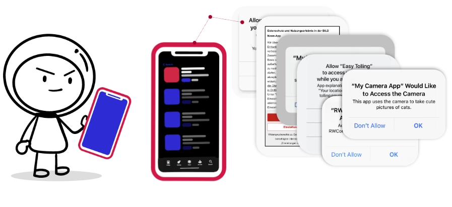
Picture this: Bill downloads your app, excited to try it out. Within 15 seconds, he’s bombarded with permission requests — ATT prompt, privacy policy, push notifications, location access, camera access, contacts. Bill’s face goes from curious to annoyed. He deletes your app after one session.
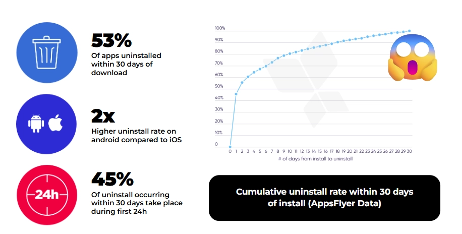
If this sounds familiar, you’re not alone. According to recent data, 53% of apps get uninstalled within 30 days of download, and 45% of those deletions happen within the first 24 hours. The culprit? Poor user onboarding.
I’ve spent years working with mobile apps at Replug, and I’ve seen this pattern repeat endlessly. The thing is, most app developers know onboarding matters. But knowing and executing are two different games entirely. So let me walk you through what actually works — not theory, but patterns I’ve seen succeed across dozens of apps.
Why user onboarding matters
Three forces have converged to make onboarding more critical than ever:
Users are ignorant. Not in a pejorative sense — they simply don’t understand how your app works. They download it with a vague idea and expect immediate clarity. You have seconds, not minutes, to make things click.
Privacy requirements have exploded. ATT on iOS, upcoming changes on Android, GDPR in Europe. Every platform now demands explicit permission for everything. These interruptions fracture the user experience unless you design around them intentionally.
Monetization can’t wait. You need revenue to keep building. The old approach of “let them use it for weeks, then ask for money” doesn’t work in competitive markets. Onboarding has become your first real monetization opportunity.
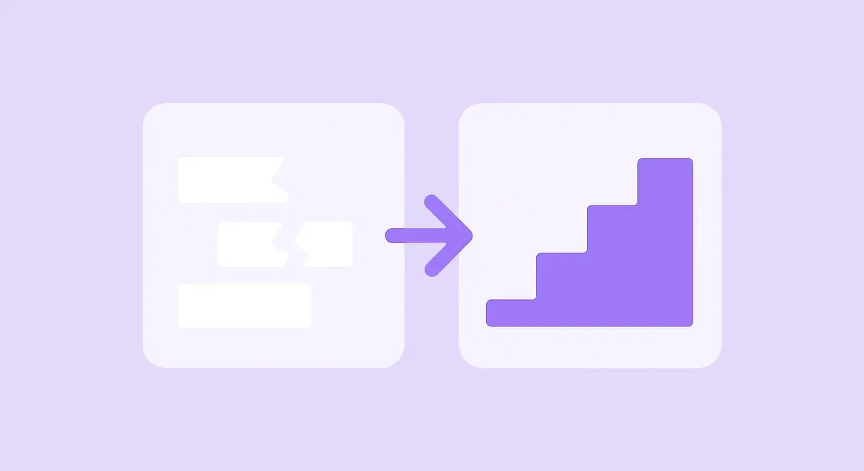
What good onboarding actually achieves
Let’s break down the concrete benefits, divided into product and marketing perspectives:
Product benefits
1. Welcome your users
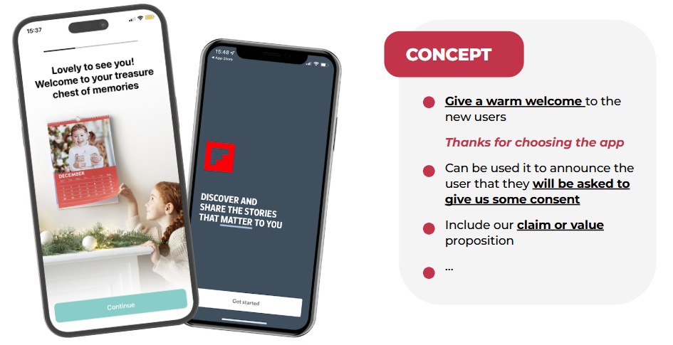
This seems obvious, but most apps skip it entirely. A simple “Thanks for choosing us” page sets the tone. When PhotoSì says “Lovely to see you — welcome to your treasure chest of memories,” it’s cheesy, sure. But it works. You’re establishing warmth before making demands.
2. Explain your core features
One of our clients had a feature that made users incredibly sticky once they tried it. We added one onboarding screen explaining this feature. Now, the users wanted to try it and knew where to find it.
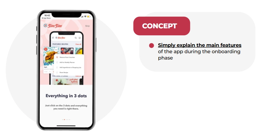
If something is crucial to your value proposition, show it early. Don’t assume users will discover it organically.
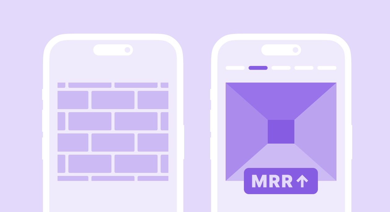
3. Prevent uninstalls and limit one-session users
When users understand what they downloaded and feel welcomed, they stick around. Apps with structured onboarding see significantly lower day-1 churn.
Marketing benefits
4. Request permissions intelligently
Here’s where pre-authorization screens become your best friend. Instead of immediately showing Apple’s ATT prompt, show your own screen first explaining what IDFA tracking means and why accepting benefits them.

Adidas Runtastic nailed this. They literally explained the technical concept of IDFA before asking for permission. This approach:
- Creates awareness and knowledge
- Gives you a chance to explain the “what’s in it for me”
- Lets users who will say “no” skip without triggering the official prompt (which you can only show once)
5. Increase push notification opt-in
Roughly 50% of users decline push notifications on iOS. That means you can’t reach half your audience with updates, offers, or engagement nudges. Pre-permission screens significantly improve these numbers.
The Economist uses a simple visual: “Stay up to date — enable push notifications to receive updates from The Economist.”
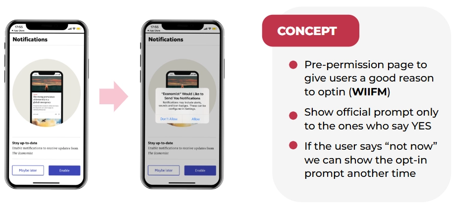
The app offers a “skip” option. If users skip, you don’t show the official prompt yet — you wait for a better moment. For a delivery app, that’s when they place their first order. For a news app, it’s after they read their first article.
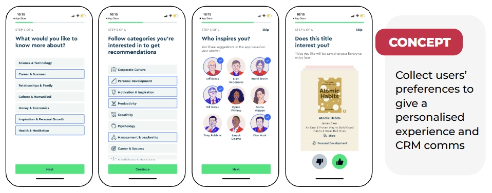
6. Collect user preferences and registration
When you know what users care about, you can personalize everything — their feed, your push notifications, your email campaigns, your product recommendations.
Blinkist asks what type of books you like and what you want to learn about. E-commerce or fashion apps can ask about favorite brands and sizes. All this can be used for future communication. One clever trick: after users spend time selecting preferences, present the account creation page with “Sign up to save your interests.” It’s a small nudge that converts remarkably well.
7. Create immediate monetization windows
Subscription apps increasingly show paywalls during onboarding — often after explaining value but before full app access. This isn’t aggressive; it’s strategic. You’re creating a moment where the user understands what they’re getting and can make an informed decision about upgrading.
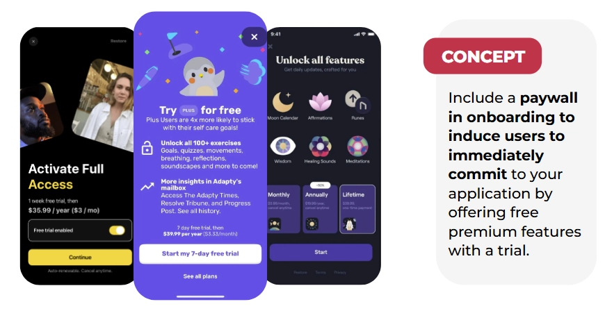
The paywall placement varies by app type, but the principle holds: monetization conversations start early now, not after weeks of free use. Check out this article to learn more about different types of paywalls.
Real app onboarding examples: Bad to good
The bad: permission overload
I downloaded an app recently that immediately hit me with:
- Location permission request
- Push notification opt-in
- Privacy policy acceptance screen
- ATT prompt
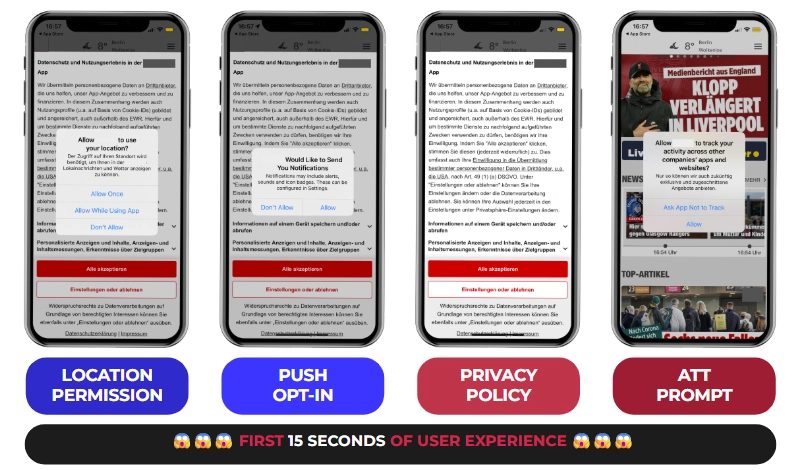
All within 15 seconds. Don’t do this. Your users aren’t prepared, they don’t understand why you need these permissions, and you’re burning through one-time prompts before establishing any value.
The good: Blinkist
Blinkist’s onboarding is a masterclass:
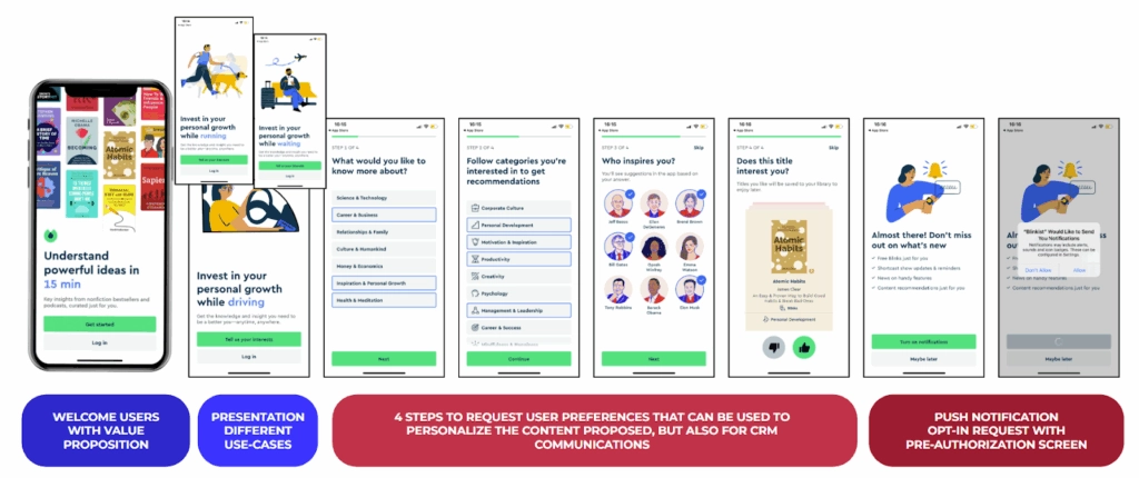
- Welcome page: “Understand powerful ideas in 15 minutes” with visuals of their best books
- Use cases: Shows when you can use the app (while driving, running, waiting)
- Preference collection: What topics interest you? What categories? (Using a Tinder-style swipe interface for book selection)
- Push notification request: Pre-permission screen saying “Don’t miss out on what’s new”
- Registration: Only after establishing value
Each step builds on the previous one. By the time they ask for permissions or registration, you understand the app and want to say yes.
The good: hvv switch (Hamburg mobility app)
hvv switch impressed me with their honest approach:
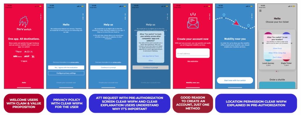
- Welcome page: “One app, all destinations”
- Privacy + ATT: Pre-permission screen that says “Help us — we’d like to use digital ads to draw the attention of other Hamburg residents to our app.” They’re explicitly appealing to local pride
- Account creation: Clear value proposition for why you need an account
- Location permission: Pre-screen explaining “See vehicles around you”
Honesty works. They’re not hiding what they need or why. Users appreciate transparency.
The good: Paired (relationship app)
Paired combines monetization with preference collection brilliantly:
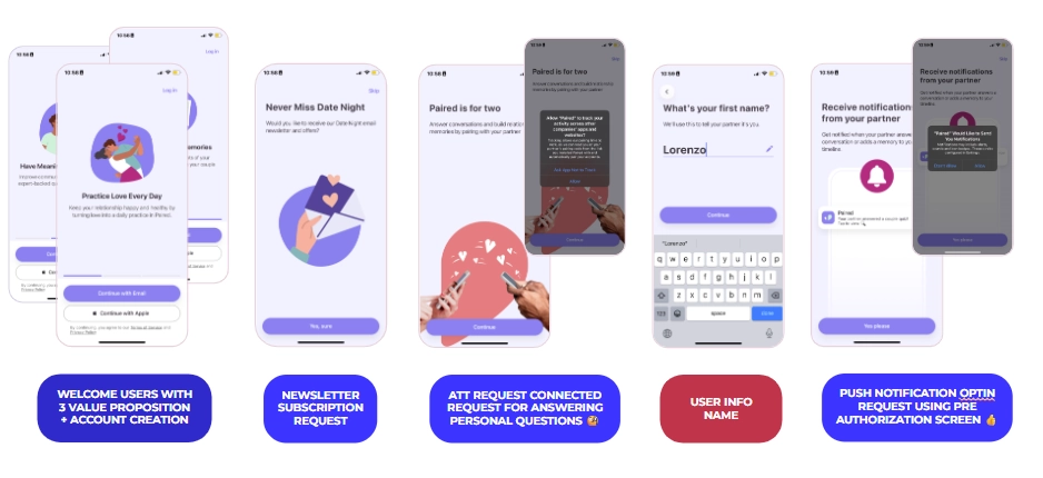
- Welcome with three value propositions
- Immediate account creation (essential for their use case)
- Newsletter opt-in
- ATT request with pre-screen
- Personal information collection
- Push notification request: “Notifications from your partner — you don’t want to miss those”
- Paywall with transparent trial: “7-day free trial. In 5 days we’ll remind you. In 7 days you’ll be charged.”
That last point is crucial. The best paywalls don’t feel sneaky. They clearly explain when charges happen.
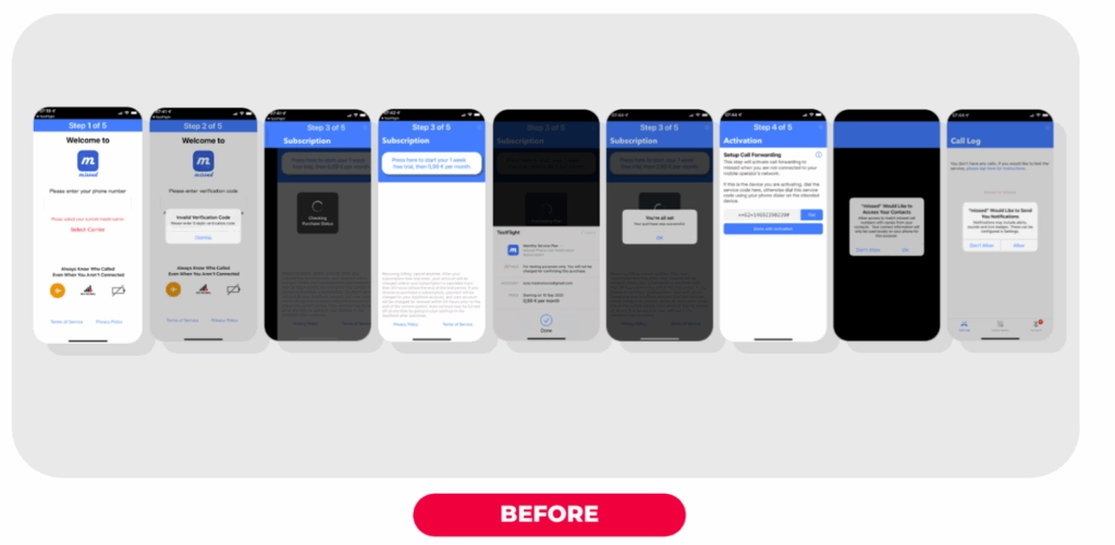
The 37% improvement that changed everything
One of our clients ran a paid acquisition campaign with terrible trial conversion rates. Users were downloading but not starting trials. We analyzed their onboarding and found several issues:
- Visually unappealing registration page
- Unclear value proposition
- Confusing permission requests
We redesigned the onboarding with:
- Clear welcome screen with value props
- Simplified registration
- Well-designed paywall emphasizing “Don’t miss calls ever again — start your 30-day free trial”
- Streamlined permission requests with context
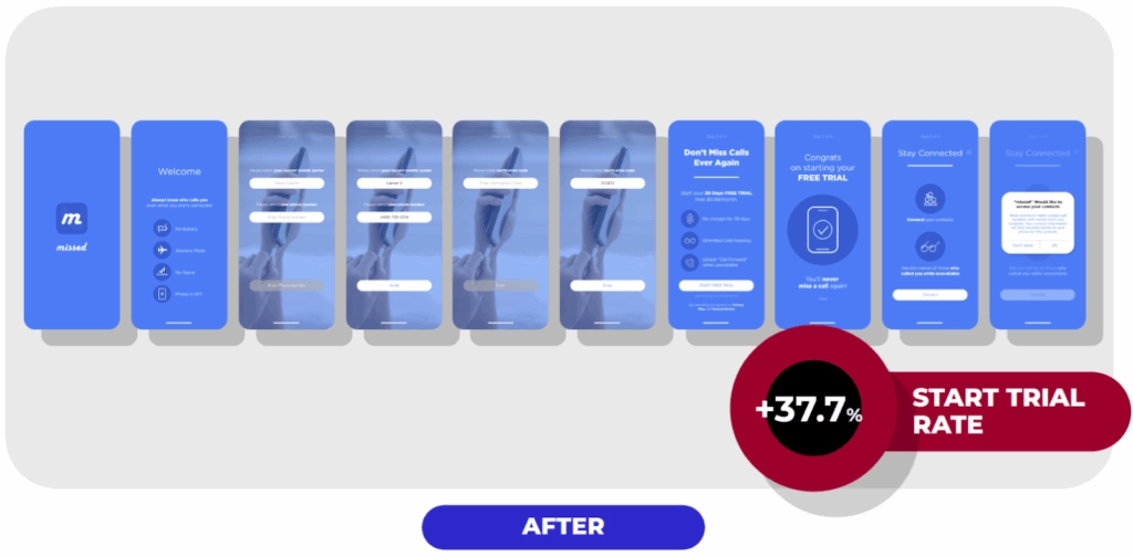
Result: 37% increase in trial start rate. More downloads converted to trials, which meant more opportunities for users to experience the product and convert to paid.
What you should do
Based on hundreds of apps I’ve analyzed, here’s what consistently works:
Be polite and welcoming. Your users chose you among competitors. Show gratitude.
Always specify “what’s in it for me.” Every request should come with a clear user benefit. Don’t just ask for push notifications — explain what valuable information they’ll receive.
Use pre-permission screens religiously. This is especially critical for ATT, push notifications, and review requests. Pre-screens let you:
- Explain why you need the permission
- Filter out users who will say no (preserving your one-time official prompt)
- Choose better moments to ask again
Consider contextual onboarding. Guide users through your app as they use it, rather than explaining everything upfront.
Give users control. Always offer a “skip” or “maybe later” option. Users want to feel in control, even if you prefer they complete every step.
Add a paywall to create immediate monetization opportunities. Don’t be shy about this — if you’ve explained value well, asking for money makes sense.
Create a seamless experience. Onboarding isn’t separate screens duct-taped together. It’s one cohesive journey from download to active use.
What you should avoid in app onboarding
Don’t show multiple permission prompts back-to-back. Space them out. Provide context. Never bombard users in the first 15 seconds.
Don’t be overly formal. Onboarding is your chance to show personality. Use your actual brand voice, not corporate speak.
Don’t treat all requests equally. Prioritize based on your app type. A weather app absolutely needs location. A news app can ask for that later (or never).
Don’t forget users who say “no” to pre-screens. They declined in that moment, not forever. Find better moments to ask — like when they’re actually using the feature that needs that permission.
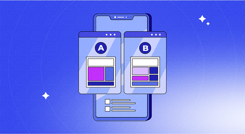
Don’t assume — test everything. Gaming apps need different onboarding than fitness apps. Subscription apps differ from e-commerce apps. What works for one app may fail for another. Test your assumptions.
Why Bill matters
Remember Bill from the beginning? That story matters because every day, thousands of users have Bill’s experience with apps. They download something promising, get overwhelmed by demands, and delete.
Your job is to guide users from curiosity to comprehension to commitment. Onboarding is where that journey begins.
Get this right, and you’ll see better retention, higher monetization, more permissions granted, and ultimately, sustainable growth. Get it wrong, and well — Bill deletes your app, and you never get a second chance.