Why Japanese ASO creatives need a different strategy


In today’s saturated app marketplace, App Store Optimization (ASO) is a battlefield for user attention. Nowhere is this more apparent than in Japan, where ASO creatives must earn instant trust, explain complex features, and visually communicate cultural familiarity.
For Western companies used to designing for the US App Store, the Japanese market presents a surprising and often misunderstood challenge: screenshots, icons, and preview videos that work in the US can fail spectacularly in Japan.
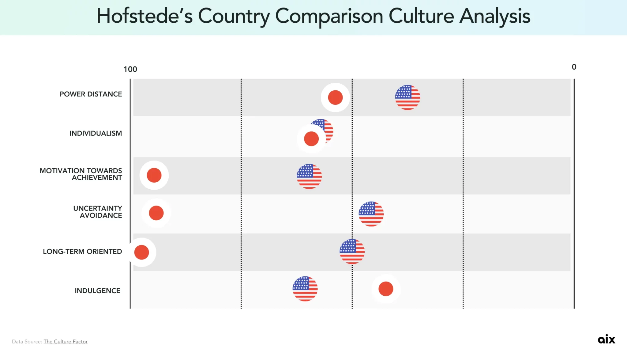
Based on Hofstede’s Country Comparison Culture Analysis, Japan and the United States hugely differ in Motivation Towards Achievement (Japan: 95 vs. US: 62), Uncertainty Avoidance (Japan: 92 vs. US: 46), Long-Term Orientation (Japan: 100 vs. US: 50), and Low Indulgence (Japan: 42 vs. US: 68). This is what makes ASO in Japan difficult for those who are not familiar with the culture.
In this article Jamie Lou Borile from aix compares US and Japanese ASO creative standards and unpacks the strategic implications for global teams looking to enter Japan successfully. For this article, she'll focus more on screenshot creatives to show the difference between US and Japan ASO creatives preferences and expectations.
Visual language: From minimalism to information density
US screenshots often emphasize:
- Simplicity and white space
- Short taglines (“Send money instantly”)
- Large UI visuals with minimal annotation
In contrast, Japanese screenshots favor:
- Information-rich layouts with layered captions
- Explanatory labels, annotations, and callouts
Japanese users are accustomed to consuming dense information quickly, and they expect screenshots to act as a tutorial, ad, and trust signal – all at once.
Strategic Advice:
Design Japanese screenshots as visual infographics. Every frame should answer: “What is this? How does it help me? Can I trust it?”
Copy strategy: Clarity > Emotion
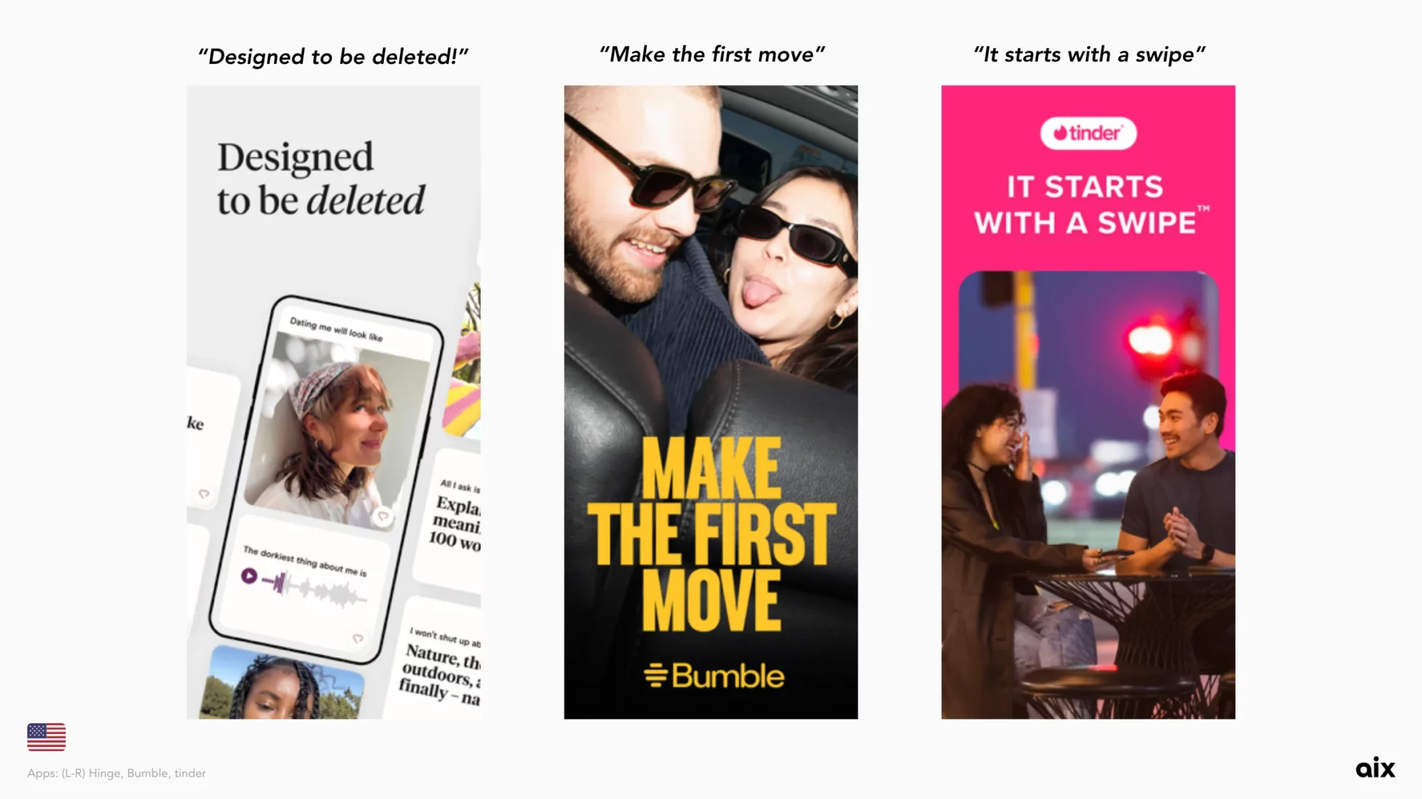
In the US, app visuals often aim for emotional resonance:
But Japanese users tend to favor direct, actionable copy:
Literal explanations convert better than abstract inspiration.
Why?
Japanese consumers have lower tolerance for ambiguity in UX. With thousands of alternatives available, they often seek function-first clarity – even at the expense of design elegance.
Strategic advice:
Localize headlines to be clear, specific, and benefit-driven. Translate the function, not just the feeling.
Use of social proof and cultural symbols
In the US, social proof is often subtle (e.g., a review star in the corner). In Japan, it’s a conversion engine.
While the top matching apps in the US opted for short but impactful taglines, top-performing matching apps in Japan featured track record data like number of downloads and “No.1”.
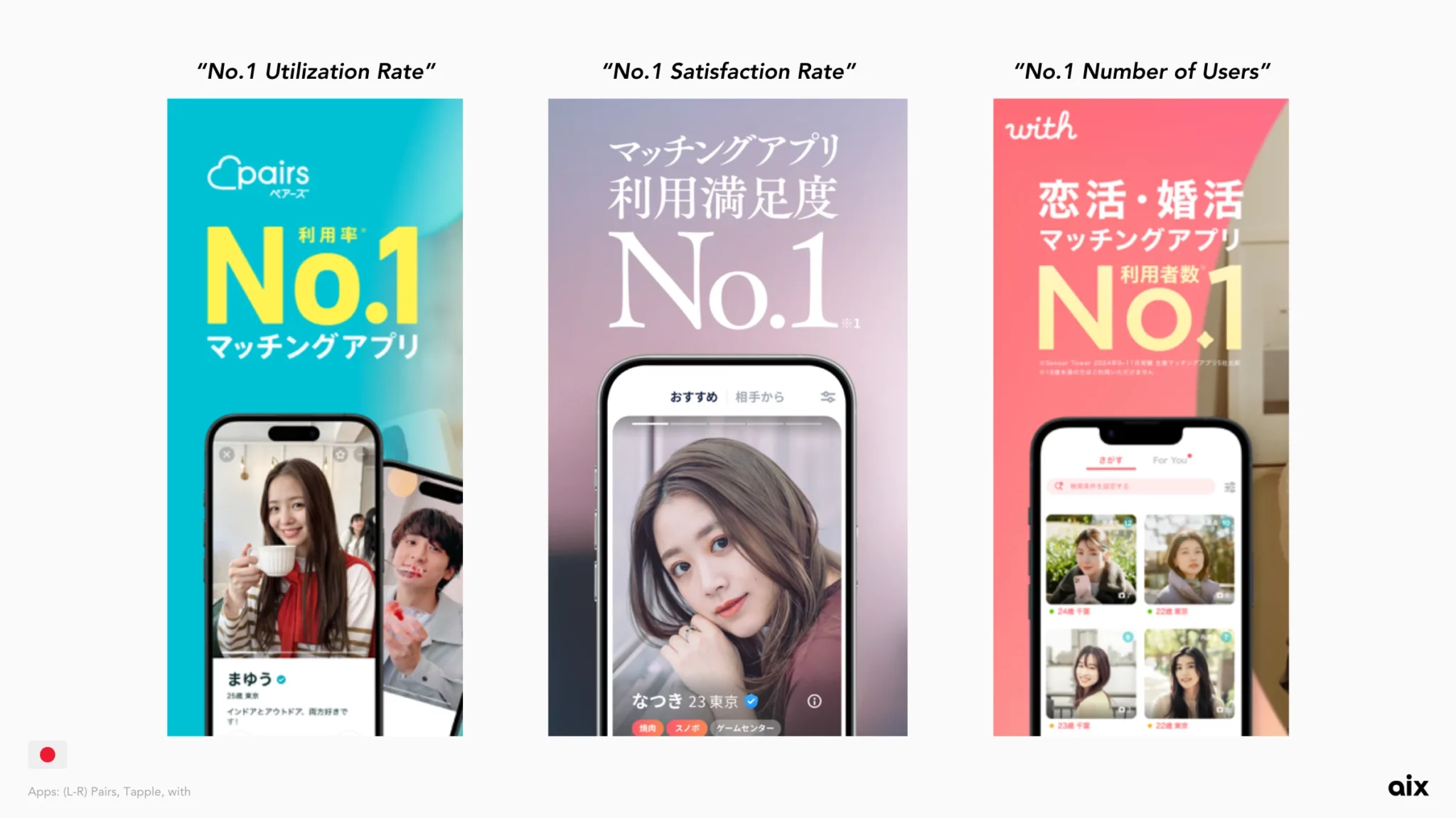
The example above are the top 3 matching apps in Japan, all claiming to be No.1!
- Pairs: No.1 Utilization Rate
- Tapple: No.1 Satisfaction Rate
- with: No.1 Number of Users
Strategic advice:
Don’t hesitate to include badges, download stats, and limited-time markers in your Japanese creatives. They’re persuasive design elements.
Conclusion: ASO Localization in Japan is about full adaption
In Japan, app store creatives must be reimagined from the ground up to match user expectations and cultural context.
Key takeaways:
- Treat ASO creatives as cultural products
- Build creatives that teach, reassure, and convince
- Use local design standards to stay in tune with Japanese users
Entering Japan? Start by speaking their visual language.
If you're interested in launching your app in Japan, check our previous posts:
To discover more about Japan's visual preferences and even get some assistance, explore aixpost.com or reach out to Jamie on LinkedIn!