Why your churn rate looks different depending on what you're measuring
TL;DR:
Churn is three different metrics pretending to be one. Plan duration, acquisition method, and which renewal checkpoint you're measuring all produce different numbers — and conflating them is how teams end up optimizing the wrong thing.
Every founder I've talked to has had the same conversation at some point: two people looking at churn data for the same app, getting different numbers, and arguing about which one is right.
Both are usually right. That's the problem.
Churn is context-dependent. The number you get varies based on the plan type you're analyzing, whether subscribers came in through a trial, which renewal checkpoint you're measuring, and whether you're looking at subscriber counts or revenue. Change any one of those variables, and you get a completely different picture.
Adapty's State of in-app subscriptions 2026 — based on $3B in subscription revenue across 16,000+ apps — makes this concrete with category-level and plan-level data that shows just how much these dimensions diverge. Let's unpack the main ones.
How does plan duration change your churn number?
This is where most teams get tripped up first. They pick one retention curve and treat it as the baseline for the whole product. The plan duration alone can make that number misleading.
Weekly plans churn fastest. Based on 2025 data across 16,000 apps, only about 5% of weekly subscribers are still active after one year. By day 30, 65% have already churned. That's not a product problem — that's the nature of a low-commitment billing cycle. Users opt in easily. They also opt out easily.
Monthly plans sit in the middle. Around 43% of monthly subscribers are still active at day 90. After 12 months, roughly 17% remain. Better than weekly, but the drop-off between month one and month twelve is steep.
Annual plans hold almost everyone through year one — then spike at renewal. Annual churn is back-loaded. You keep almost everyone through year one, then take the hit at renewal. That means your one-year retention looks strong, but you take a real hit the moment billing cycles over.
| Plan Type | Day 30 Retention | Day 90 Retention | One-Year Retention | Key Churn Pattern |
| Weekly | ~35% | ~15% | ~5% | Front-loaded — most churn in first 30 days |
| Monthly | ~65% | ~43% | ~17% | Steady erosion across billing cycles |
| Annual | ~90%+ | ~90%+ | Varies by category | Back-loaded — spikes at renewal point |
The practical implication: if you're running a mixed plan offering (weekly + monthly + annual), you need separate retention curves for each one. Blending them into a single churn metric will average out signals that should be treated very differently.
Does the acquisition method (trial vs. direct) affect churn?
Yes — and the direction of that effect depends heavily on your category.
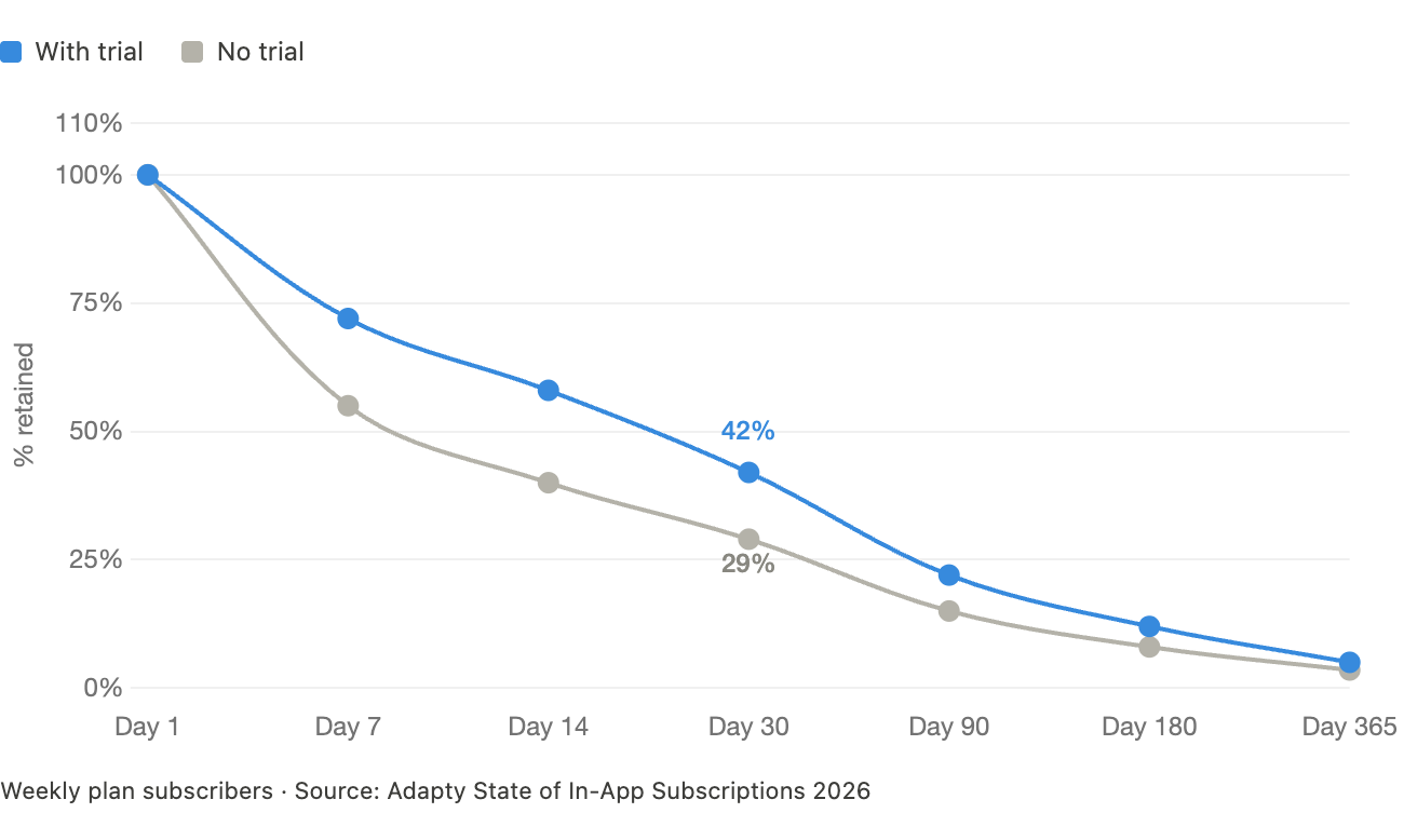
The conventional wisdom says trials improve retention. You've heard it: let users experience the product, reduce friction, convert more committed subscribers. The Adapty 2026 data partly supports this. On weekly plans, trials boost one-year retention by 43%. At the first renewal checkpoint, trial users retain 8–60% better than direct buyers, depending on plan type.
But here's what the same data shows for other categories:
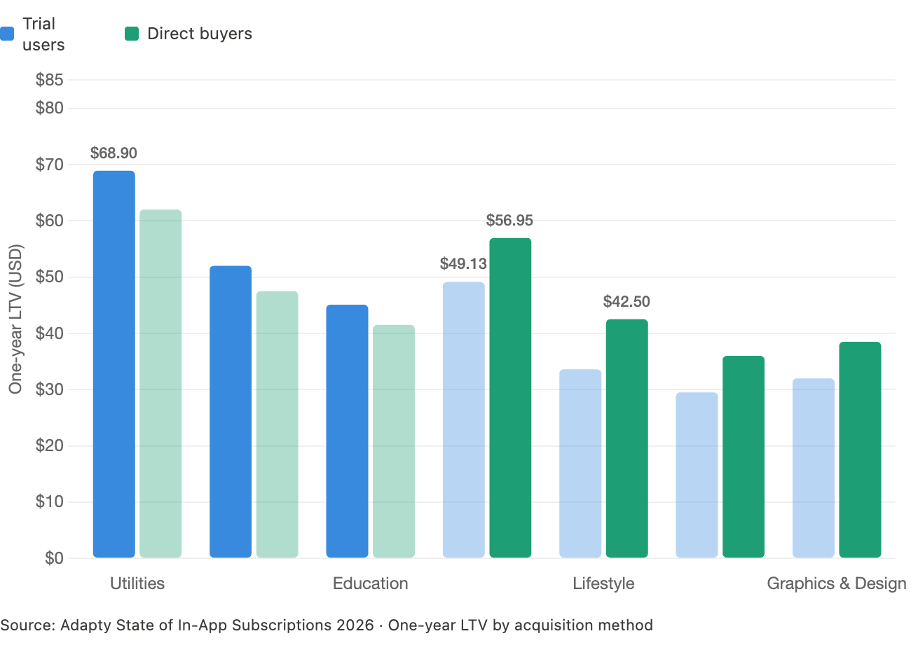
What this means for churn measurement: if your trial cohorts are churning faster than your direct cohorts, you're not measuring a retention problem. You're measuring an acquisition quality problem. Trials in certain categories attract users who are browsing, not buying. Those users inflate your trial starts and drag down your conversion and retention metrics — even if your product is delivering value.
Trial-to-paid conversion tells you who converted. Retention by acquisition method tells you whether those conversions were worth anything. If your trial cohorts are churning faster than your direct cohorts, you're not measuring a retention problem — you're measuring an acquisition quality problem.
What's the difference between renewal rate and retention rate?
These get used interchangeably. They're not the same thing, and confusing them changes how you diagnose problems.
Renewal rate measures the percentage of subscribers who renew at each billing cycle. It's a point-in-time snapshot: Paid → Renewal 1, Renewal 1 → 2, Renewal 2 → 3.
Retention rate measures the percentage of subscribers who are still active after a defined time window — typically 30 days, 90 days, or one year.
Both matter. Neither is sufficient on its own.
Here's a scenario where they diverge: imagine a monthly app with a 59% first-renewal rate. That's roughly in line with the SOIS 2026 benchmark for all categories globally. But if each renewal loses another 15–20% of remaining subscribers, your one-year retention hits ~17%. That app looks reasonably healthy renewal-by-renewal, but loses 83% of its subscriber base across 12 months.
Renewal rate tells you where subscribers are dropping off. Retention rate tells you what you end up with. You need both numbers to build an accurate picture.
| Metric | What it measures | When to use it | Blind spot |
| Renewal rate | % of subscribers who renew at each cycle | Diagnosing where churn spikes | Doesn't show cumulative loss over time |
| One-year retention | % still active after 12 months | Understanding long-term subscriber value | Masks where in the lifecycle loss occurs |
| Trial-to-paid conversion | % of trials that become paying subscribers | Evaluating paywall effectiveness | Doesn't account for post-conversion churn quality |
Does category change what 'normal' churn looks like?
Significantly. The SOIS 2026 data makes this concrete across eight App Store categories, and the variance is wide enough that cross-category benchmarks are nearly useless for individual apps.
Productivity retains best overall: 14% of users are still active after one year across all plan types — the highest of any category. Productivity apps create habitual daily use and carry enough switching cost to hold subscribers.
Utilities lead on annual plan retention, specifically, at 22.1% one-year retention. Utilities also generate the highest per-subscriber LTV at $68.90 over 12 months for trial users.
Health & Fitness behaves differently from every other category. It's the only one where annual plans dominate revenue (60.6% share) and continue growing. Users in this category either buy on Day 0 or on Days 4–7 — suggesting that trials work because they give the product time to demonstrate results before the commitment decision.
Entertainment shows the most extreme price-retention gap: low-priced apps retain 2x better than high-priced ones on monthly plans. This is the category where pricing churn is most visible.
How does churn vary across regions?
Region affects churn in two ways: through refund behavior (which is a form of immediate churn) and through subscriber lifetime value, which reflects how long people actually stay.
North American subscribers convert at higher rates and generate more LTV. Install-to-trial rate in North America is 14.5%, vs. 7.6–10.2% in other regions. North American install LTV is roughly 2x the global average across most categories.
European subscribers are the most price-sensitive at renewal. Low-priced European monthly apps see first-renewal rates 40% higher than high-priced apps in the same region. European subscription prices jumped 18% year-over-year in 2025, so this sensitivity has real implications for churn if you're raising prices in that market.
APAC has the most extreme refund-as-churn behavior. Photo & Video trial refunds globally sit at 6.4% of revenue — but in APAC, that number spikes to 14.1%, driven largely by Korea's consumer-friendly refund policies. In effect, a significant share of 'paid subscribers' in that region are reversing their decision within days.
| Region | Install-to-Trial Rate | Trial Refund Rate (Photo & Video) | Notable Pattern |
| North America | 14.5% | ~3–4% | Highest conversion and LTV globally |
| Europe | 7.6–10.2% | ~4–5% | Most price-sensitive at renewal; prices up 18% YoY |
| APAC | 7.6–10.2% | 14.1% (spiking in Korea) | Highest refund-as-churn risk for trial plans |
| MEA | 7.6–10.2% | 2.5–3.1% (lowest globally) | Best refund profile; lowest immediate churn |
Should I be worried about refunds as a separate churn signal?
Yes. Refunds are a churn event that most retention dashboards don't capture correctly, because they happen outside the normal subscription lifecycle.
The SOIS 2026 data shows refunds can cost up to 14% of subscription revenuein the worst-case scenarios. Globally, the average refund rate is 8.3% across all categories. The variance by category and region is wide:
- MEA has the lowest refund rates overall — 2.5% for non-trial, 3.1% for trial subscribers
- Photo & Video globally hits 6.4% trial refund rates
- APAC Photo & Video spikes to 14.1% — the highest category-region combination tracked
What makes refunds particularly damaging from a measurement standpoint is that they distort LTV calculations. If a significant share of your 'conversions' refund within days, your trial-to-paid conversion metric looks healthy while your actual revenue per cohort is much lower. Track refund rates by acquisition method and region, not just in aggregate.
What's the right way to track churn, then?
The short answer: track it in layers, segmented by the variables that actually drive the divergence.
Layer 1: Renewal rate by plan type
Set up separate renewal funnels for weekly, monthly, and annual subscribers. The SOIS 2026 benchmark conversion funnel shows: 11.2% install-to-trial, 27.8% trial-to-paid, 59.2% first renewal, 45.1% second renewal, 37.1% third. That cascade is your reference point — but it only makes sense if you're looking at a single plan type at a time.
Layer 2: Cohort retention by acquisition method
Split trial-converted vs. direct-converted subscribers into separate retention cohorts. If they're diverging, you have an acquisition quality signal. If they're converging, your trial experience is working. Don't blend these numbers.
Layer 3: Refund rate by region and category
Track refunds as a distinct revenue drain, separate from cancellations. A cancelled subscription after 3 months is different from a refunded subscription after 2 days. Both are churn, but they have completely different root causes and fixes.
Layer 4: One-year retention as the summary metric
After you've diagnosed with the layers above, one-year retention is still the most useful single number for understanding subscriber health — as long as you benchmark it against your specific category, not the global average. Productivity at 14% looks very different from Entertainment at ~5–8%.
The bottom line
Churn is a measurement problem before it's a product problem. The same app can generate a 5% one-year retention rate and a 22% one-year retention rate simultaneously — depending on whether you're looking at weekly subscribers or annual ones.
Plan type, acquisition method, category, and region all create real divergence in what retention looks like. The fix isn't a single number. It's building a churn measurement framework that treats these variables as distinct dimensions — and benchmarking each one against the right reference point.
If you're running on blended averages, you're missing the signal.
The category- and region-level benchmarks used throughout this article come from the Adapty State of In-App Subscriptions 2026 report — fully interactive, filterable by category, plan type, and region.
One more thing worth knowing: refunds are a churn event that most dashboards don't capture cleanly. If you want to close that gap without building anything, Adapty's Refund Saver intercepts refund requests automatically and recovers lost revenue without any code or workflows.