What Japanese paywalls look like and why Western strategies won’t work

TL;DR:
Japanese users expect transparency, detailed explanations, and clear value justification in paywalls. Discover why Western strategies fall short and how to adapt for success.
When expanding an app into the Japanese market, many developers assume they can apply their existing Western paywall design and expect similar conversion results.
However, Japan’s approach to app paywalls is fundamentally different from what’s commonly seen in Western markets. From the visual hierarchy to pricing transparency and user psychology, Japanese paywalls cater to a distinct consumer behavior that prioritizes trust, clarity, and perceived value.
In this article by Jamie Lou Borile from aix Inc., we’ll explore the key design differences and why adopting a localized strategy is essential for success.
The role of trust and clarity in Japanese paywalls
Unlike Western paywalls, which often employ aggressive upsell tactics with prominent free trials and countdown timers, Japanese paywall screens focus on building trust.
Key features:
- Detailed explanations. Instead of a brief summary, Japanese paywalls tend to provide thorough descriptions of premium features, ensuring users fully understand what they’re paying for.

- Transparency in pricing. Western apps often push free trials with hidden auto-renewal details. In contrast, Japanese paywalls clearly outline subscription costs, renewal terms, and cancellation policies upfront.

- Minimal hard-sell tactics. While Western paywalls may use urgency tools like limited offers and timers, Japanese paywalls often take a softer approach, focusing on value rather than pressure.

Text-heavy vs. concise paywalls: providing information matters

Japanese users expect comprehensive explanations before making a purchase decision.
- Western apps often rely on minimal text and visually compelling graphics.
- Japanese paywalls contain more text, often including FAQs, step-by-step usage details, and even testimonials.
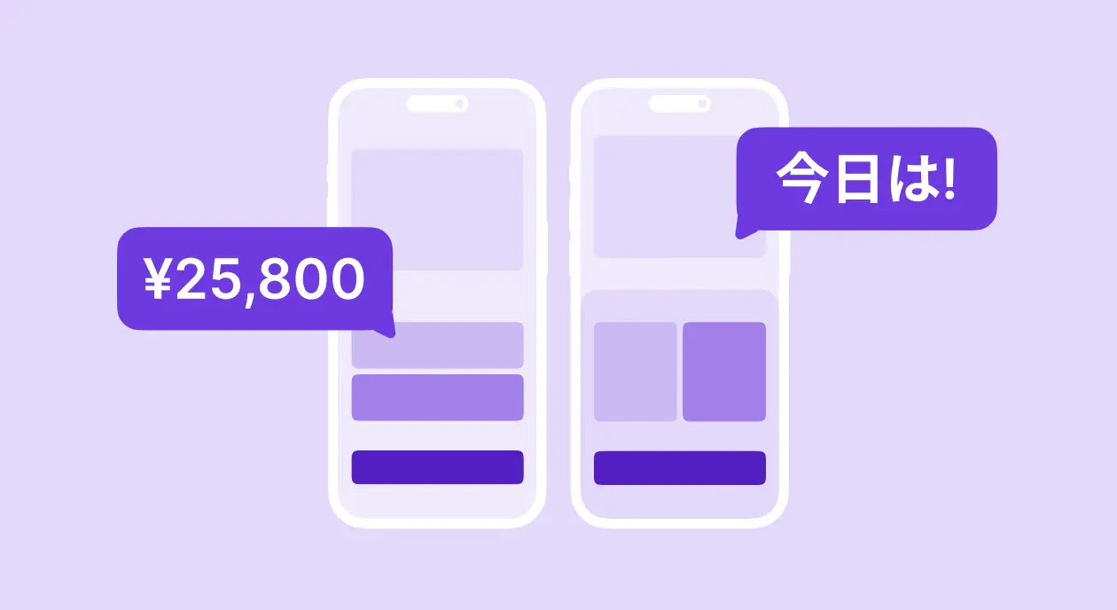
Visual differences: simplicity vs. boldness
A stark contrast between Japanese and Western paywall screens lies in visual presentation.
Western paywall design trends:
- Emphasis on immediate action. Western paywalls often focus on getting users to subscribe quickly, using persuasive messaging and limited-time offers.
- High-contrast CTA buttons. Calls-to-action like "Start free trial" or "Subscribe now" are prominently displayed in bold colors to grab attention.
- Trial-first approach. Many Western apps heavily push free trials, sometimes with auto-renewal enabled by default, making it easier to convert users into paying customers.
- Psychological triggers. Strategies such as FOMO (fear of missing out), social proof (e.g., "Join over 40,000 couples"), and risk minimization (e.g., "Cancel anytime") are commonly used.

Japanese paywall design trends:
- Long-form layouts. Japanese paywall screens tend to be longer, providing extensive information before asking users to commit. They often include detailed descriptions, FAQs, and multiple supporting visuals to ensure clarity.

- Use of tables or comparisons. Subscription tiers are frequently displayed in a table format with precise feature breakdowns.
- Step-by-step justification. Many Japanese paywalls provide a logical step-by-step explanation of why upgrading is beneficial rather than simply listing features.

Why you need a Japan-specific paywall strategy
The nuances of Japanese paywall design reflect deeper cultural and consumer behavior differences. A one-size-fits-all approach that works in Western markets won’t yield the same results in Japan.
Developers looking to optimize conversions should invest in localized UI/UX, pricing models, and communication strategies that align with Japanese user expectations.
Key takeaways:
- Japanese users value transparency, structured layouts, and detailed feature breakdowns.
- Aggressive upselling techniques are less effective than trust-building strategies.
- A thoughtful, localized approach to paywall design will maximize engagement and conversions in Japan.
By treating Japan’s paywall experience as a unique challenge rather than a simple adaptation, app developers can significantly improve their market success. If you're considering expanding your app into Japan, investing in a Japan-specific paywall design is a strategic must, not an afterthought.
This is the second article about Japanese app market. In the previous article, we explored how Japanese apps onboard users. If you want to know more about Japan marketing insights, visit aixpost.
![]()