? Meet our fresh newsletter with hot paywalls that will be delivered to you every month! We dig through hundreds of paywalls and pick the most interesting ones to share with you.
In this issue: paywall tricks that the top grossing and new hot apps use. Could be some cool ideas to try, let’s have a look!
Compare
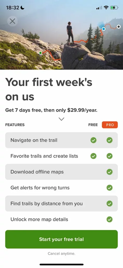
The paywall of the app providing hiking routes AllTrails drew our attention with its comparison table. This practice is commonly used on the web, but it’s quite rare in mobile apps. Still looks convincing and might be worth giving a try.
Build a video paywall
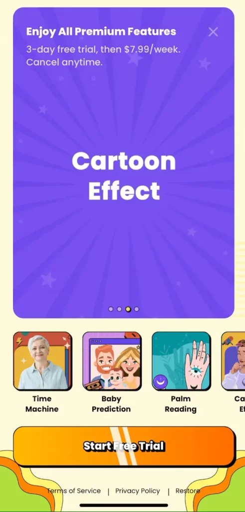
The AI-powered app for photo and video alteration Magic Me shows its work in action with a video paywall.
They demonstrate all their features with videos: aging effect, baby appearance prediction, cartoon effect, and more. This way, the paywall in some sense also onboards the users.
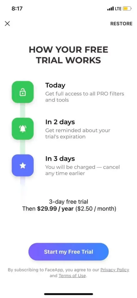
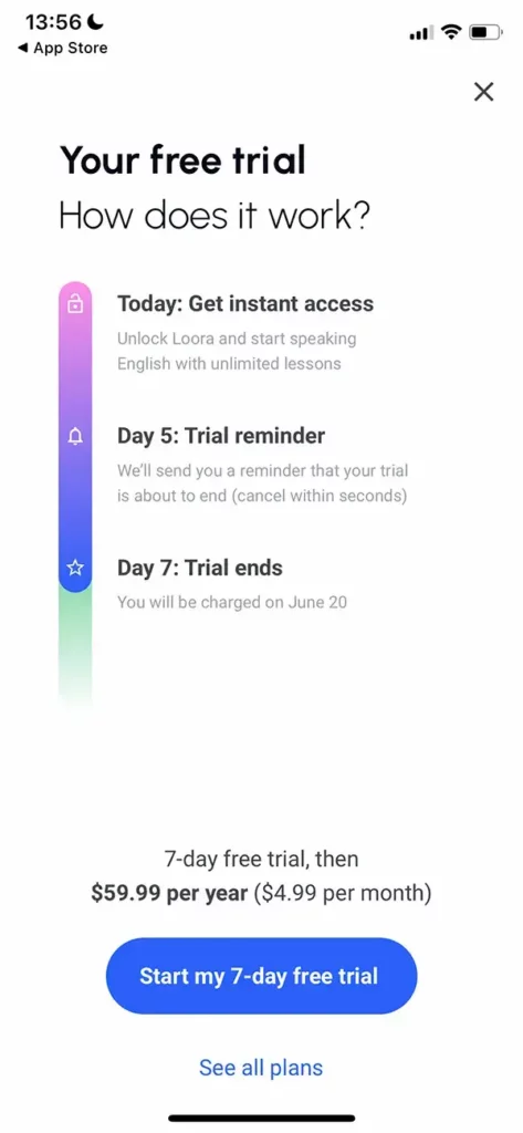
Be nice to your subscribers with a trial end reminder
Get mysterious by hiding plans
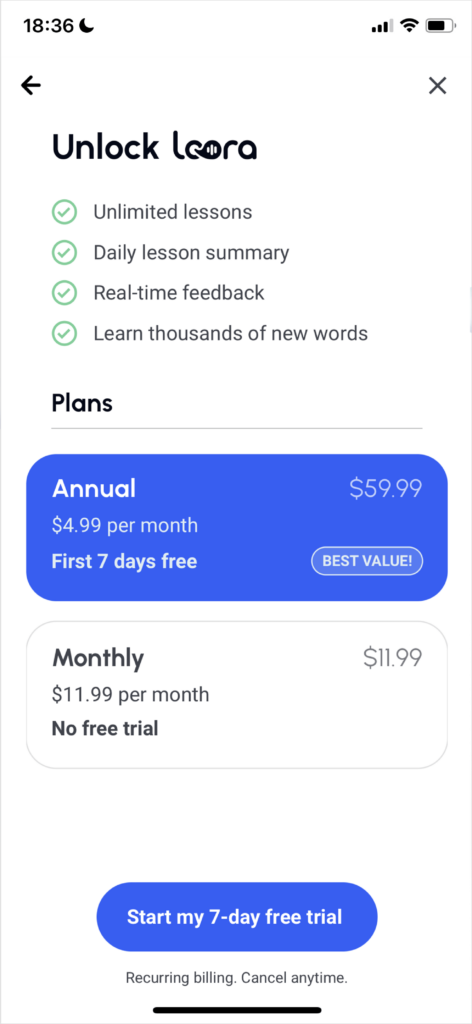
The aforementioned app Loora has another interesting thing on its paywall. Originally, it offers only the annual plan, but you can also find the link “see all plans” below. After hitting it, the user will see another paywall with two products on it: preselected annual subscription and monthly plan.

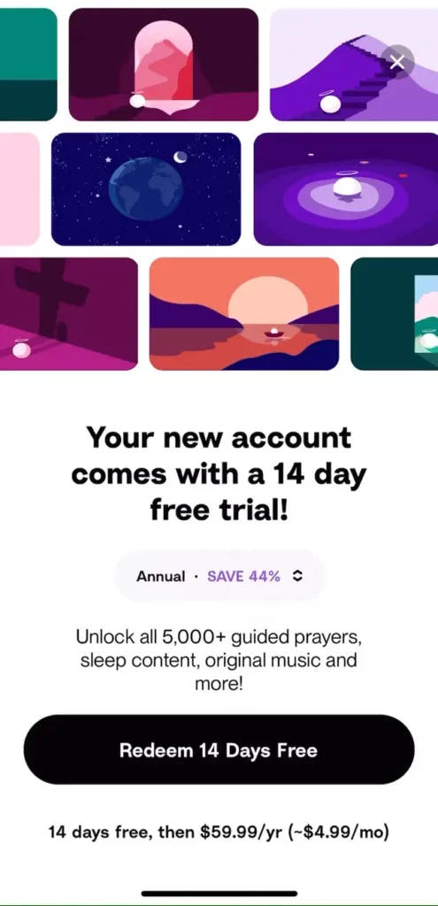
We also spotted another way of hiding plans in the catholic meditation app called Hallow.
Look at these arrows near the annual plan, they allow the user to switch to the monthly subscription. We almost missed it while examining their paywall, so we bet most users choose the annual plan. Though it also looks more attractive than the monthly option, thanks to the 44% discount.
News!
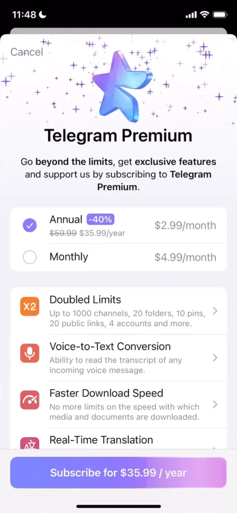
This June the most advanced messenger on the market, Telegram, added the premium plan. Let’s have a look at its paywall.
The paywall looks more like a web-page with the detailed descriptions of what the paid features provide and the ability to expand every feature into a nice preview.
At the end of the paywall, there is a text explaining the reasons for introducing the premium plan.
The messenger provides only the monthly subscription.
