TL;DR
- Your onboarding is the single most critical flow in your app. Screw it up, and users bounce before they see your value.
- Stop selling features. Users don’t care about your “AI-powered algorithm.” They care about saving time, reducing stress, or hitting their goals.
- The right onboarding guides users to their “Aha!” moment fast, reduces friction with psychology, and tests relentlessly to find what converts.
Your onboarding is your first date with the user. If you lead with a boring slide deck about your “proprietary algorithm” or ask for their email before they’ve even seen why your app matters, you’ve already lost them. And unlike dating, you don’t get a second chance.
Most apps treat onboarding as an afterthought. They slap together a few screens, hope users figure it out, and wonder why 80% drop off before hitting the paywall. This approach is a death sentence.
But here’s what makes onboarding so powerful: it’s one of the highest-leverage areas you can optimize. Small changes — a progress bar, a personalized question, a trust signal — can swing conversion rates by double digits. Here’s the guide to building an onboarding flow that converts, backed by real A/B test data from the apps we work with at Adapty.
First principle: Stop selling features. Sell outcomes
The first mistake most apps make happens before users even tap the first button. They showcase features instead of outcomes. Here’s what actually happens when you flip that script.
Don’t sell features during onboarding. Sell the benefit
Nobody cares about your “AI-powered recommendation engine.” They care about finding the perfect workout in 10 seconds or finally sticking to a meditation habit. Speak to the outcome, not the tech stack.
Here’s an example from our experience: in one app from the productivity category, we tested two onboarding approaches: one that showcased features (“unlimited questions,” “fast responses”) and one that emphasized outcomes (“get answers to complex problems instantly”). The outcome-focused version lifted trial conversions by 17% and ARPU by 13%.
First, articulate the pain. Then, show the cure
A powerful onboarding technique is first to articulate the user’s pain point — “Tired of messy notes?” — then immediately follow up with how your app is the solution. This problem-solution framing makes your value proposition crystal clear. When users see their own frustration reflected back at them, they’re primed to believe you have the answer.
You built the app for a reason. The user downloaded it for themselves
Dive deep into what they hope to achieve. Is it to save time? Make more money? Reduce stress? Speak their language, not yours. If your onboarding copy could apply to any app in your category, you’re doing it wrong. Get specific about the transformation your app enables and who it’s for.
But articulating the outcome is only half the battle. The other half is proving you can actually deliver on that promise — and you need to do it in seconds, not minutes.
Second principle: Guide users to the “Aha!” moment fast
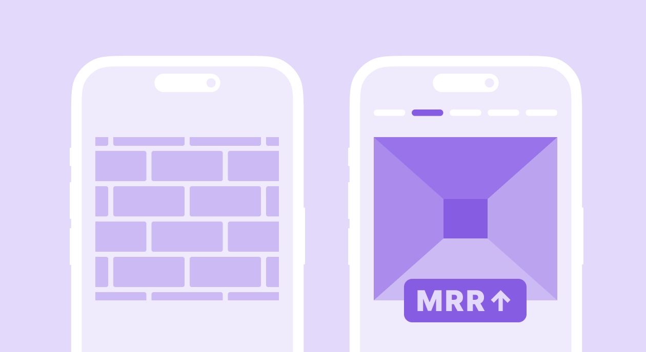
Once you’ve told users what transformation they’ll get, you need to show them. This is where most onboarding flows fall apart. They explain the app’s value in theory, then dump users into a complex interface and hope they figure it out. That’s not onboarding. That’s abandonment.
Don’t hope users stumble upon your app’s magic. Design for it
Your onboarding should guide users directly to that “Aha!” moment — the instant they get why your app is fantastic. The faster they get there, the more likely they are to stick around. If your value isn’t evident in the first 60 seconds, you’re already bleeding users.
I’ve seen this play out clearly in an education app that tested three onboarding variations: a trial lesson-only, a survey-only, and a survey-plus-lesson. The survey-plus-lesson approach won decisively, with a 25% increase in trial starts and a 78% lift in ARPU. Why? Because it guided users to experience value immediately after personalizing their journey.
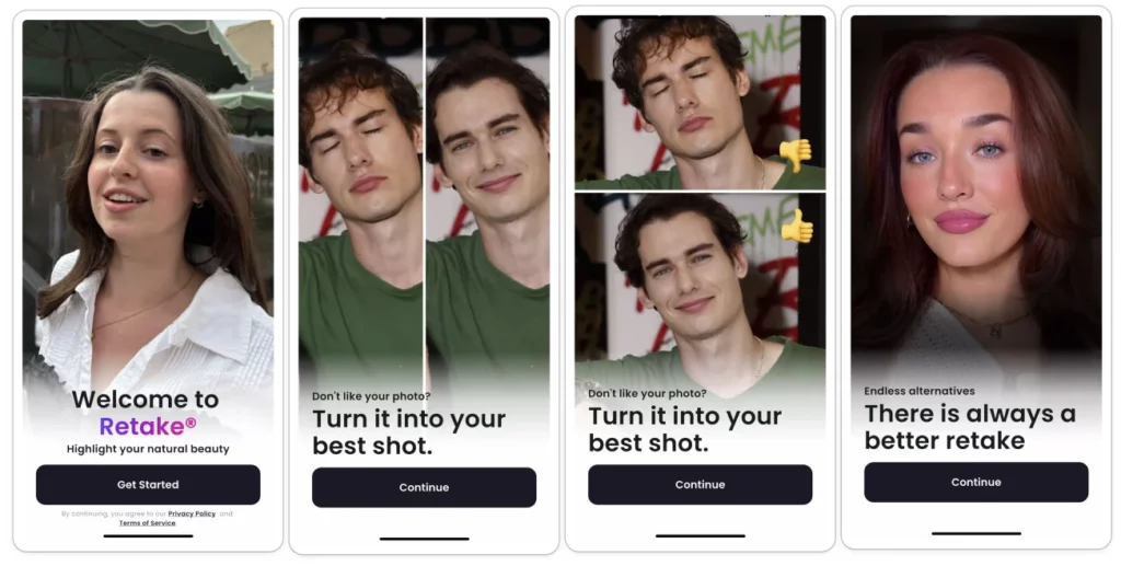
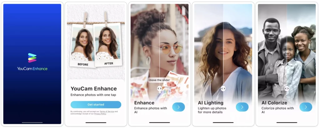
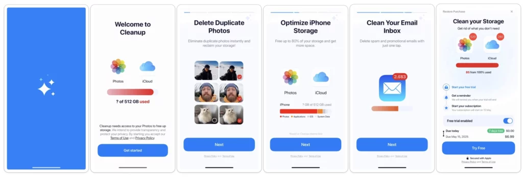
If your app transforms something, show it
A powerful “before and after” visual helps users instantly grasp the value. Fitness apps do this well: show the transformation, not the feature list. It motivates users to get started because they can see the outcome they want. Whether it’s a polished photo, a completed task list, or an unlocked language skill, give users a glimpse of their future success.
Getting users to the “Aha!” moment is critical, but there’s a way to make it even more powerful: tailor that moment to each user’s specific needs. That’s where personalization comes in — and the data on this is unambiguous.
Third principle: Personalize the experience
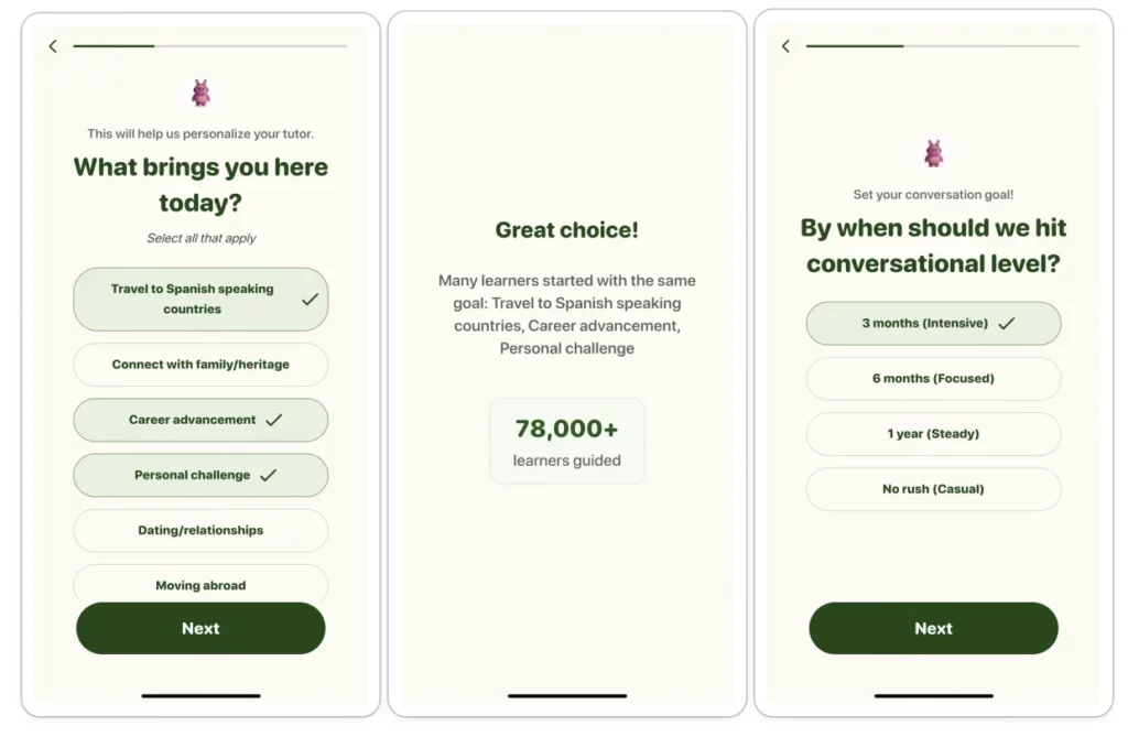
Generic onboarding treats every user the same. Personalized onboarding makes users feel understood from the first tap.
In all our tests, a personalized onboarding flow crushed a generic one
Ask a few simple questions to tailor the experience. It makes the user feel understood. Our growth team ran a test with a productivity app comparing two onboarding versions: one with generic feature demos and social proof, and another that added personalization questions upfront with a loading screen that said “customizing your experience.” The personalized version delivered an 8.5% increase in trial starts, a 17% lift in paying conversions, and a 22% increase in overall ARPU. In the US market specifically, the gains were even more dramatic: paying conversions jumped 27% and ARPU rose 35%. So, personalization isn’t just nice-to-have.
The right number of onboarding steps is the one that works for you
There’s no magic number. After endless testing, you’ll find a balance between collecting enough info to personalize and keeping the flow short enough that users don’t bounce. Start with 3-5 steps and iterate from there.
Here’s another example from our experience: one entertainment app tested a lengthy onboarding (with user questions, bot customization, stats, and loading screens) against no onboarding at all. The long version won with a 40% increase in payment conversions on iOS and 20% ARPU growth. But when they tried to shorten it, conversions dropped 13%. So, don’t assume shorter is always better. Test to find your sweet spot.
This brings up an important tension in onboarding design: you want to collect enough information to personalize the experience, but every field you add is another opportunity for users to drop off. The key is asking the right questions at the right time and cutting everything else.
Fourth principle: Reduce friction with psychology
Every element in your onboarding flow should either move users forward or be cut. Here’s how to identify and eliminate the friction that’s killing your conversions.
Every extra field is another chance for users to drop off
Unless it’s essential for personalization or for the app’s core function, save it for later or don’t ask at all. If your app works fine without a user’s birthdate, don’t ask for it during onboarding. Every field you remove is a conversion win. We’ve seen sign-ups become one of the biggest drop-off points in onboarding. The more you can delay this step — or better yet, let users experience value first — the more users you’ll convert.
If it’s not strictly necessary, never put a sign-up form before the user sees the core value or the paywall
Sign-ups are friction. Let users experience your app first, then ask them to commit. You’ll convert more users and collect better data because they’re already invested. This approach works because it flips the psychology: instead of asking for trust upfront, you earn it by delivering value immediately.
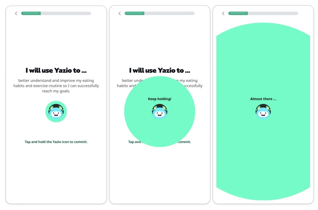
Ask users to commit with a small ritual
A subtle but powerful onboarding trick: ask users to commit with a small ritual. It could be drawing a checkmark, signing their name, or tapping ‘I promise.’ This small, unconscious commitment makes them more likely to follow through. It’s based on the psychological principle of consistency — once someone makes a micro-commitment, they’re more inclined to honor it.
Use ‘Do you relate?’ statements
For example, ‘Struggle to stay organized?’ When users tap yes, you’ve framed their pain and primed your app as the solution. It’s a psychological nudge that makes the value prop feel personal. This works because it creates instant empathy and positions your app as understanding their specific problem.
Ask a simple, positive question
Like, “Are you ready to improve your health?” The user will almost certainly tap “Yes.” This small, unconscious commitment makes them more likely to follow through with the rest of the onboarding. It’s the foot-in-the-door technique applied to mobile UX.
Celebrate progress
After a user makes a choice or answers a question, show them a quick screen that says something like, “Great choice!” or “We’ve got you covered.” It’s a small psychological boost that makes the experience feel more like a supportive conversation. People stick with what makes them feel good. This approach works because positive reinforcement increases engagement and completion rates.
These nudges work because they make the experience feel smooth and supportive. But here’s the other anxiety users carry: Is this app legit? Will it actually work? Trust signals answer those questions.
Fifth principle: Build trust and momentum
New users are inherently skeptical. They’ve downloaded dozens of apps that overpromised and underdelivered. Your job in onboarding is to prove you’re different — and you need to do it without breaking the flow.
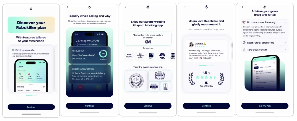
Incorporate trust signals right into your onboarding
This can be anything from press mentions (“As seen in TechCrunch”) to user testimonials (“Join 50,000 happy users”). It tells new users they’re making a smart choice, not a risky one. But don’t cheat — if you don’t have the credentials, don’t fake them. Authenticity matters more than inflated numbers.
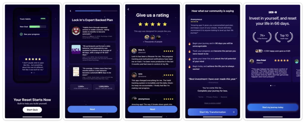
Loading screens are prime real estate
Instead of a blank spinner, show testimonials, ratings, or quick wins. It keeps users engaged and reinforces why they made the right choice. Wasted screen time is a wasted conversion opportunity. That said, test whether you even need the loading screen.
I watched an education app test something simple: removing its onboarding loading screen entirely. Trial conversions jumped 22%, and ARPU rose 30%. Loading screens can work when they’re doing a job — but don’t keep one just because it feels like you should.
Once you’ve built trust through social proof and momentum, you’re in a position to ask for something more valuable: permissions. But here’s where most apps blow it: treating permissions as a transaction rather than a value exchange.
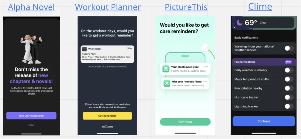
Sixth principle: Handle permissions smartly
The iOS notification prompt is one of the most important moments in your onboarding flow — and most apps waste it with a cold, contextless ask. Here’s how to frame permissions as benefits, not requests.
Don’t just ask for notification permissions. Build a short flow that shows why they’re valuable
The right context can turn a ‘No’ into a ‘Yes.’ Instead of hitting users with a cold permission request, explain what they’ll get: “Get daily reminders to stay on track” beats a generic iOS prompt. One education app tested setting up reminders during onboarding versus on the home screen. The in-onboarding version increased trial conversions by 6.4% and lifted ARPU by 24%. This approach works because you’re framing the ask around user benefit, not app functionality.
Now here’s the hard truth: everything I’ve just outlined — selling outcomes, guiding to the “Aha!” moment, personalizing, reducing friction, building trust, handling permissions — none of it matters if you don’t test it. Because what works for one app won’t work for another, and what works today might not work next month.
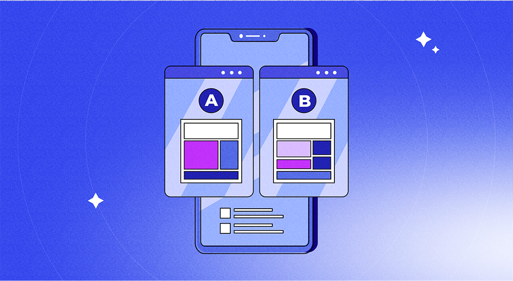
Seventh principle: Test everything
The right onboarding is the one that converts. And you won’t find it without testing. What works for a meditation app won’t work for a fintech app. A/B test step count, copy, visuals, and CTAs.
Why I’m writing this now
Full transparency: I got the idea for this article right after getting access to Adapty’s onboarding builder. And honestly, I was blown away.
Here’s the context. Everything I just shared — the seven principles, the A/B test results, the tactics that work — came from apps that had to fight for dev resources every time they wanted to test a new onboarding flow. Every experiment meant tickets, sprints, QA, and app store review. Weeks to launch a single test.
Most apps settle for mediocre onboarding, not because they don’t know what works, but because the cost of testing is too high.
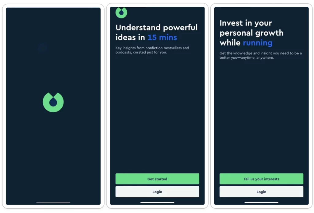
What hit me was seeing what’s possible when you remove that bottleneck. I could suddenly design, personalize, and A/B-test onboarding flows without writing code or waiting for releases. Quizzes, progress bars, testimonials, paywall handoffs — all from a visual editor. Real-time experiments. No dev cycles.
That’s what changed for me. Not the features. The speed. If you’re serious about onboarding, that’s the unlock worth paying attention to.
→ Check out Adapty’s onboarding builder