How to design a paywall for iOS that converts — and doesn’t get your app rejected
Over 80% of in-app purchases happen on the first paywall screen. It’s your best chance to turn users into subscribers.
But here’s the thing: If the paywall feels confusing, users leave. If it doesn’t meet Apple’s rules, your app won’t get through review. And if the pricing or trial terms aren’t clear, users will complain and your ratings will suffer.
To get it right, your iOS paywall needs to do two things well:
- Make the value of your subscription obvious.
- Follow Apple’s guidelines to avoid rejection.
This guide breaks down how to do both. You’ll learn what to include, what to avoid, and how top apps design high-converting, App Store-approved paywalls.
If you’re building an iOS app paywall, focus on clarity and trust. The best-performing paywall iOS apps use are clear, compliant, and built to convert.
Let’s dive in.
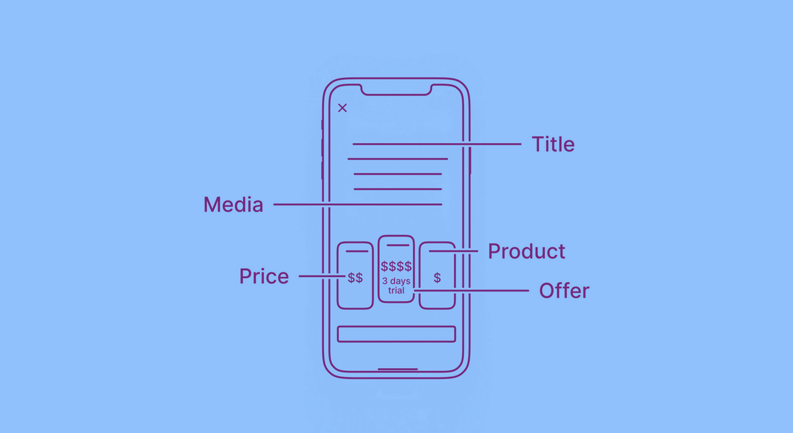
What to include in your iOS paywall
Most iOS app paywalls come down to seven core elements. Each one shapes how users think and each one gives you room to test and improve.
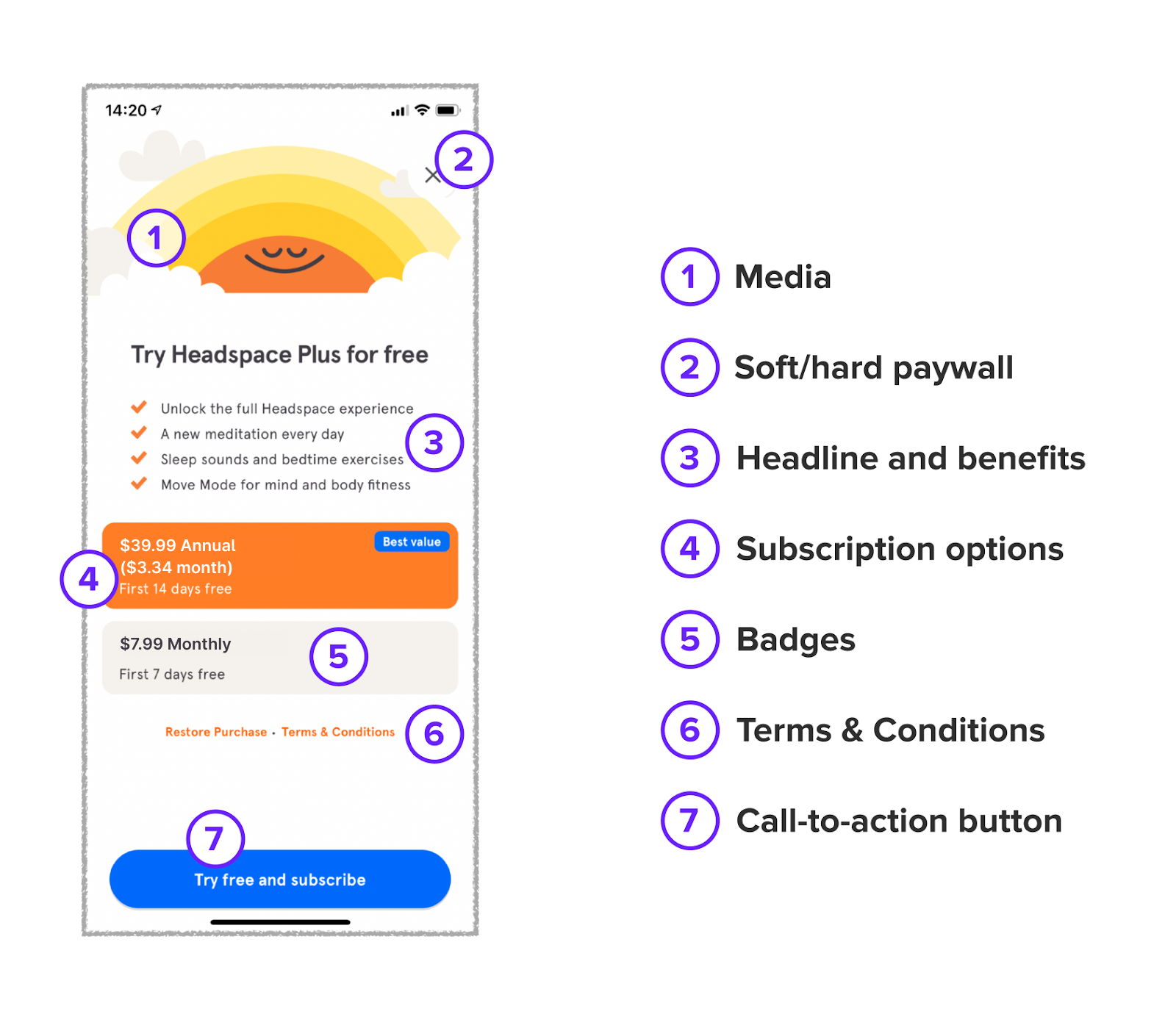
Media elements
You can show a background image, a short video, or nothing at all.
Some apps skip visuals to keep the focus on the message. Others add a calming illustration or looping video to match the mood.
Ask yourself: does this visual help someone say yes or just take up space?
→ Find more examples in our paywall library.
Paywall type
You can block all access until the user subscribes — that’s a hard paywall. Or let them use part of the app before asking to pay — that’s a soft paywall.
There’s no official App Store guideline on this as it’s a product decision. But it’s also one of the easiest things to test.
Hard paywalls often convert better early on, but more users drop off. Soft paywalls keep users engaged longer and give you more chances to show value.
Some apps also show a second paywall after the first with a better offer or longer trial. That extra step can help.
→ Test all of this — timing, flow, wording — with A/B testing in Adapty.
Headline and benefits
This is where you explain what the user gets after subscribing. Start with a clear headline — something simple that reflects the value.Then list out the main benefits of the paid version.
You can also add supporting elements:
- Social proof, like short reviews or ratings
- A quick FAQ to answer common questions upfront
- Awards or recognitions, if relevant
- A comparison table between free and paid versions
Not all of this needs to fit on one screen. Pick what matters most for your app and test different layouts to see what improves conversion.
→ Try building your paywall with Adapty’s Paywall Builder. It lets you preview different formats, customize them, and push changes without releasing a new app version.
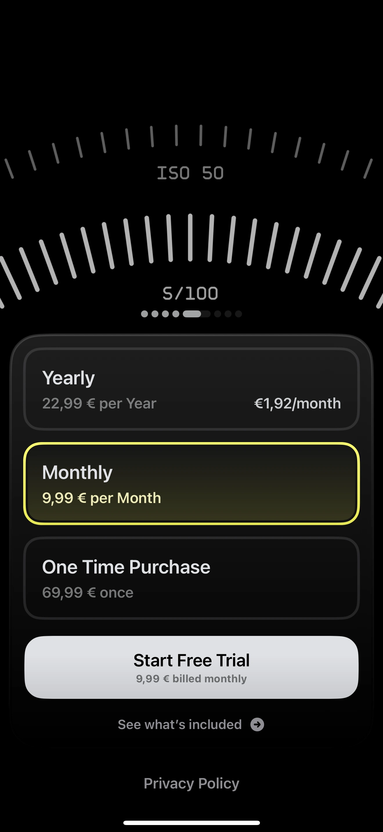
Subscription options
Show the full price, billing period, and trial details for each plan. Don’t leave room for guessing — users and Apple expect everything to be clear.
If you show a price like “$4.99/month,” also include the full amount billed. For example: “$59.99 per year.”
✅ Use local currency.
✅ Match the exact price in App Store Connect.
✅ Keep it consistent with what users see at checkout.
Apple allows these billing periods: 1 week, 1 month, 2 months, 3 months, 6 months, and 1 year. You can use any of them or combine several, as long as you show all options on one screen.
There’s flexibility in how you display them: buttons, swipeable cards, different layouts or badge shapes, as long as the information stays readable.
You can also test different price points and durations to see what works best.
→ Read how Prosto increased revenue by 30% by adding a 6-month plan because users didn’t want to commit to a full year.
→ Learn more in our pricing strategy guide for iOS app paywalls.
Badges
Badges help users make a choice. You can add labels like Best value, Most popular, or Recommended to highlight a plan. They don’t take up much space, but they guide decision-making.
Apple doesn’t set any rules here, so use that freedom wisely. Just keep the language honest and clear.
Terms and conditions
Add links to your Privacy Policy and Terms of Use. Apple expects to see them on the paywall.
You don’t need to get creative here, just place them where users can find them.
There’s not much to test or optimize in this section.
The CTA button
This is the final step — the moment a user decides to subscribe.
Use clear, direct text. “Start free trial,” “Subscribe for $9.99,” or just “Continue” — all work fine, as long as the wording matches what actually happens next.
You can experiment with:
- Different button text
- Layout and size
- Whether tapping the whole card or just the button triggers the subscription
You can also test variations in other screens like promo paywalls, upsell offers, or introductory deals. Small changes here often lead to meaningful results.
Free trial
A free trial gives users a way to explore your app before they pay. You can offer access to all features or just a limited set. You decide when to offer a trial, and which plans include it.
For example, Moonly added a trial only to one plan and increased revenue by 47%.
Some apps let users activate the trial with a toggle.
Others add a separate screen that explains how the trial works and when billing starts. That extra clarity helps build trust.
→ Find more ideas and examples in our Paywall Newsletter — sent out monthly with real paywalls that perform well.
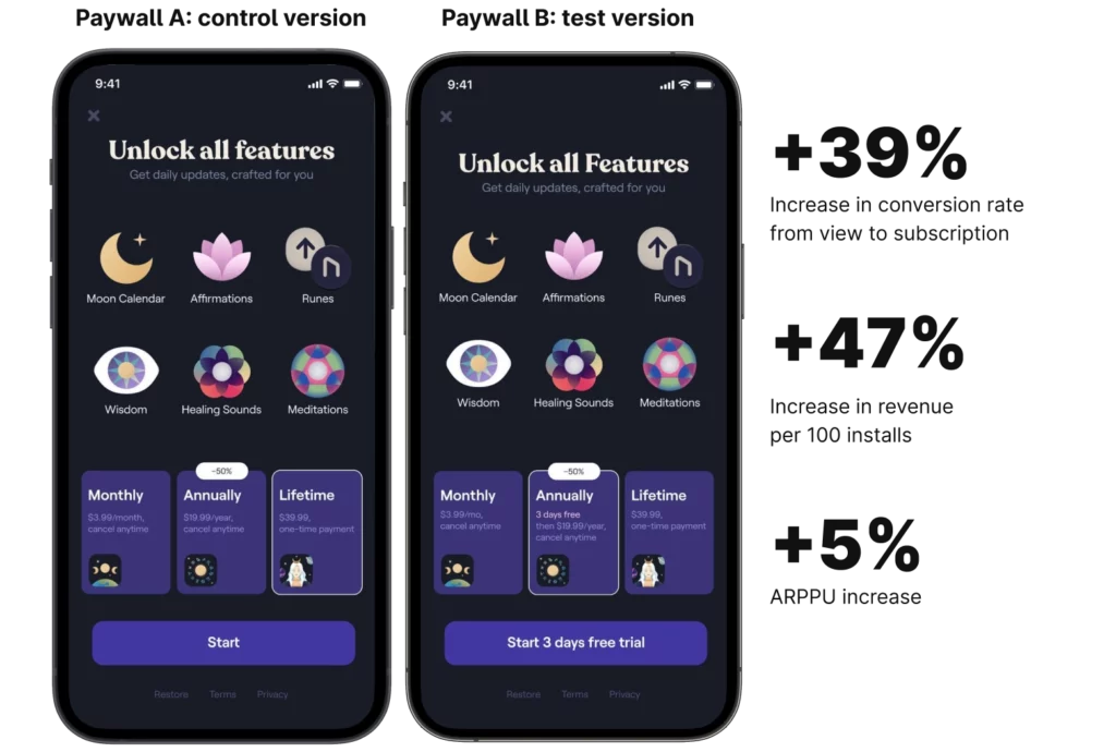
Impact of paywall design elements on conversion
Small design changes can have a significant impact on conversion rates. Here's what the data shows:
| Design element | Conversion impact | Implementation tips |
| Animated elements | +12% to +18% | Use subtle motion on CTAs; avoid overwhelming users |
| Animated vs static paywall | 2.9× higher | Add carousels, timers, or benefit animations |
| User name personalization | +17% | "John, unlock your premium features" |
| Dynamic/segmented discounts | +35% | Show different offers based on user behavior |
| 2 products vs 1 product | +61% | Offer monthly + annual options |
| 3 products vs 2 products | +44% | Use decoy pricing strategy |
| Visible discount percentage | +20% to +30% | "Save 50%" badge + strikethrough price |
| Free trial toggle | +10% to +20% | Give users perceived control |
| Trial mentioned multiple times | +15% to +25% | Reinforce risk-free message throughout |
| Social proof (reviews) | +10% to +15% | Include real user reviews with avatars |
App Store guidelines: what to follow
Apple reviews every iOS app paywall and they don’t tolerate confusion or misleading offers.
If your paywall isn’t clear, you risk rejection. Here’s how to stay compliant:
Show what the user gets
Make the benefits obvious. Your paywall should explain what’s included in the subscription and what problems it solves. That helps both the user and your approval chances.
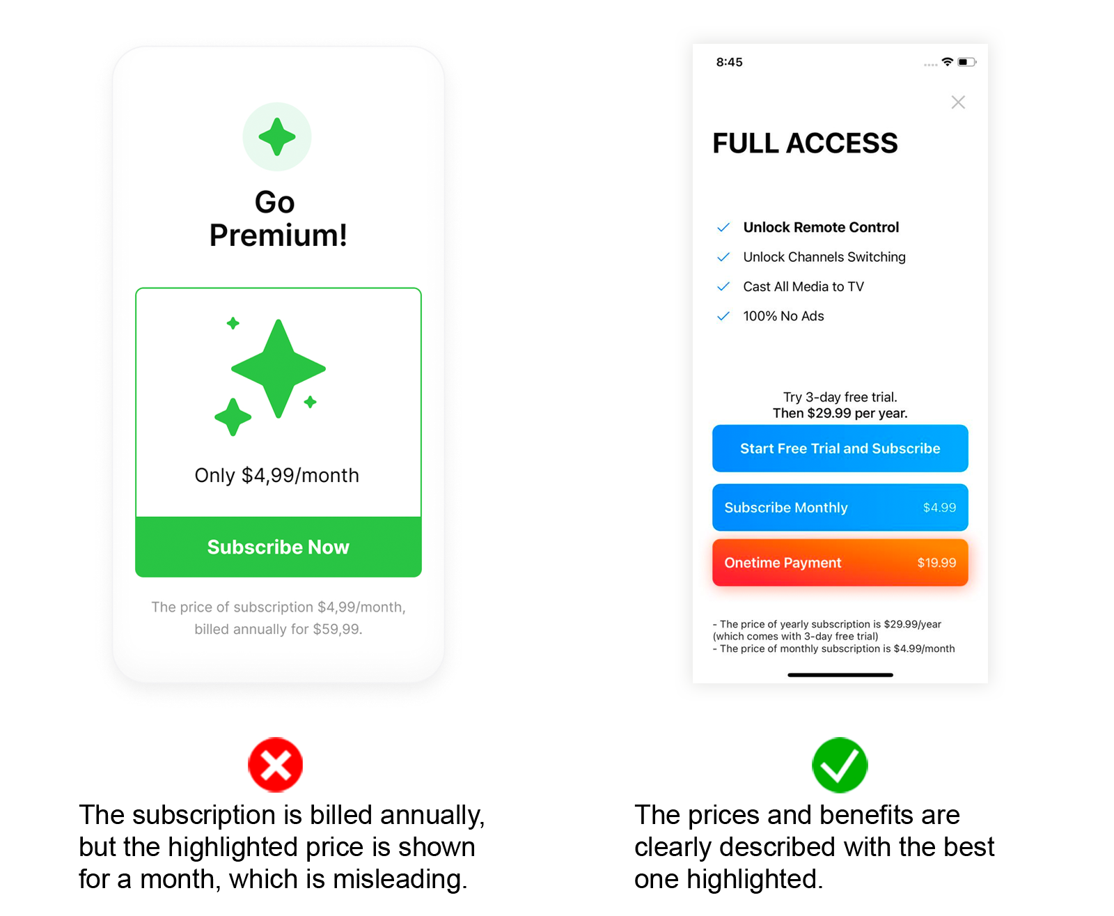
Be transparent about pricing
The price shown on your paywall must match the price in App Store Connect — no exceptions. You can show discounts and cross out old prices, but don’t hide the real cost.
If you show “$4.99/month,” and bill $59.99 annually, explain it clearly.
For example: “$59.99/year — that’s just $4.99/month.”
Make billing periods clear
Avoid tricks like highlighting the monthly breakdown while charging for a full year upfront. If you offer multiple plans, list each one with its actual billing cycle.
That small detail can prevent a lot of user complaints and review issues.
Explain how the trial works
If you offer a trial, say how long it lasts and what happens after. Users should know when the trial ends and when they’ll get charged. Even one short sentence helps avoid confusion.
Keep the CTA text honest
Apple used to be strict about button text. A few years ago, if your button said “Start free trial,” even when you actually offered a trial, your app could get rejected.
Now, Apple allows more flexibility. “Start free trial,” “Continue,” “Activate,” and “Subscribe” — all work fine as long as the action matches the text.
We still recommend using standard wording. It helps avoid confusion for users and extra review time.
You don’t need to mention auto-renewal
Apple no longer requires you to add text like “Subscription renews automatically unless canceled 24 hours before the end.” Still, some developers include it in small print just to stay on the safe side.
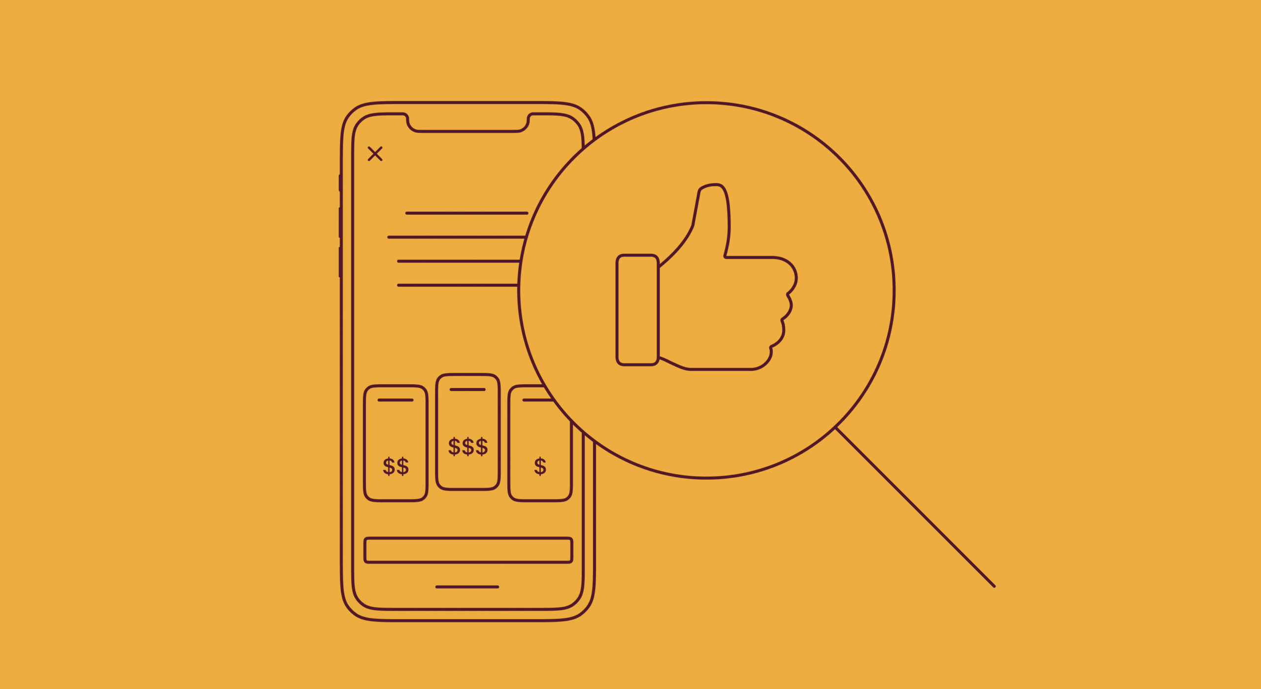
Examples of clear, user-friendly paywalls
Want to see how real apps handle paywalls? Here are a few examples that explain pricing, show trial details, and highlight subscription benefits — all in a way that’s easy to understand.
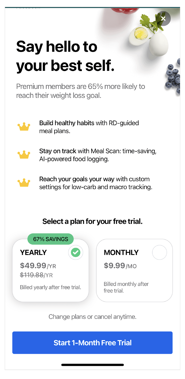
My Fitness Pal
This paywall explains that all plans include a trial.
It also highlights the yearly discount both as a percentage and with a strikethrough price. Clear, direct, and easy to compare. This is a great example of a well-structured iOS paywall that converts and complies.
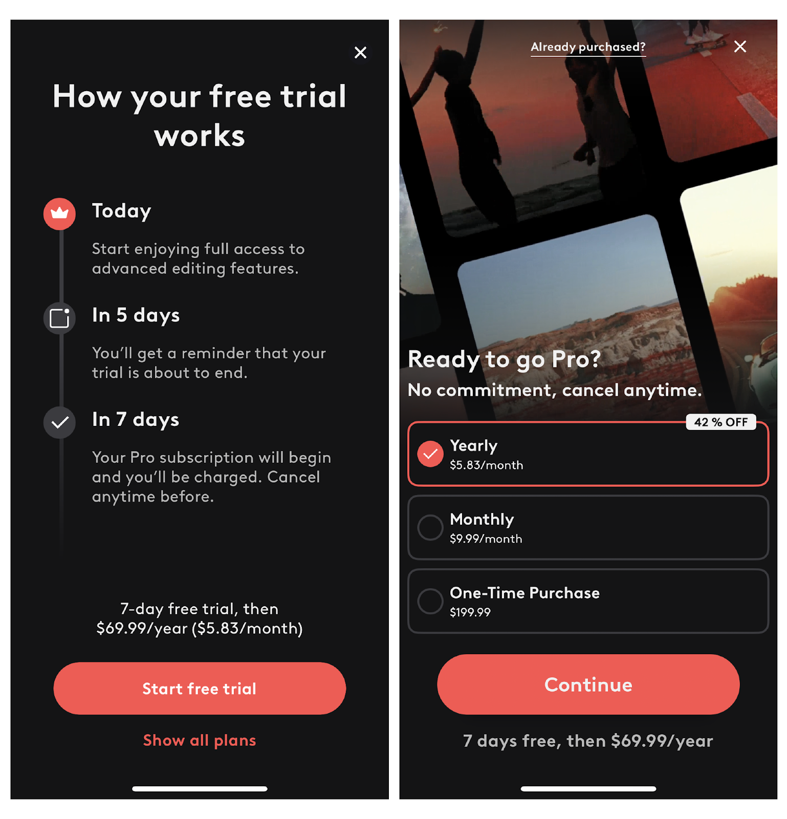
Videoleap
This one goes even further than Apple requires. It explains exactly how the trial works, shows what the user will pay after it ends, and lists three clear plan options.
Picture This
Another strong example. The paywall clearly shows the benefits, explains the trial and pricing, and even includes a reminder about when the trial ends — something most apps forget to add.
Clean, honest, and helpful. Everything a paywall iOS apps aim for.

Paywall examples to avoid
Some paywalls still make it through review even if they break key guidelines or confuse users. But getting approved once doesn’t mean staying safe.
If a paywall hides pricing, misleads users, or causes complaints, Apple can take another look.
In some cases, the app might get removed or lose access to in-app purchases.
Here are a few real examples to learn from.
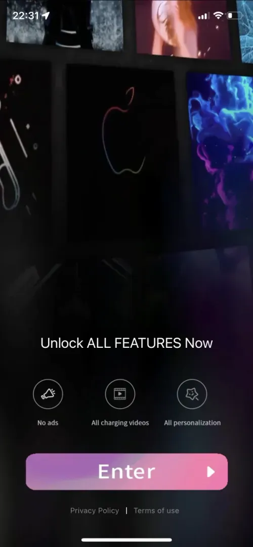
Magic Charger
- Doesn’t show any pricing up front.
- “Enter” button hides the subscription terms.
- Creates a poor user experience.
This kind of design frustrates users and raises red flags during review.
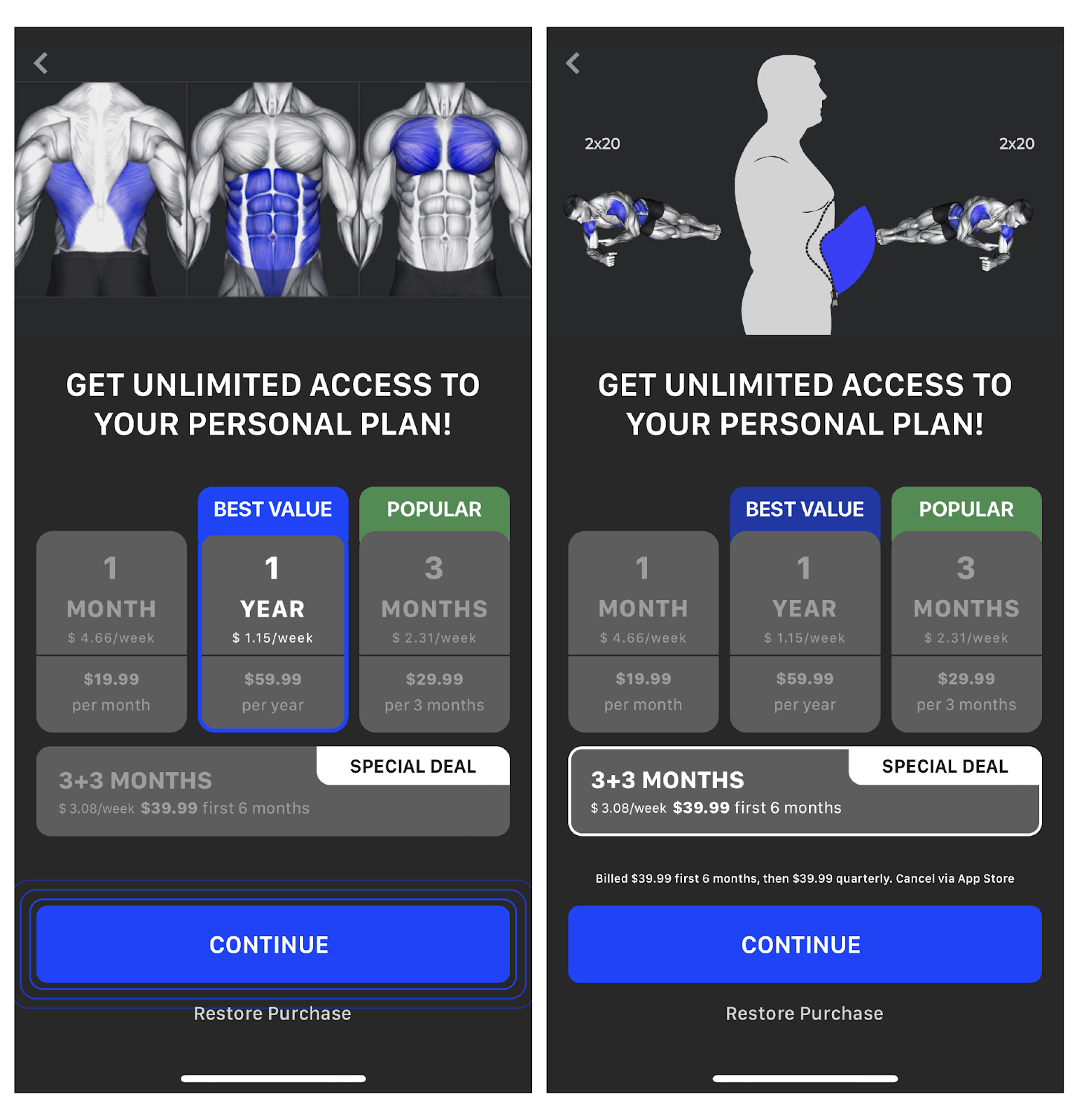
Muscle Booster
At first glance, this paywall looks fine.
- Special deal looks like 6 months for $39.99.
- In reality, it becomes a 3-month auto-renewal.
- Important info hidden in tiny text.
This is a classic dark pattern. Apple may let it slip once but it’s a time bomb for complaints.
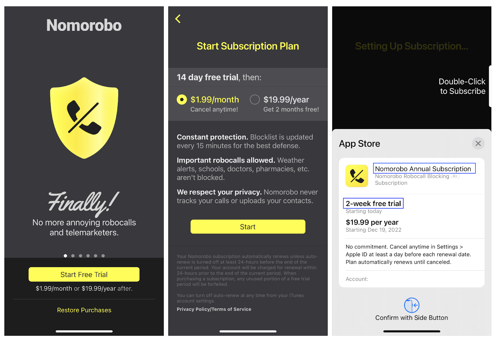
Nomorobo
- Key info is spread across multiple screens.
- “Start Free Trial” button leads to another step, not a trial.
- Says “2 months free” but really just promotes the annual plan.
If a user expects a 2-month trial and gets billed immediately, they’ll report it. And they should.
What happens if you break the rules
If your iOS paywall doesn’t follow Apple’s guidelines, your app won’t pass review. That’s straightforward — you won’t reach the App Store until you fix it.
The bigger risk comes later.
If you update the paywall remotely and break the rules after approval, Apple can step in at any time:
- They can block in-app purchases
- Remove your app from the App Store
- Or, in rare cases, suspend your developer account
Apple doesn’t check every app manually. But users can report issues, and Apple also runs random reviews.
Changing your paywall on the fly is fine as long as you stay within the rules.
Apple usually updates its guidelines every six months.
Here’s where to check for the latest:
- Paid Applications Agreement (available in App Store Connect)
This last one tends to reflect the most up-to-date review logic. It’s worth checking regularly.
Final checklist
Building a strong paywall iOS users trust means balancing clarity, compliance, and conversion.
Here’s what to keep in mind:
- Keep it clear
Show the value, explain the price, and make the next step obvious.
- Follow Apple’s rules
Be transparent about billing, trials, and subscription terms. Don’t hide or overcomplicate.
- Test everything
Try different formats, offers, and flows. A/B testing helps you improve without guesswork.
- Stay up to date
Apple updates guidelines often. Check the App Store Review Guidelines and Paid Applications Agreement regularly.
- Use the right tools
Platforms like Adapty let you build, test, and improve paywalls without resubmitting your app every time.
Use this checklist to ensure your iOS paywall meets Apple's requirements and won't be rejected during review:
| Element | Required | Recommended | Guideline |
| Full subscription price (must match App Store Connect) | ✓ | 3.1.1 | |
| Billing period (week/month/3mo/6mo/year) | ✓ | 3.1.1 | |
| Trial terms (duration and what happens after) | ✓ | 3.1.2 | |
| Privacy Policy link | ✓ | 5.1.1 | |
| Terms of Use / EULA link | ✓ | 3.1.1 | |
| Restore Purchases button (easily accessible) | ✓ | 3.1.1 | |
| Local currency display | ✓ | 3.1.1 | |
| Clear CTA (matches actual action) | ✓ | 2.3 | |
| Benefits description (3-5 key features) | ✓ | — | |
| Social proof (reviews, ratings, awards) | ✓ | — | |
| Free vs Paid comparison | ✓ | — | |
| Visual trial timeline | ✓ | — | |
| "Best Value" / "Most Popular" badges | ✓ | — |
iOS paywall trends in 2026
The paywall landscape is evolving rapidly. In 2026, successful iOS apps are moving beyond static screens toward intelligent, adaptive experiences that respond to user behavior in real time. Here are the key trends shaping paywall design this year.
1. AI-powered paywall generation and optimization
Artificial intelligence has transformed how teams create and optimize paywalls. Instead of spending weeks on design iterations, product teams can now generate multiple paywall variants in seconds using AI tools.
Tools like Adapty's AI Paywall Generator allow you to simply paste your App Store link and receive fully designed, brand-consistent paywalls within 30 seconds. The AI analyzes your app's visual identity, copy style, and metadata to create paywalls that match your brand DNA — no design skills required.
Key benefits of AI paywall generation:
- Generate unlimited paywall variants for A/B testing
- Maintain brand consistency automatically
- Reduce design-to-launch time from weeks to minutes
- Built-in compliance with Apple's App Store guidelines
2. Dynamic and personalized paywalls
Static, one-size-fits-all paywalls are becoming obsolete. In 2026, leading apps serve different paywall experiences based on user segments, behavior patterns, and predicted intent. Dynamic paywalls with segmented or time-based discounts deliver approximately 35% higher conversion rates than static alternatives.
Personalization tactics that work:
- Adding the user's name to paywall copy (increases conversions by 17%)
- Showing different offers based on user engagement level
- Adjusting pricing by region and purchasing power
- Contextual triggers based on in-app behavior
3. Animated and interactive elements
Motion design has become a powerful conversion tool. Animated paywalls produce 2.9× higher conversion rates than static designs. Strategic animation draws attention to key elements like pricing, discounts, and CTA buttons without overwhelming the user.
Effective animation patterns:
- Subtle button pulsing to draw attention to CTAs
- Countdown timers for limited-time offers
- Carousel animations for benefit showcases
- Progress indicators for trial timelines
4. Retention-first design
The subscription economy in 2026 is shifting focus from acquisition to retention. Winners are those who keep existing subscribers engaged rather than constantly chasing new ones. This affects paywall strategy significantly.
Retention-focused paywall features:
- Pause subscription options (usage grew 68% in 2025)
- Win-back offers for churned subscribers
- Clear cancellation flows that build trust
- Value reminders showing usage statistics
5. External payment options
Following the Epic vs. Apple ruling in May 2025, US apps can now include links to external payment systems without Apple's 30% commission. This opens new opportunities for paywall design and pricing strategy, though implementation requires careful attention to Apple's updated guidelines.
What this means for paywalls:
- Ability to show real-time discounts and promo codes
- More flexibility in pricing presentation
- Faster payouts (days vs. Apple's 30-60 day cycle)
- Option to offer web-based checkout
6. Trial timeline visualization
Visual trial timelines have become an Apple-endorsed pattern. These timeline graphics clearly show users what happens during and after the trial period — when they'll be charged, how to cancel, and what they get during the trial. This transparency builds trust and reduces refund requests.