Paywall A/B testing in subscription-based apps is a key means of growing revenue, improving conversions, and reducing bounce rates. And we’ve just made it easier!
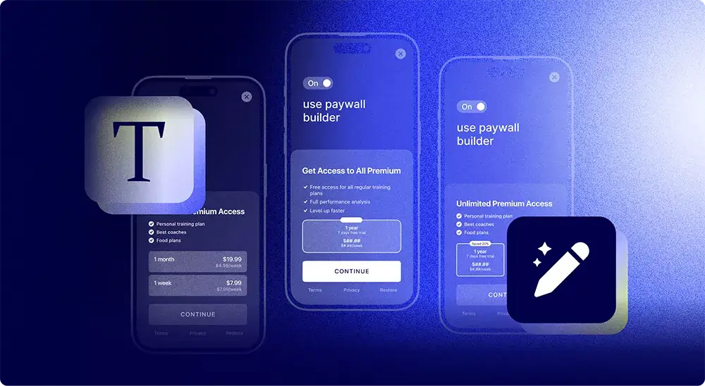
We’re proud to present you with our highly anticipated paywall builder – an easy-to-use tool for creating native mobile app paywalls in a few clicks.
Introduction
Judging by the name, the main purpose of Adapty’s paywall builder is creating mobile paywalls, and frankly, it is so. You’re now able to conveniently and rather quickly design a modern-style paywall on your own within Adapty’s admin panel and immediately show it in your app, with no releases or coding (well, almost no coding, but we’ll get to that later).
However, there’s one more important use case for the paywall builder, as the ability to make a good-looking paywall in a couple of minutes significantly improves the A/B testing possibilities. Create an original paywall, make as many copies as you want, tweak them according to your hypotheses, and launch the tests. No need to wait for the designer to come up with a new mockup or a developer to apply the changes to the code. The whole process, from creating a paywall to launching a test, can now take about 10 minutes and be carried out by just one person!
In this article, we’ll talk in more detail about the general aspects of the paywall builder, learn what it can be used for, check on how to integrate it with your app, and end up with a step-by-step guide to designing your own paywall.
Why do you need the paywall builder?
Creating native paywalls in minutes
We’ll never get tired of saying that the paywall is a crucial part of any subscription-based app. It’s the place where you ask the user to confide in your app and make a purchase, which is probably the most stressful point of the user journey. So in order to create a nice first impression you have to have a neat and comprehensible paywall.
Many inexperienced developers, tired after dealing with all the atrocities of integrating in-app purchases, create paywalls for their apps from the perspective of just making something a bit better than a placeholder. But in this case, no matter how good the app is, when the user faces a poorly designed and unclear page extorting their money – chances are you’ll never see them again.

Adapty’s paywall builder helps solve this problem with style. We’ve checked dozens of the most popular and profitable apps and came up with a number of versatile templates split into 3 categories:
Overlay – consisting of two layers, combining an image at the bottom and a layer showcasing your products or content on top.
Transparent – offering a captivating visual experience by featuring a full-screen image that immediately grabs users’ attention.
Flat – reminiscent of a streamlined landing page, presenting all the essential elements in a single continuous layer.

By choosing a template you already get a paywall that will look native and neat, but then you’ll be able to style it to your own liking, by manually changing the color scheme, uploading the background of your choice, adjusting button shapes, writing text for the feature list and buttons, adding subscription offers, and more. But most importantly – all this is done within one panel with a user-friendly interface.

Facilitating paywall A/B testing
A/B testing is a universal and powerful way to find what works best for your app and in the end, come up with an ultimate version of the paywall that easily hooks the users. However, finding “the one” paywall is usually a never-ending process – it’s impossible to find something that will work perfectly for a long time, as the mobile industry, user demands, and store policies are constantly changing. So once you find the right combination of design, offers, prices, and copy, you may have a sigh of relief, enjoy it for a while, keep it as a “working safe point”, and move on to testing new things.
Although Adapty already makes the paywall A/B testing process easy and convenient – an experiment can be launched in just 10 minutes – creating different versions of the paywall to test may be time-consuming. If you’re not an indie developer, pretty sure your process of hypothesis testing looks something like that:
- Coming up with a hypothesis
- Discussing it with the team and giving tasks
- Waiting for the designer to finish the new variant
- Waiting for the developer to add fixes to the code
- Setting up the experiment
Changing one or two even minor things on the paywall, in this case, may turn into 1-2 days of leisurely “teamwork”. To solve this problem back in the day we provided Adapty users with the remote config feature. It’s based on a JSON file where the user mentions all the elements of the paywall that can be later changed remotely, meaning that all the changes appeared in the app right away, bypassing the need for another store review.

However, using remote config requires initial preparation, like coming up with the list of elements you’d want to change in the future, adding “placeholders” for these elements in the app code, and inserting certain fetch, activate, and get methods. Here’s a more detailed explanation of how it works. But once you’re set, you can change the selected paywall elements via the JSON field in real-time with no involvement from the developer or designer.
The only downside here is that you can change only the elements that you selected in advance and only for one paywall. For example, if you didn’t put the CTA button in the list and now feel like changing it for a hypothetical conversion improvement – you need to add more code and send the app for the store review. Or if you want to create a new paywall to place it somewhere else in the app, you need to also add more code for it and wait for the review.
Other than that, remote config immensely facilitates the process of adjusting your paywall, as well as running paywall A/B tests. But the paywall builder takes it to another level, as it enables you to change as many elements as possible from the start, as well as create an unlimited number of paywalls to experiment with. Yes, it also requires some initial preparation, but basically, the dragged-out teamwork we talked about earlier, now may be done in just 10 minutes by one person only – from an idea to the running experiment.
I bet you’re already eager to see how it works, so let’s wait no further and get to the tutorial.
Integration
To be able to use the paywall builder you need to be the Adapty user in the first place, meaning that you’ve already created an account, set up your products, and integrated our SDK into your app.
The next part is installing AdaptyUI SDK and configuring the Visual Paywalls needed for the proper functioning of the paywall builder. The process will likely take you no more than an hour to complete. Once everything is set up, you can get down to the design part.
Designing a paywall
To create your first no-code paywall, go to the Paywalls & Products section of Adapty’s dashboard and click Create paywall.

The next step is to name the paywall and add the products you want to use there. The products must be created beforehand in the corresponding section. You can also add a promo offer if you want to include a free trial, personal discount, or something else.

Once the general info is added, it’s time to activate the no-code paywall by switching the corresponding toggle to “on”.

Once it’s activated, you’ll see the pop-up window offering to select a template for your future paywall. Choose the one that you like best in terms of the structure and visuals then click Apply.

Depending on the template category and the amount of design elements, you’d be able to adjust different aspects of the paywall. For our example, we chose a template from the “Transparent” category.
The paywall builder consists of four main tabs: Layout, Products, Texts, and Buttons. Let’s see what can be configured in every tab and create our own unique paywall.
Layout

In the Layout tab you’ll be able to:
- Select another template if you’re not satisfied with the one you’ve chosen.
- Upload the background image.
- Add the color layer and manually adjust its properties.
- Choose whether to make your paywall soft or hard by placing (or not) the close button.
For our example, we’ll upload a different background image by clicking the picture area.

Then, to match the color scheme of the image we’ll set the color parameters. Here you can choose the colors, transparency level of the layer, and select between having one solid color or gradient.

It’s important to mention that the color menu was made extremely user-friendly which enables you to choose colors either manually or by pasting the desired hex code, which is pretty helpful when you want to use a specific color or get a perfect complimentary match.
Products

The Products section enables you to adjust the visual representation of your products on the paywall. At first sight, the board may seem rather overwhelming, but once you click through most of the elements, you’ll see how convenient it actually is. Here’s what you can edit here in terms of the product cards:
- Set the alignment of the text inside.
- Set the curve level of the shape.
- Choose the placement order of the products – row or column.
- Set which product card should be marked as the main one for adding the “most popular” label. The label can also be adjusted in terms of text, its color and size, the color of the label and its curve.
- Set the color of the card itself and the text inside, as well as choose the font size and the color and thickness of the border for the main card.
- Choose the color and size for the Offer and Price per period text elements.
In our case, we only changed the color of the cards and increased the main card’s border thickness.
Text

In this tab, you’ll be able to adjust the headline, subheading, and feature texts. Every line of text can be also edited in terms of color and font size. Alignment can also be set for the heading/subheading group and separately for the feature list. In our case, we wrote a new headline, included a subheading, and added a list of features showing the value of the app.
Buttons

The last section called Buttons enables you to place all of your legal links, such as terms and conditions or privacy policy. There’s also a restore purchase button which is required by some stores. In addition to that, you’ll be able to configure the purchase button, which is a pretty important element of any paywall. For our paywall, we changed the color of this button, changed the text to a simple CTA, and provided the links to the legal buttons.
After you adjust the paywall to your liking, click Save & Publish to apply all the changes.
Localizations
Do you want to show the localized paywalls faster? You can now use separate JSONs for different localizations in Adapty. When you add a localization, you see the locale code needed for the Adapty.getPaywall() method to fetch the localized remote config. Use this feature to increase conversions by being closer to local cultures.
Other features
There are also a few important features placed at the top of the preview panel that will become clickable after you save and publish the paywall.

The Metrics button takes you to a new page where you can see the main metrics for the paywall, such as revenue, proceeds, ARPPU, ARPAS, and many more. Clicking View in analytics will take you to the analytics dashboard with the paywall selected as the default filter. Click Duplicate if you want to create a copy of the current paywall for changing one or two elements to run an A/B test. And, of course, you have the possibility to Archive the paywall by clicking the corresponding button. You may also check how your paywall will look on a certain device by selecting the model in the device drop-down bar right above the paywall preview.
The remote config feature will also still work for you if you need it. The main advantage of this tool is the possibility of localizing your paywall into different languages. Add as many locales as you need and edit them from one place of the dashboard.

So, after we filled all the fields, uploaded the desired image, and chose the suitable colors, here’s the final result we got:

Conclusion
Adapty’s paywall builder is an easy-to-use tool that enables you to quickly design native paywalls in a WYSIWYG manner. It’s not only helpful when it comes to creating paywalls, but is also irreplaceable for fast and autonomous A/B testing that is sure to boost your conversions and increase the app revenue. Check out the document section to learn more about the integration process and find more details and tips on how to work with the design elements.
