
Health & Fitness apps have become the proving ground for sophisticated subscription upsell mechanics on iOS. They consistently out‑innovate other categories in:
- Onboarding persuasion and trust building
- Web‑to‑app funnels and cross‑channel coordination
- Multi‑offer sequencing
- Review‑safe UI patterns that survive app review rejections
While other categories get slapped with multiple rejections for discount offers & multiple paywalls, Health & Fitness teams are shipping state‑of‑the‑art flows that pass Apple’s scrutiny and convert.
Let’s see how they do it.
Why Health & Fitness category leads the pack
High perceived value but also high skepticism. Users question efficacy (“Will this actually help me?”), so apps must prove value fast and de‑risk the purchase.
Habit formation requires an ongoing push. This creates natural touchpoints for multiple, context‑aware upsells.
Rich content depth. From workouts to meal plans to meditation libraries, there’s enough value to slice into differentiated plans and time‑boxed offers.
Competitive market pressure. With skyrocketing UA costs, teams aggressively test funnels to maximize LTV faster than competitors.
Case study #1: Foodvizor. Trust first, then play
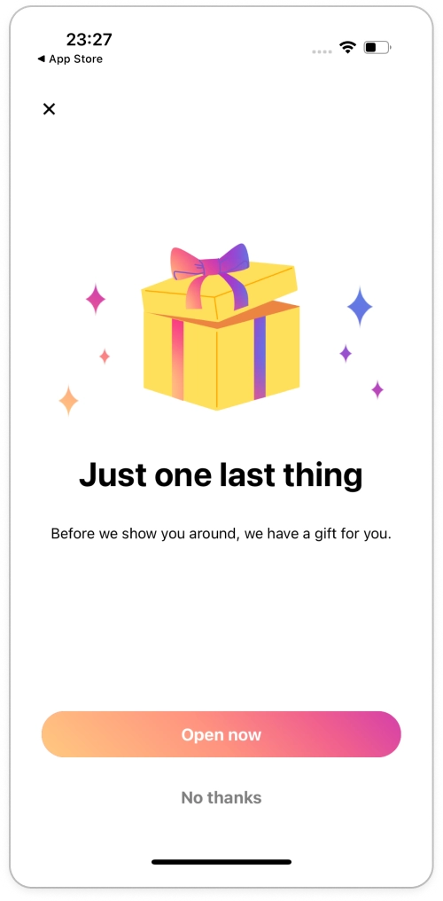
Foodvizor exemplifies the Health & Fitness playbook by layering trust, excitement and value reminders before every pitch.
1. Trust before the paywall
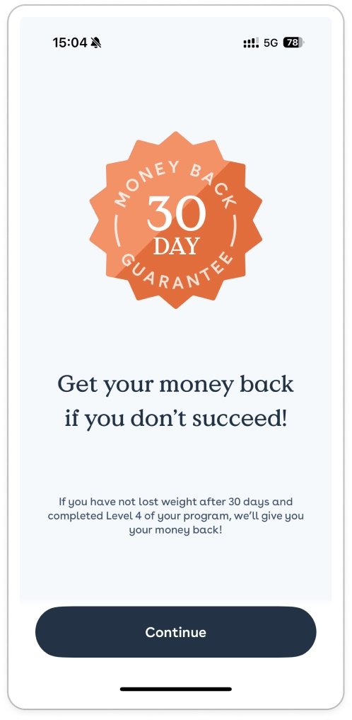
- 30‑day money‑back guarantee shown before the first paywall.
- Purpose: Lower risk perception and pre‑empt objections (“What if it doesn’t work for me?”).
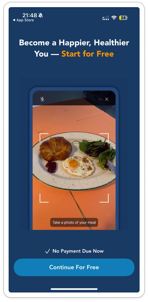
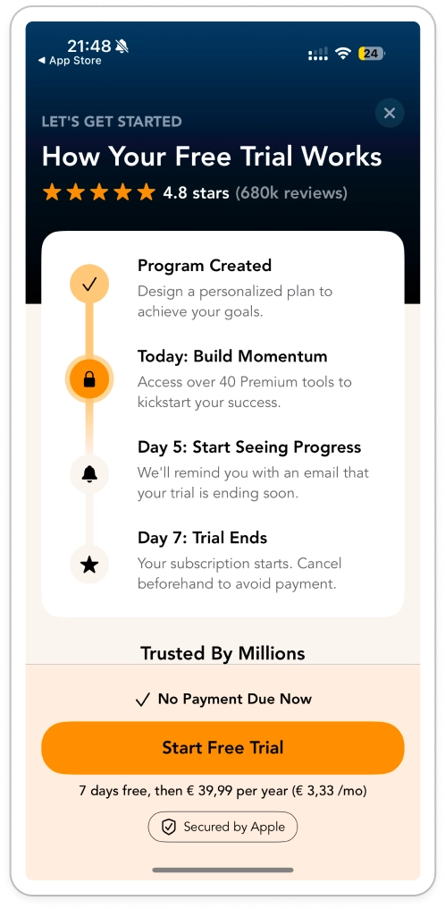
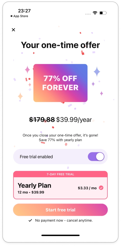
2. A clean first paywall
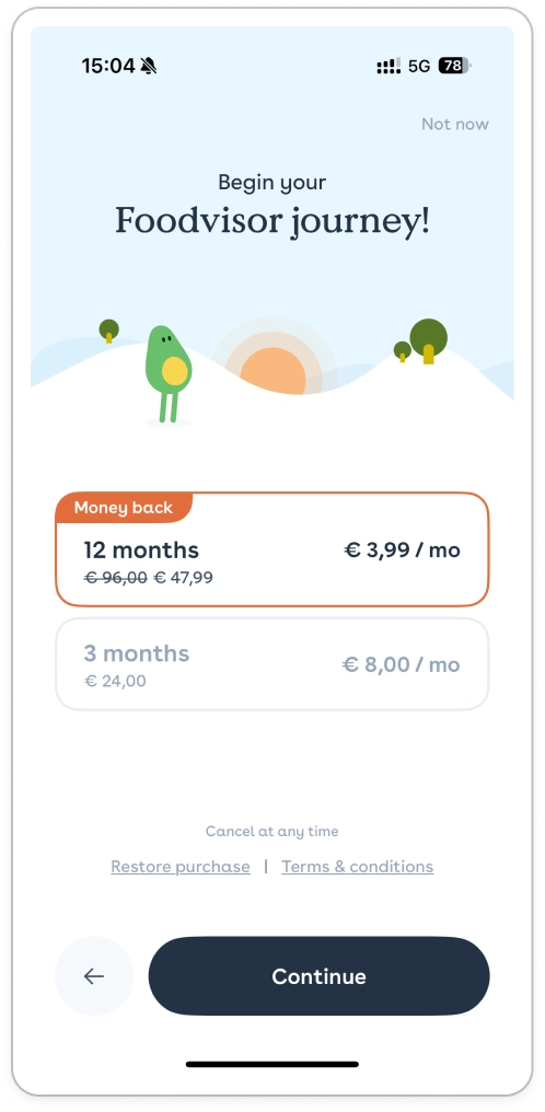
- No fluff: There were 50 onboarding screens to prove the value. Now it’s time for the user to decide (No pressure)
- Two products only (e.g., Monthly vs. Annual) to reduce decision friction.
- Repeated money‑back promise to reinforce safety.
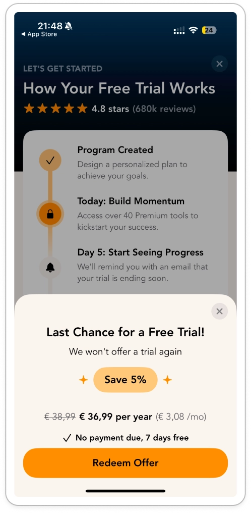
3. Missed it? Gamify the second touch
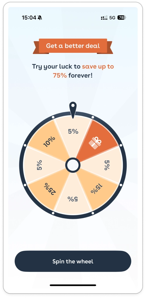
- Spinning wheel mechanic appears after the initial decline.
- First spin: Meh. Not great. Creates an anchor.
- Second spin: The “real deal” at 75% off. Surprise & delight, plus a sense of earned reward.
Didn’t work?
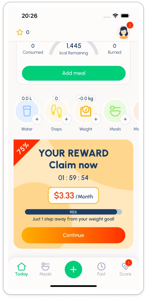
4. The last resort: countdown banner on home

- A discount countdown banner dominates the home screen if the user still hasn’t converted.
- Between the home screen and the final purchase, Foodvizor inserts value delivery moments to remind users that the app already helps them and make this last offer even more attractive.
12 screens, 3 offers, 1 game, 1 “lucky moment” and constant value reinforcement. That’s the Foodvizor funnel architecture in a sentence.
Case study #2: Fastic. Paint the future, pump the dopamine
Fastic runs a very similar play to Foodvizor’s, but the emotional driver flips: less “we’ve got your back” transparency, more dopamine/oxytocin‑fuelled excitement and vivid future‑self framing.
1. Discount code, right out of the gate
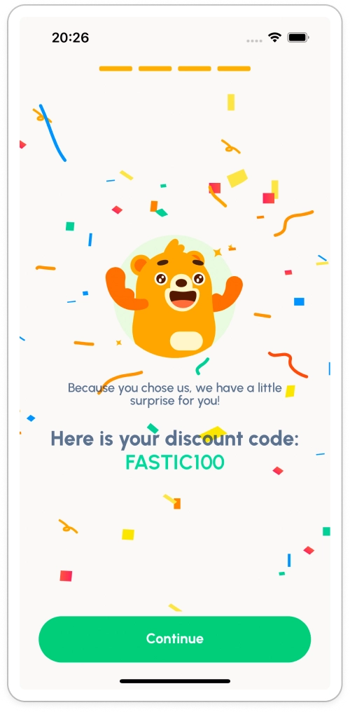
- The flow starts with a gift: a discount code appears immediately.
- It’s unexpected, feels generous and sets the mood: “I’m already winning here.”
2. The big, long, everything paywall
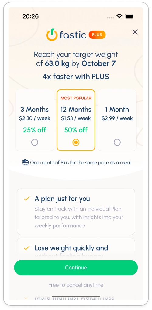
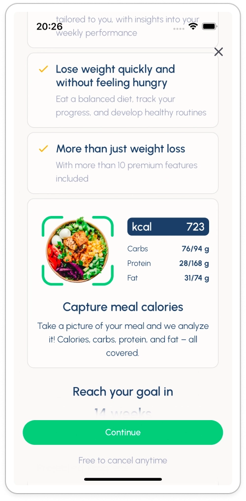
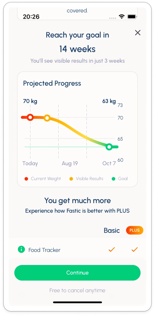
Fastic’s primary paywall is a buffet of persuasion techniques. No stone unturned:
- Clear discounts front and center
- Decoy pricing to steer choice
- “Cheaper than one meal” comparison (A classic we rarely see anymore. Nice!)
- Text value promises for scanners
- Visual feature tiles matched to the user’s imagination
- Plan comparison tables for the rational audience
- Before & After visuals for the emotional audience
- Social proof/recognition as the cherry on top
Every possible lever gets pulled to bend the user toward one inevitable conclusion: that’s worth paying for.
3. Didn’t bite? Spin the wheel
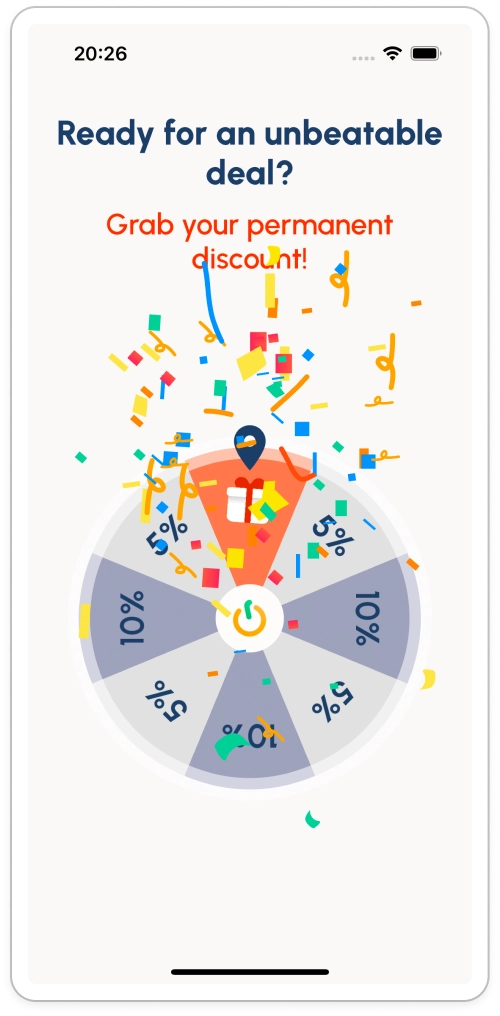
- Yup, the spinning wheel returns. Pumped‑up excitement, even bigger discount right after the starting discount.
- The second‑chance mechanic increases desire. Maybe THIS time I’ll get the crazy deal? Yes! FOREVER DISCOUNT! What a catch!
Still no conversion here?
4. Home screen banner → Straight to subscribe
- A limited-time offer banner with a very strong copy lives on the home screen.
- Smart twist: tapping the banner triggers the purchase directly, skipping a full paywall revisit. Fewer doubts, fewer exits.
Same skeleton as Foodvizor. Different soul. Foodvizor reassures. Fastic exhilarates.
Case Study #3: Lose It! Simpler funnel, ruthless loss aversion
Lose It! keeps the flow short but still punches hard by weaponizing loss aversion and a gentle emotional roller coaster.
1. “Free start” framing before the paywall
- The journey tees up a free start before you ever see pricing.
- Expectation set: you’re getting something for nothing. Nice and safe.
2. Classic paywall… Then the twist when you close it
- The paywall itself is very much classic.
- Close it. And oops. Lose It! tells you this was the only chance for a free trial. Scarcity flips on, loss aversion engaged.
- They quietly attach a small discount here. It’s not a new paywall per se. It’s an explanation that just so happens to pitch you again.
3. Decline again? Double down on loss
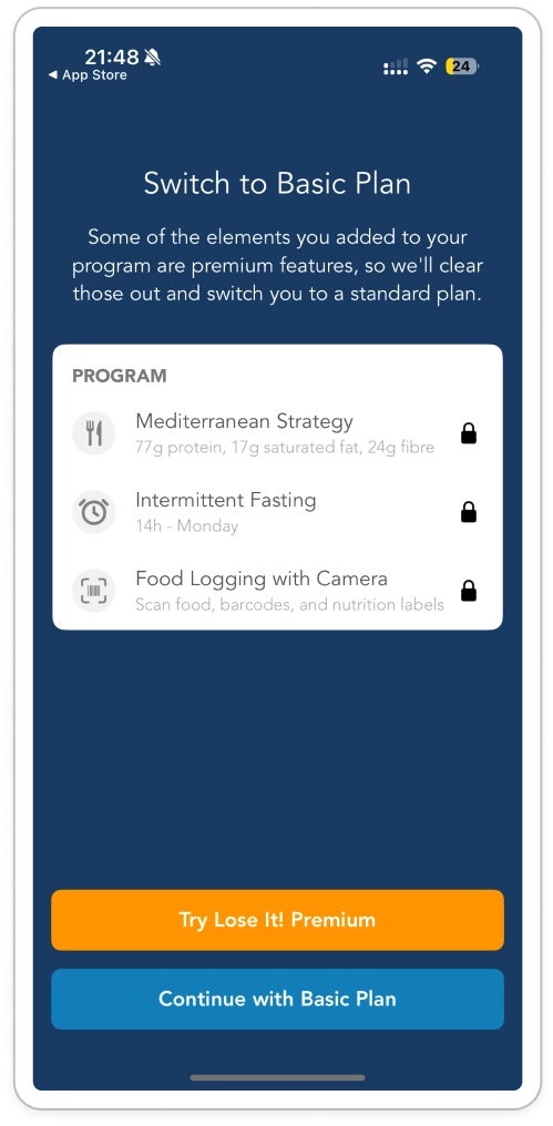
- If you still back out, the app forces you to explicitly choose the basic plan and acknowledges you’ll “lose access” to premium features.
- It stings on purpose. Micro‑regret installed.
4. Push, promise, payoff
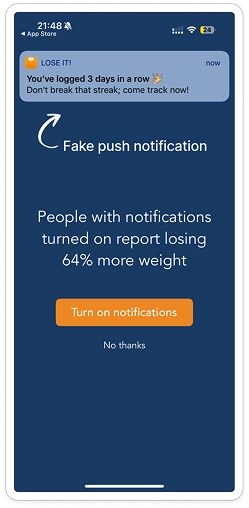
- Next, a motivational push notification swoops in: “64% of users like you hit their goal.” Hope spikes.
- Perfect timing for the final discount. Sad → hopeful → rewarded: a mini dopamine arc that ends in conversion.
Bonus case: Flo. Guilt trip, then a hug (with a discount)
Flo runs a cousin tactic with a softer, brand‑fit wrapper.
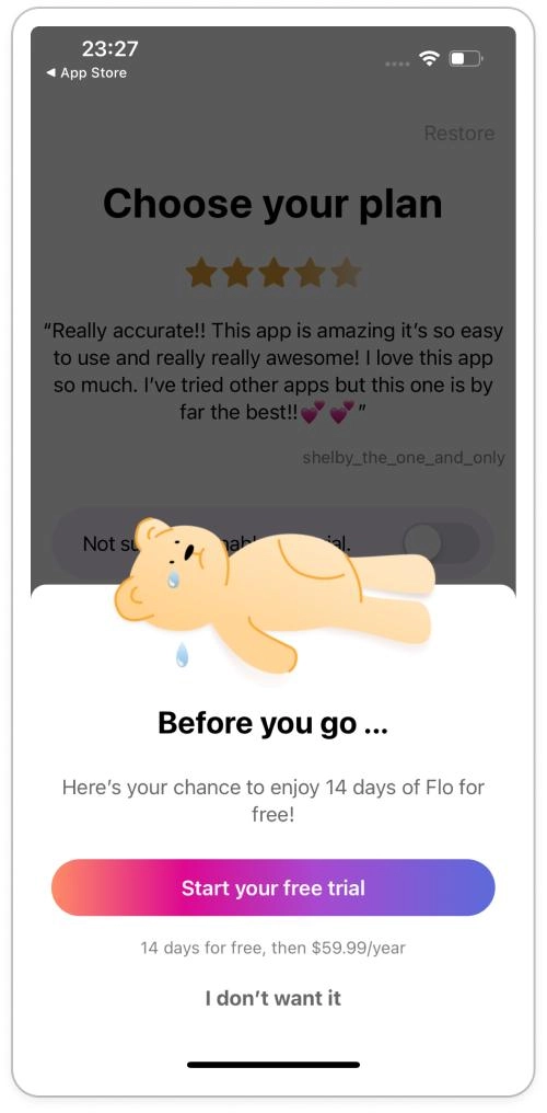
- Reject the bear (Did you? Heartless creature). But it’s okay. You’re still cheared up and ready to start. And guess what? There’s even a little gift waiting for you: a surprise discount.
- Two quick value/excitement screens later… surprise discount.
- Same structure as Lose It!: guilt → relief → gift but tuned to Flo’s audience and visual language.
Pattern library: What top Health & Fitness apps do differently
Here are proven patterns you can adapt and apply for almost any app, even outside Health & Fitness.
1. Trust accelerators
- Money‑back guarantees are displayed upfront
- Social proof in contextual snippets (testimonials tied to the step the user is on)
- Transparent pricing / eligibility messaging (“You already used the free trial last year, here’s a different kind of deal…”)
2. Intent moments
- List all touchpoints where a user’s motivation & curiosity spike and use them to offer a deal
- Create those moments intentionally & continuously
3. Multi‑offer ladders (The “escalating commitment” flow)
- Primary offer: Full price + value framing (“Best value: Annual saves 58%”).
- Secondary offer: Temporary discount or different term (e.g., 30% discount now!) triggered by exit intent.
- Gamified offer: Spin wheels, scratch cards, mystery boxes: limited attempts to increase excitement.
- Win‑Back offer: For lapsed or churned subs, discounted re‑entry with a capped period will boost LTV (e.g., 3 months at 50% off).
4. Value reminders between offers
- Micro‑content unlocks (“Here’s a free recipe pack while you decide”)
- Progress preview (“You’re 2 days away from finishing Week 1. Unlock the rest?”)
- Habit streak nudges (“Don’t break your 5‑day streak — lock in premium coaching now”).
5. Review‑safe UX tactics
- Avoid stacking multiple paywalls one-by-one. Spread them contextually across the journey.
- Always disclose pricing clearly and respect Apple’s guidelines.
- Let users easily close/skip. The next screen can carry the offer. Force alone only triggers churn.
Ethical guardrails (Don’t be “that app”)
- Avoid dark patterns: Wheel odds should be real; don’t fake countdowns.
- Respect cognitive load: Too many offers without value interludes feel spammy.
- Honor guarantees promptly: Refund friction destroys trust capital you worked so hard to build.