Many app developers believe that the less friction they have in onboarding, the better. Short forms, quick skips, early paywall. Though they might see more people getting through onboarding, this doesn’t convert into long-term value – not for users, and not for the app.
People do not download your app to “explore features.” They want to get a job done. And more often than not, the job is not functional but emotional. When onboarding helps them see that your product is the right tool for that job, you don’t get simple conversions but higher retention and LTV.
In this article, I’ll explain how to leverage the Jobs-to-be-Done framework during user onboarding to accelerate or rekindle your app’s growth. You’ll also find real examples of app onboarding flows that utilize this approach.
How to convince people that your app is the right choice
Most apps promise a functional job: “track workouts,” “block distractions,” “crunch macros.” But users don’t want to do something for the sake of doing it. They want to see a positive change in their lives.
That’s why it’s more important to keep focus not only on a functional job your app promises to deliver, but on an emotional or socially driven job.
— User doesn’t want to build muscles → they want to feel more confident.
— User doesn’t want to have VPN → they want to have a good time watching shows not available in their region.
But here’s the catch. You can’t make users experience the outcome of completing a job because they just downloaded the app. Moreover, they are subject to anxiety and inertia that keep them from trying something new.
So you need to help users understand the value of your app before they experience it. That’s where the Jobs-to-be-Done onboarding comes in, allowing you to build perceived value.
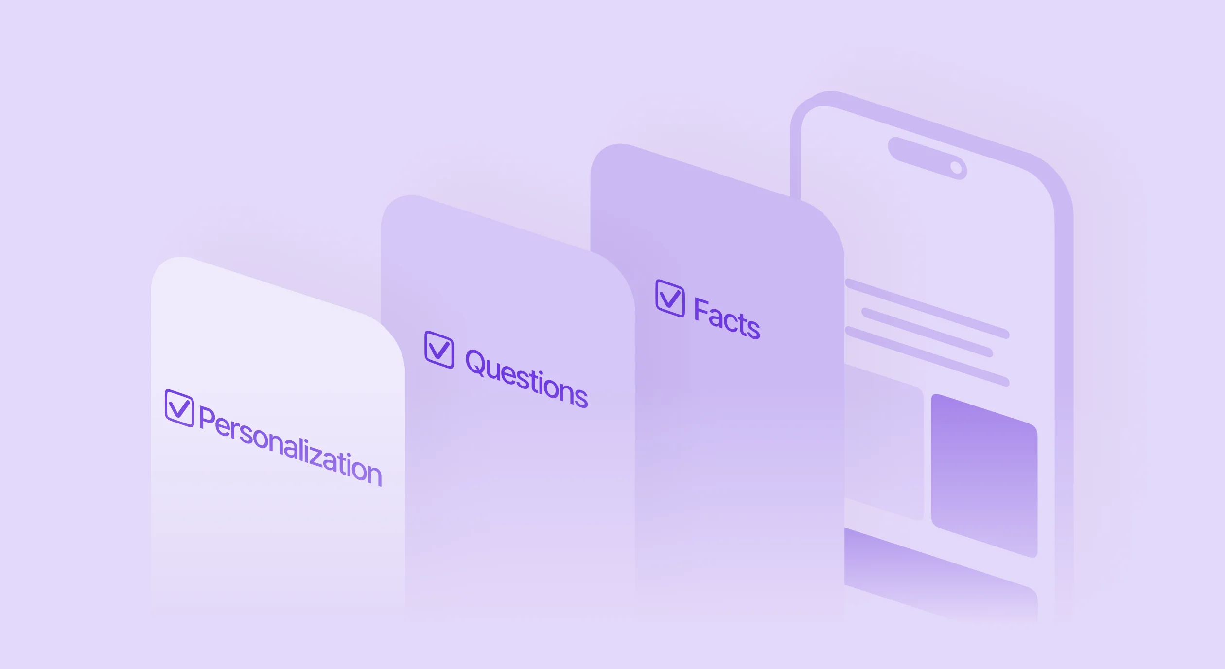
Jobs-to-be-Done onboarding helps accomplish three objectives:
- Build perceived value by demonstrating you understand their deeper motivations
- Reduce anxiety by addressing concerns before they become conversion blockers
- Establish trust through social proof from users with similar goals
What is Job-to-be-Done?
Job-to-be-Done is a framework that focuses on understanding why people “hire” products to solve problems in their lives. Instead of asking what features users want, it asks what job they’re trying to accomplish.
The core insight: people don’t buy products for the products themselves – they buy them to make progress toward a goal or resolve a struggle.
A person doesn’t buy a drill because they want a drill; they buy it because they need a hole in the wall. In apps, this means looking beyond functional tasks (“track workouts”) to understand the emotional outcomes users actually want (“feel more confident,” “sleep better,” “reduce anxiety”).
Why are longer onboarding flows ≠ worse results
The goal of creating perceived value, reducing anxiety, and establishing trust transforms into onboarding that signals to the user, “Hey, I know how you feel. Here’s how I can help, and here’s what others have already achieved through this app”.
But that means that you’ll need to add more screens to your flow, which sounds counterintuitive. Won’t people drop off? This concern arises from our misunderstanding of friction.
There are two types of friction: negative and positive.
- Negative friction serves the company, not the user. Registration forms, marketing permissions, tracking requests, “Where did you hear about us?” These screens extract value without giving any back.
- Positive friction serves the user. It personalizes the experience, demonstrates understanding, and builds confidence that this is the right product for their specific needs.
In practice, you can add multiple screens as long as they provide value to the user. The more positive friction you add while reducing negative friction, the higher your conversion rates climb.
What are the results of implementing Jobs-to-be-Done onboarding
Thanks to Jobs-to-be-Done onboarding, you get more motivated users who are more likely to make a purchase and stay longer within your app.
Results of applying the Jobs-to-be-Done onboarding are consistent, and I saw it over and over again with partner apps. One subscription app achieved a 72% conversion increase, another saw 300% higher average revenue per user, and a third improved conversions to payer by 35%.
When and how to start implementing JTBD onboarding
It might seem like you need to have a large app to start investing effort into JTBD onboarding flows, but in reality, you can start as early as possible. You need a product and some conversion event (downloads, trials, or purchases), but you don’t need significant revenue or large user bases.
So, the path to building JTBD onboarding flows is straightforward: talk to your users.
Identify recent converters, send personal outreach messages, and schedule 15-20 minute conversations focused on their decision psychology rather than product feedback.
Who: Recent converters (within 7-14 days of purchase/trial). They remember their decision-making but haven’t developed strong product opinions yet.
How many: Around 10 users.
Recruitment: Personal outreach: “Do you have 15-20 minutes to talk about the product so we can make it better?” Phone calls often work better than scheduled meetings.
Questions focus on decision psychology, not product features:
- “What did you think the product was going to enable you to do?”
- “Can you remember when you downloaded the app? What were you thinking?”
- “How long have you been thinking about this problem?”
Avoid product-focused questions like “What features do you like?” or “How would you rate the interface?” If you’re asking about your product, you’re asking wrong questions.
And here is a simple template for arranging a call.
Subject: Quick chat about [Product Name]?
Hi [Name],
I noticed you recently started using [Product Name] – thank you!
I’m [Your Name] from the [Product Name] team. Do you have 15-20 minutes this week to share why you decided to try our app? Your insights help us make the product better for users like you.
Feel free to grab a time that works: [calendar link]
Or just reply to this email and we can set something up.
Thanks,
[Your Name]
[Your Title]
[Direct email/phone]
After 10 interviews, you’ll have clear themes around emotional jobs and typical anxieties. Use these insights to create one or two onboarding screens that address the strongest patterns you discovered.
What interview mistakes to avoid
Mistake 1: Using customer success or usability testing interviews instead of Job-to-be-Done methodology. These provide different insights but won’t reveal purchase motivations.
Mistake 2: Interviewing long-term users instead of recent converters. Established users have developed product opinions that overshadow their original decision drivers.
Mistake 3: Asking leading questions or focusing on features. This pushes users toward answers you want to hear rather than revealing their true motivations.
Mistake 4: Having your research team conduct interviews while you review transcripts later. The value comes from firsthand exposure to user psychology. You need to be present, listening to their struggles and motivations directly.
Mistake 5: Running interviews through AI for analysis. While AI can help organize information, the effort of manually analyzing transcripts – the pain of doing the work yourself increases your empathy towards your users and generates better insights and stronger conviction about what to build.
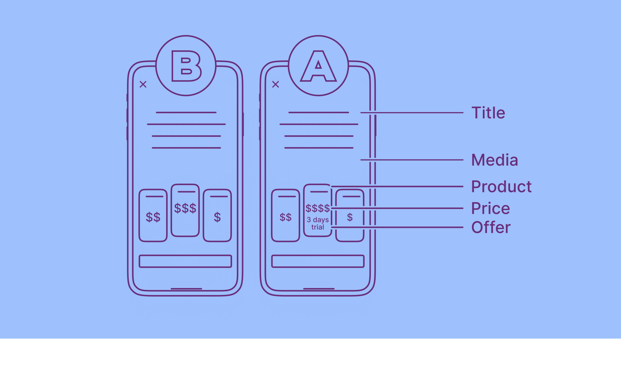
How to transform insights into onboarding screens
Once you’ve completed interviews, you’ll identify themes around emotional jobs and anxieties. A fitness app might discover themes like “build confidence,” “sleep better,” “reduce anxiety,” or “feel better in my skin.” Under each theme, you’ll find specific anxieties: “Is this too hard for me?” “Do I have the right equipment?” “Will people judge me at the gym?”
Use these insights to create onboarding screens that address jobs and reduce anxieties:
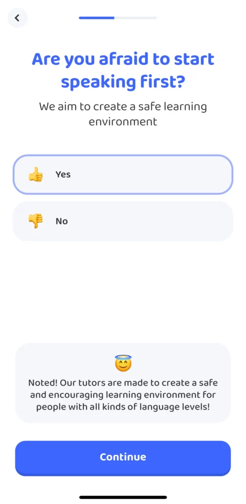
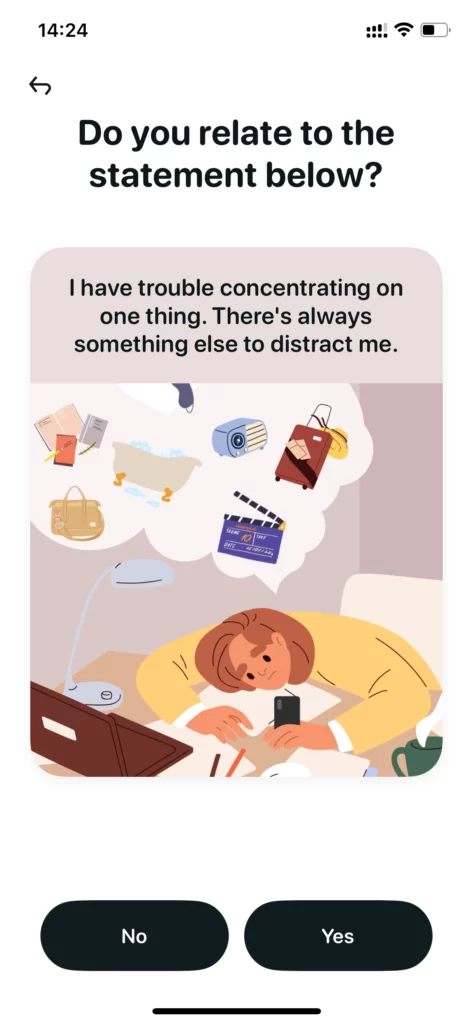
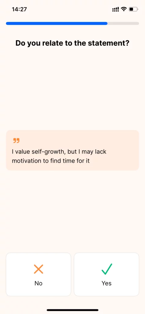
Question screens highlighting emotional jobs, not functional tasks.
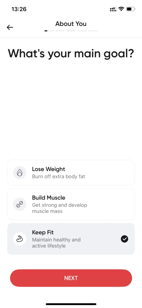
Personalization screens: Ask users about their current state to tailor the product to them.
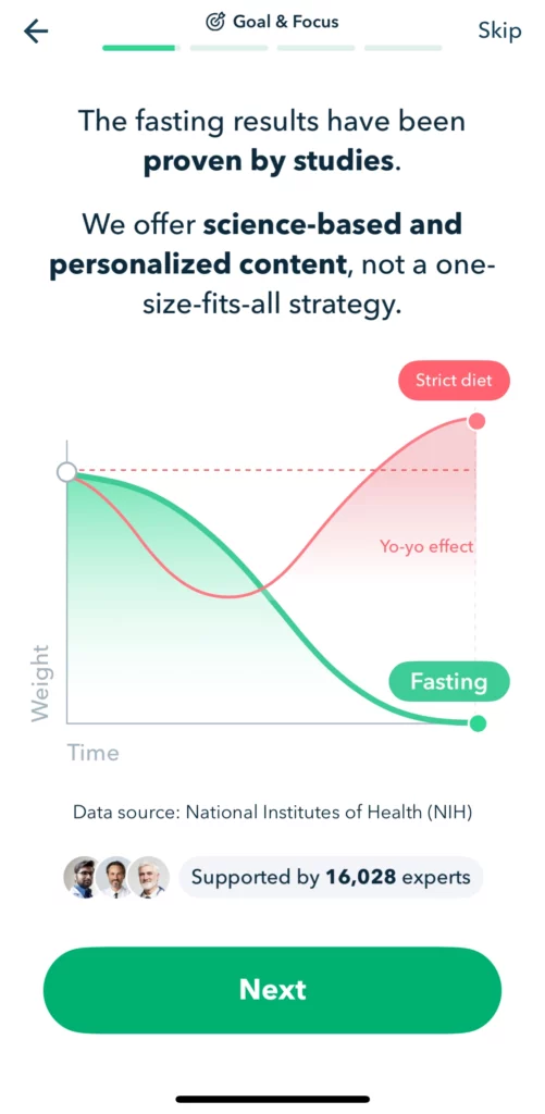
Comparison screens: Likely, the user has already tried other ways to reach their goal, hasn’t succeeded, and is feeling anxious about it. Acknowledge the possible anxiety and show how your app can do a better job.
Statement screens: Direct quotes from interviews presented as statements users can agree with.
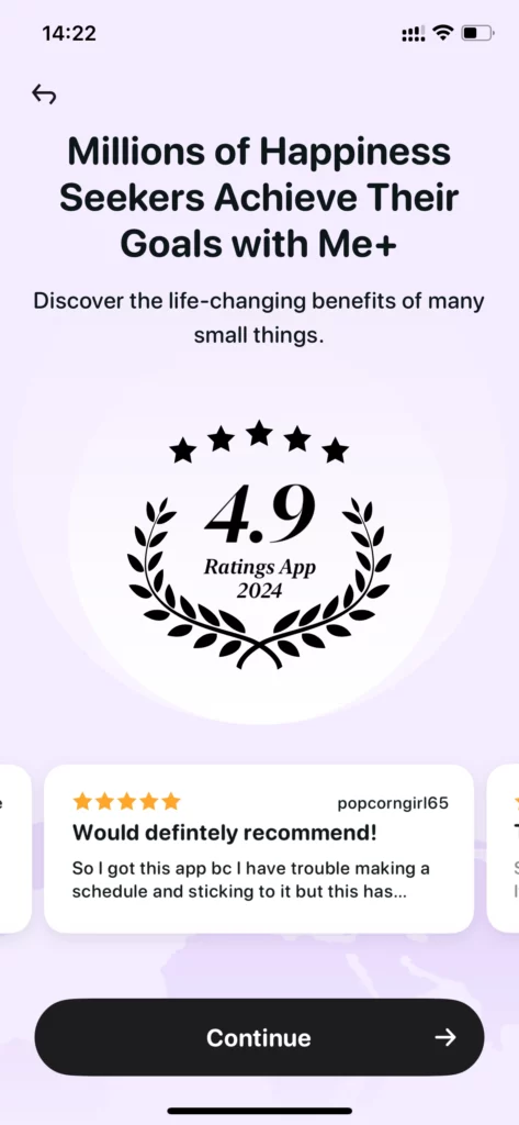
Social proof screens: Reviews and testimonials specifically focused on the emotional jobs your app helps users achieve, not generic product praise.
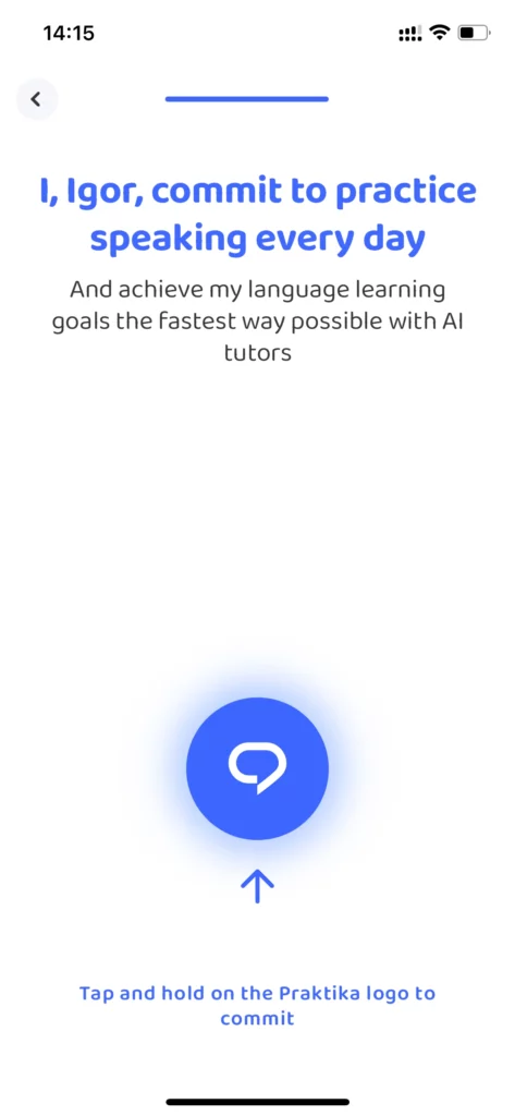
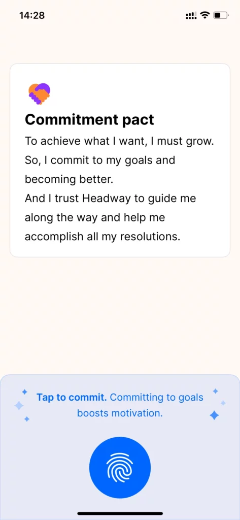
Commitment screens: Pledges or contracts where users commit to their goal.
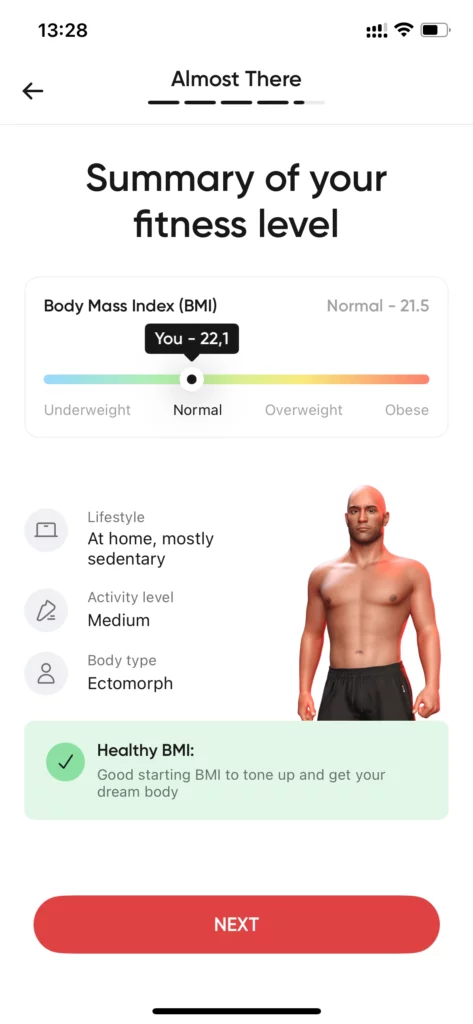
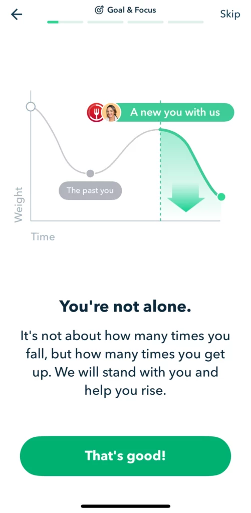
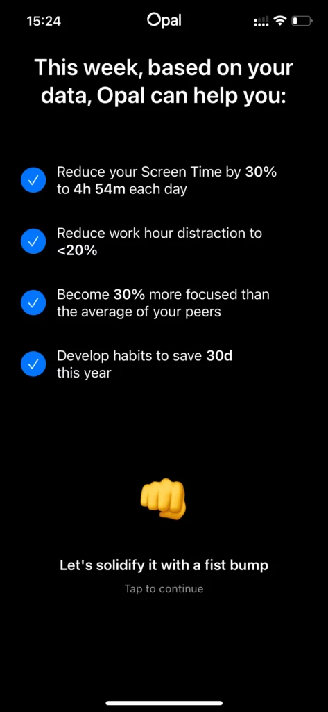
Tangible results screen: Show users what they can achieve with your app.
Remember: these screens focus entirely on user psychology – how they feel, what they want to achieve. Your product is merely the means to their end. Avoid featuring functionality or technical capabilities.
How to measure impact of app onboarding improvements
First, track conversion rate to paid subscription as your primary metric. This directly measures onboarding effectiveness.
If you have enough traffic, I would strongly suggest A/B testing those changes to ensure that the impact is significant and that you’re not seeing a trade-off, such as increasing your trial start rate while simultaneously reducing ARPU.
Secondary metrics include early engagement rates and day-1 through day-7 retention. If your Jobs-to-be-Done onboarding truly connects with users, they should demonstrate higher initial engagement with your product.
Be cautious with longer-term retention metrics, as other factors (product updates, acquisition channels, seasonal changes) can influence these numbers. Focus on conversion and early engagement for the clearest signal.
While conversion improvements are immediate and measurable, Jobs-to-be-Done onboarding creates broader benefits:
Higher engagement: Users who understand how your app fits their life goals engage more consistently.
Better retention: When users see clear connection between app usage and personal objectives, they stick around longer.
Reduced churn: Users with strong perceived value are less likely to cancel when facing minor product issues.
Improved product decisions: Understanding real user jobs guides feature development toward capabilities that matter most.
If you’re new to adding positive friction in your onboarding, start small. Introduce a social proof screen, a goal-setting screen, keep things simple, and iterate as you build the full flow.
But remember: garbage in, garbage out. Spend time nailing your user interviews before diving into new screen designs.
FAQ
Neither. Make it useful. Cut steps that serve you. Keep steps that help users see outcomes and feel confident.
As many as you need to add value. If a screen personalizes, reduces anxiety, or proves results, it earns its place.
Outcome first. Show the job users care about, personalize the plan, add proof from similar users, then show price.
They do not see the outcome. Speed without perceived value feels risky, so they bounce.
Helpful steps that serve the user. Use goal selection, simple personalization, clear expectations, and outcome-based proof.
Yes. You only need a product and a conversion event. Start with a couple of value-adding screens and iterate.
Talk to recent converters within 7 to 14 days. About ten short interviews usually reveal emotional jobs and common anxieties.
Ask about the decision, not features. Examples: what outcome they hoped for, what was happening when they downloaded, how long the problem has existed.
Goal selection focused on outcomes, simple personalization, comparison to alternatives, outcome-based social proof, a goal commitment, and a results preview.
Name the fear and answer it early. Explain effort, tools, and timeline. Show examples from users like them.
Yes. Use proof tied to outcomes. “I feel more confident” beats “Great design.” Match proof to the user’s chosen goal.